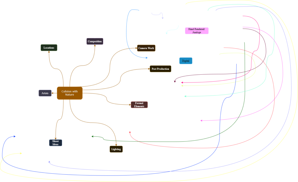
Mindmap
Here you can see my mindmap that I have made for this project. I have tried to cover all the different aspects that I need to think about and then linked them together to show connections and also my thought process.
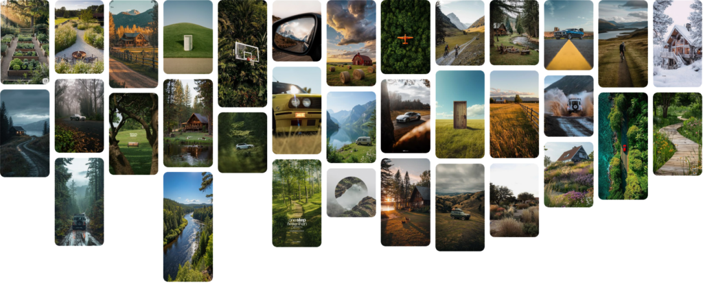
Mood board of Visual Ideas
Here you can see my moodboard of visual ideas where I have used Pintrest to college a range of images that I feel like are a good inspiration for my work and that can have a positive effect on my outlook for this project’s creative direction.
Sources
None of these images are my own work, they are found imagery from a popular Social Media/Media Sharing Platform known as Pintrest. I take no ownership of the above seen images.
Pintrest Website: https://pinterest.com/
Artist Research
Artist 1 – Victoria Siemer
Victoria, otherwise known as Witchoria is a Brooklyn-based American graphic artist who focuses mainly on photograph manipulation in Adobe Photoshop. She mainly does fractured landscapes, where she makes a frame of a landscape over a landscape using a geometric shape, such as a circle or rectangle. From her website: “She works predominantly in the digital realm, creating surreal photo manipulations that reflect her penchant for ennui, existential crisis, and heartbreak.”

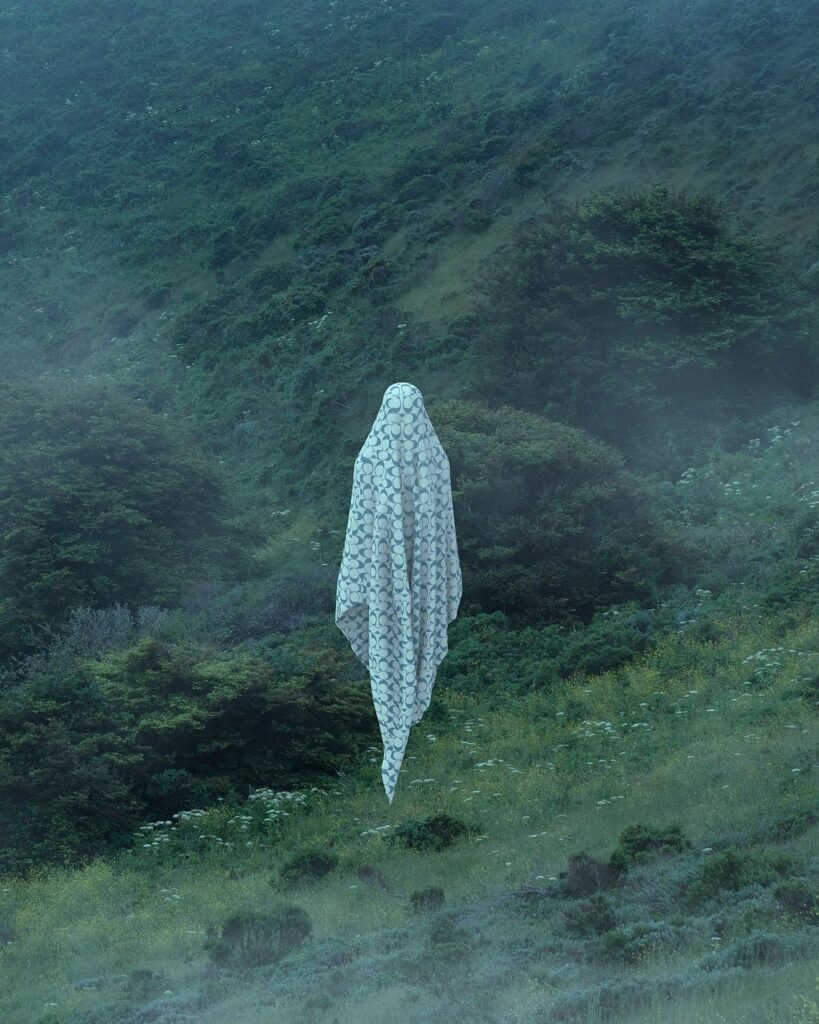
Her work has been comissioned and then used for many popular companies advertisement campaigns, including Adobe (for Adobe Max Identity 2016), Samsung (for their Galaxy Note 5 release), Gucci (for their #GucciGram campaign on Instagram), Coach (2018 artists colaboration), Dior (Lovechain Campaign) and Skillshare (Skillshare Day). Below you can see some examples of her imagery for these campaigns. Her unique style is eye catching and her geometric work can highlight branding like in image 1 where the Adobe Max logo is able to be replicated by her work. These all highlight her style, mainly Adobe Max and #GucciGram where they both add onto her “Geometric Reflections” series of work. Her Coach and Dior more work around 3D digital manipulation where in the Coach image we can see a super-imposed image of a Coach scarf in woods which is glowing and surrounded by snowfall and in the Dior image we can see a wall of moving text which is reflected in the water of the sea that is covering a beach in the original picture.

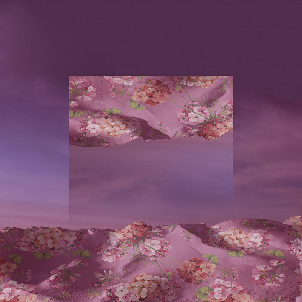
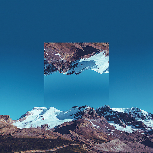
Her personal works, “Geometric Reflections” (Images 1-4) and “Hue Don’t Own Me” (Image 5-7) stand out to me most. The idea of such powerful and impossible visuals in such a natural landscape really stands out to me and the idea of completely thrown off colours with vibrant typography floating in space also really highlights her visual identity and her unique digital manipulation. Her images of landscapes are deep in contrast, well-saturated colours while not looking too unnatural and gloomy atmosphere that lingers over the scene. Her composition here often includes lots of sky, to allow her to later add the flipped manipulations in the dead space. Her other images from the “Hue Don’t Own Me” gallery look to be lit purely by car lights and are then manipulated to have unnatural vibrant colours and then typography that glows and floats in space.
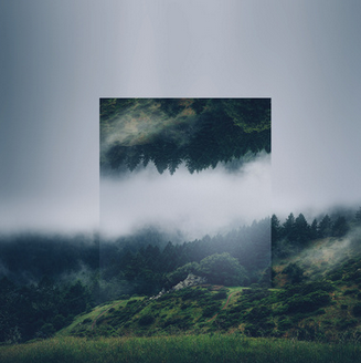
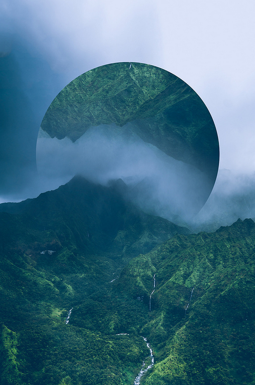
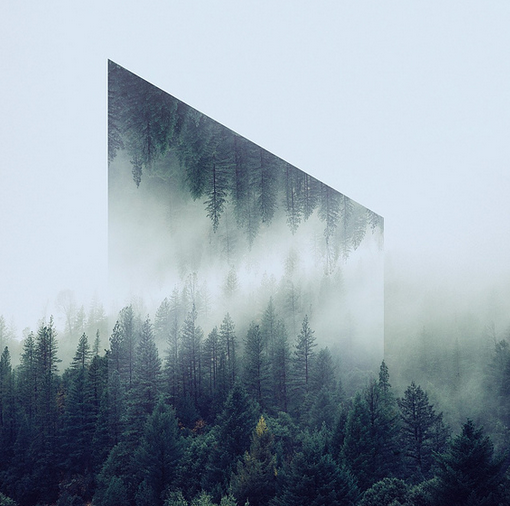
In images 1-4 they all use the idea of geometric reflections where we can see a frame of the image has been duplicated, flipped and then framed in a certain shape. These are amazing and are an awesome way to highlight a certain aspect of a scape. In image 4 in particular we can see that a gradient neutral density filter has probably been used to give the sky a gradient, or possibly masking has been used in editing to add a gradient to a exposure mask. But this gradient is made very obvious by the overlapping image where the sky has been flipped too and that can be seen as the gradient contrasts slightly with the image next to it, highlighting the chosen shape. Image 3 I really like as the shape is unique and slightly different and helps show the idea of the trees being on a hill maybe, as we can see the distance from tops of the trees from the contour line is pretty consistent. The sky being so white makes such a contrast between the flipped trees and the sky, but this is because of the chosen time where their was lots of atmosphere in the air from dropped clouds. Again something similar can be said for image 2, where the use of the circle shape follows the contour of the land where the land seems to almost cave in, however this time it looks like a different image from the main one and it seems that the artist has matched them together as their shapes “fit” together. The atmosphere is gloomy here, most likely from the weather where it looks like in the distance it is heavily raining which can be seen from the dramatic sky on the top left of the image.
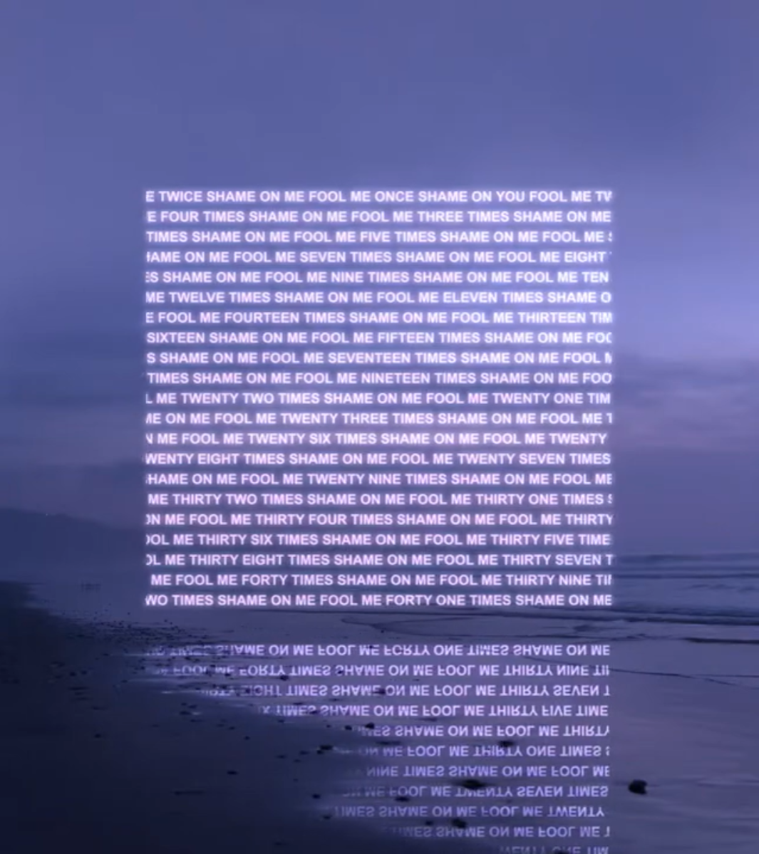
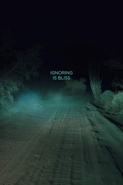
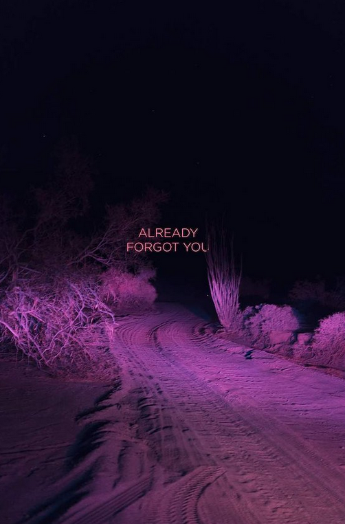
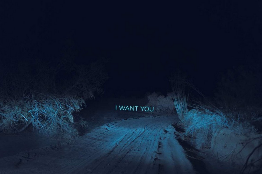
In images 5-7 we can see a singular shoot which has been digitally manipulated with HUE shifting and experimental 3D super-imposed typography with escence of heartbreak in the meaning of the text which links back to her general ethos stated on her personal website. These images seem to be taken a car ride through a barren desert, we can see tire tracks of previous drives and the trail seems to be lit purely by the lights of a vehicle, creating an ominous and mysterious feeling of the distance that we cannot see. These images almost feel like we are inside the mind of the artist and that we are traveling their thoughts.
Sources
“This is Collosol” Article: https://www.thisiscolossal.com/2015/06/new-reflected-landscapes-and-photo-manipulations-by-victoria-siemer/
Witchoria’s Website: https://www.witchoria.com
Witchoria’s Instagram: https://www.instagram.com/witchoria
Artist 2 – Ansel Adams
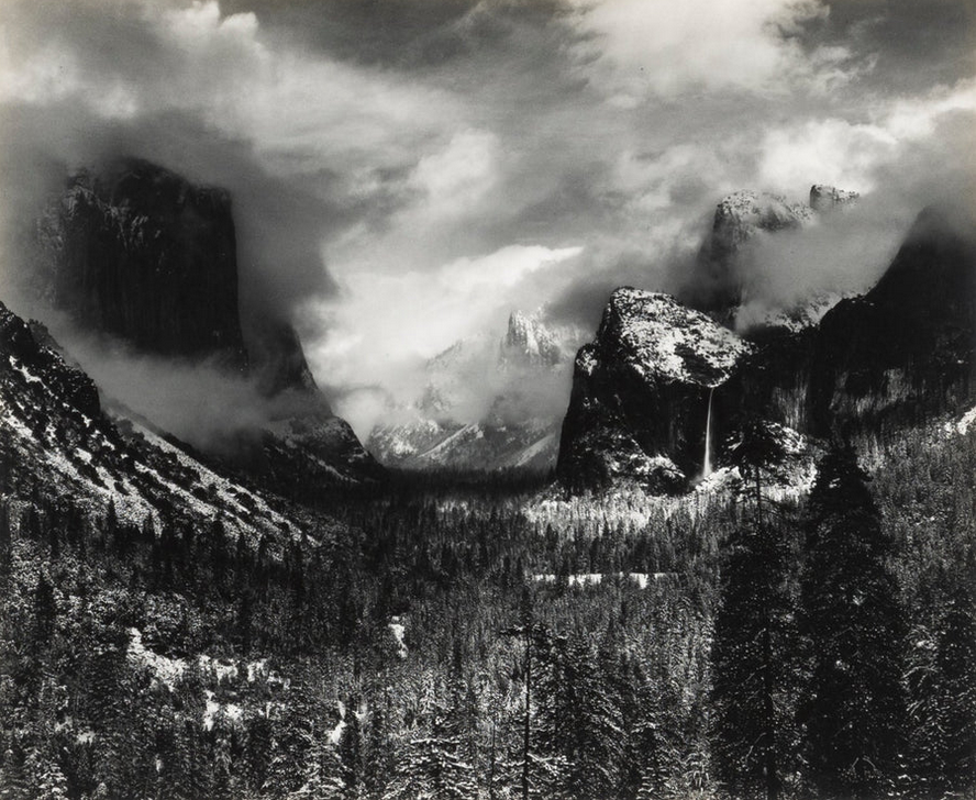
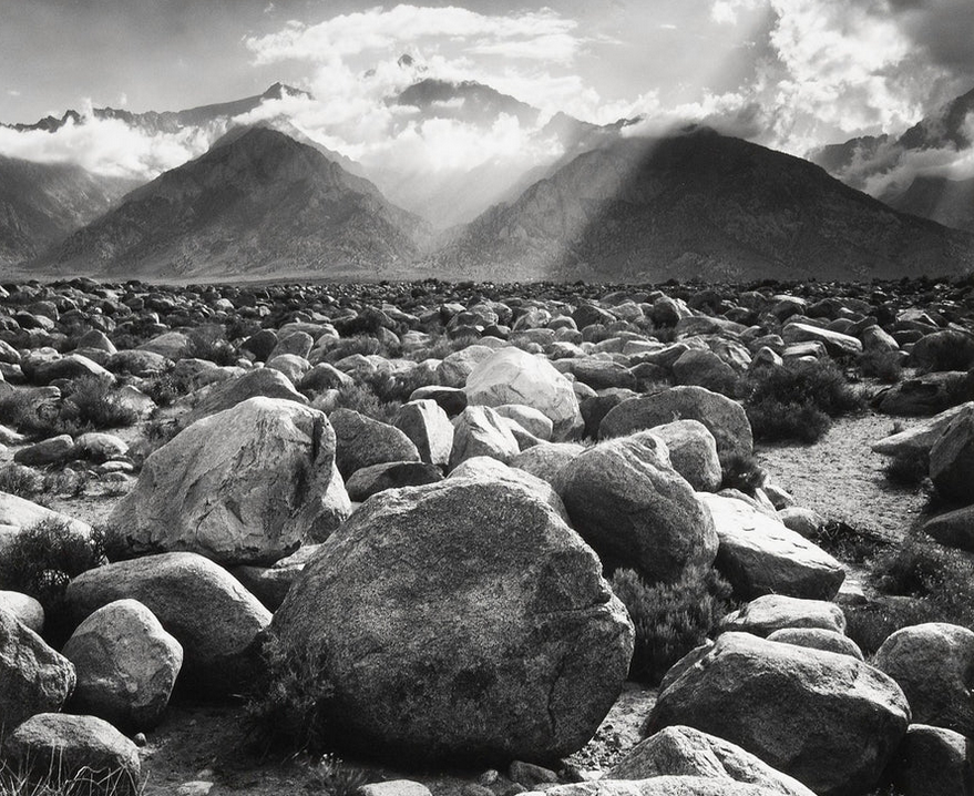
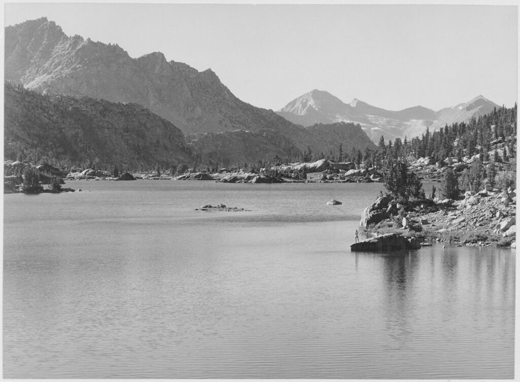
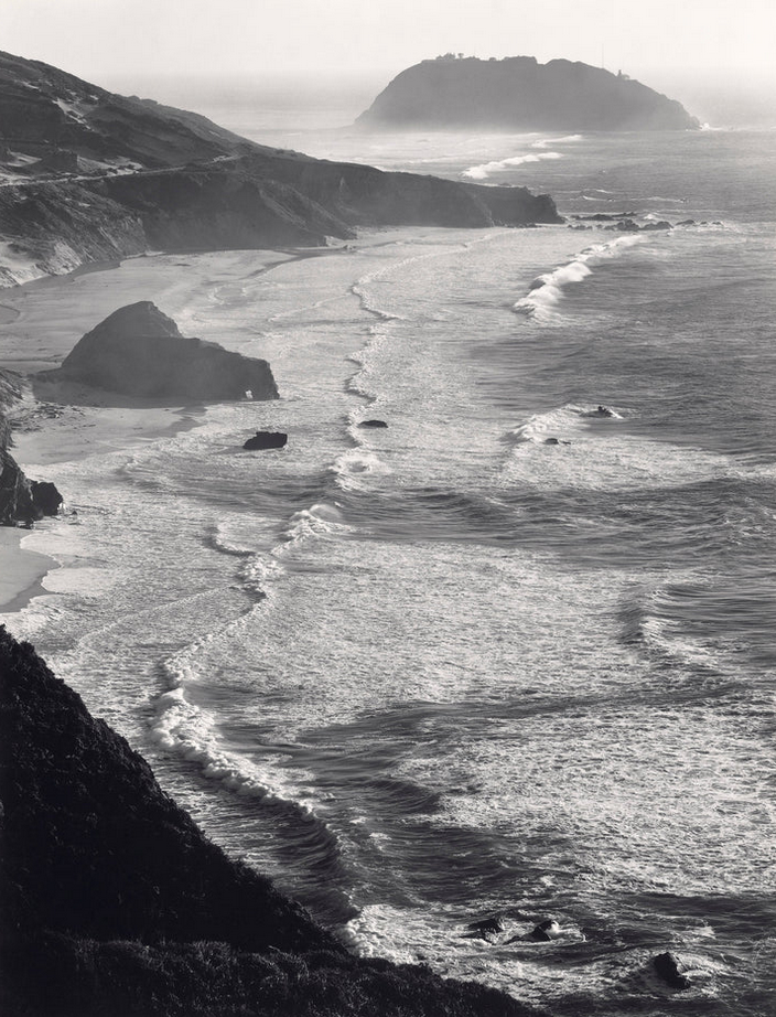
Ansel was an American Landscape Photographer and environmentalist who was born in 1902 and died in 1984 and most known for his black and white photography of the American West. He helped found the f/64 group , an association of photographers advocating “pure” photography which favored sharp focus and the use of the full tonal range of a photograph. He and Fred Archer developed a method for image-making called the zone system, a method of achieving a desired final print through a technical understanding of how the tonal range of an image is the result of choices made in exposure, negative development, and printing. He was given his first camera when he was just 14, where he then went for his first visit to the Yosemite National Park. He developed his early photographic work as a member of the Sierra Club. He was later contracted by the United States Department of the Interior to photograph national parks. For his work and his persistent advocacy, which helped expand the National Park system, he was awarded the Presidential Medal of Freedom in 1980.
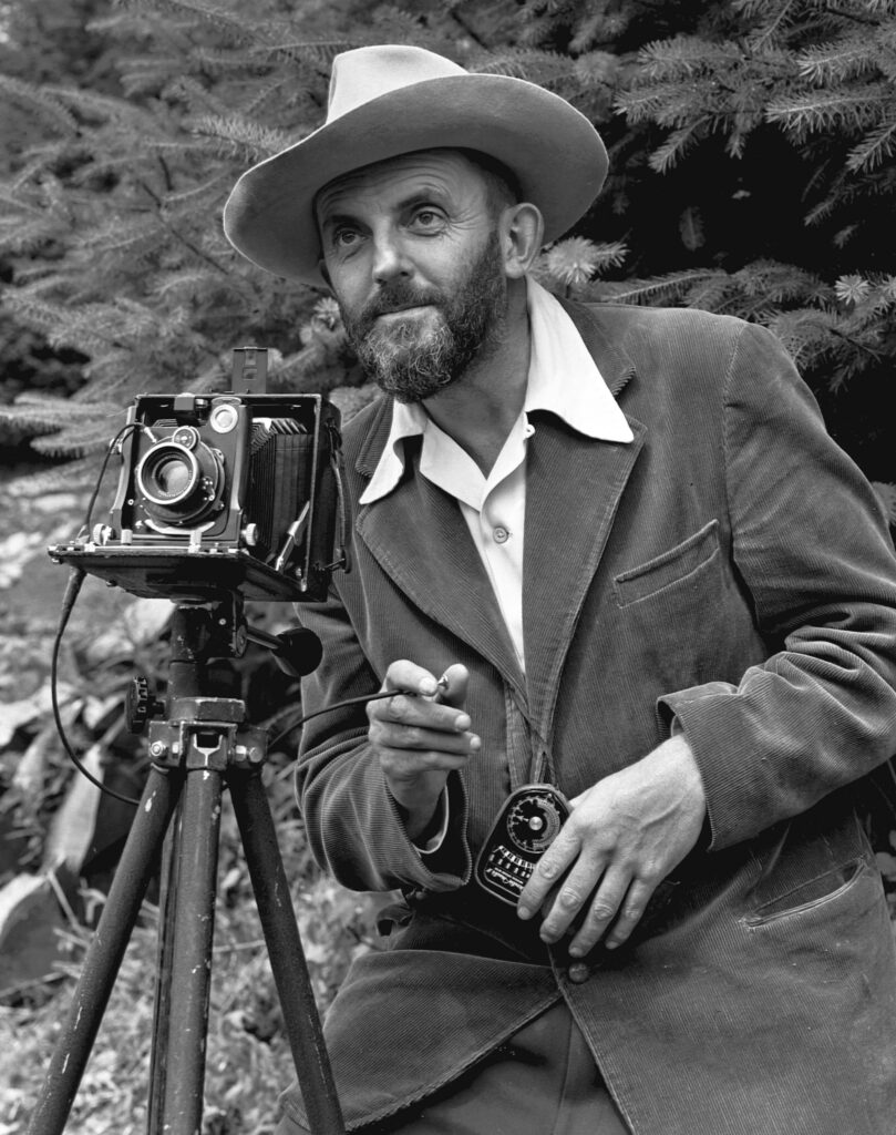
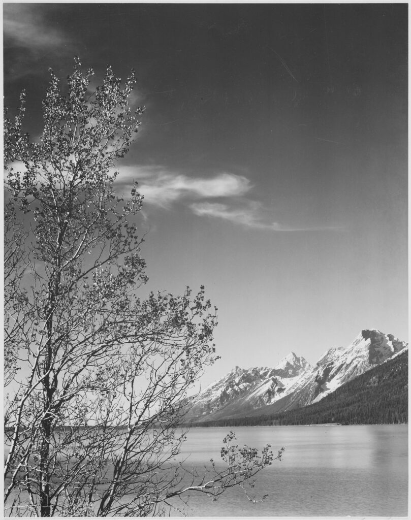
His work is incredible, deep contrasting skies against pefectly detailed subjects with composotion that dosen’t always follow the rules but creates incredible connection for the viewer to the location. The deep depth of field makes for a very interesting look in some images, where we can clearly see both extremes of the image depth in sharp focus. His works always have careful consideration of tonal balance to ensure details are not lost, creating a kind of “flat” image that remains stunning visually.
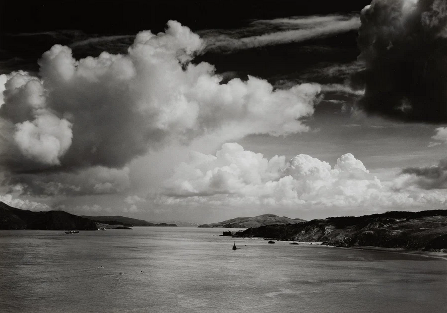
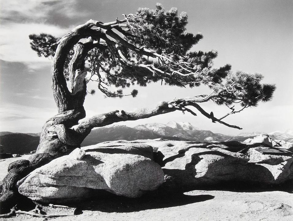
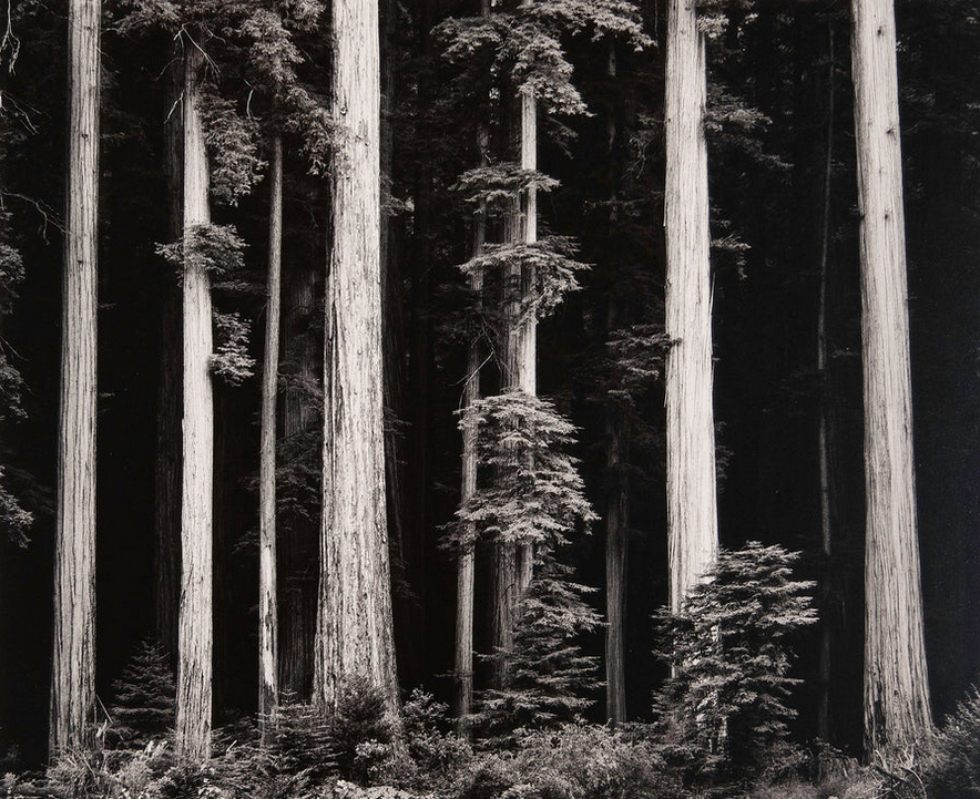
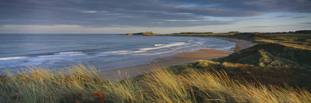
His images have a slightly yellow tint to them, most likely from how they are developed as most of them were made on glass slides. The picture of the beach (Image 11) is one of my favourites here, deep contrasting blacks in the foreground compared to the beach which is light and the sea that is perfectly sharp all the way through the image due to the high f-stop. The compositon is perfect, including barely any sky and giving the audience a perspective view of the entire beach and coastline. I also love image 6, a landscape with loads of sky breaking the rules again of composotion where only the bottom 1/3 of the image is anything but sky, making the sky feel like a prominent subject and drawing your attention into the details of the clouds. The snow capped mountains we can see in the distance are sharp and detailed because of again the high f-stop and the trees in the very near foreground are also in perfect sharpness. In image 2, we can see a tree overarching some rocks below, the rocks creaate a beautiful area of darkness below them as the harsh sun casts shadows. The underside of the branches and side of the trunk is darkened and has areas of deep contrast to the top of the tree where we can see bright parts, this contrast shows a dramatic light and I love this harsh shadowed image. Image 4 is the same idea, areas of really bright and then the rest of the image is dark, gloomy and dramatic. The clouds rolling over the landscape are stunning and shade areas of detail and almost outline the beauty of the rock faces. The trees in the foreground and onwards are all in perfect focus as in other pictures, because of a high f-stop and these are in quite dark lighting with not much range in them but that helps draw your attention away from them and instead to the mountains ahead which offsets the perfect focus because of the high f-stop. This balance being reconstructed where otherwise it was stripped away because of the high f-stop with the deep depth of field really helps to create that foreground background seperation we are so used to being done by depth of field but instead being done with the tonal range in certain selections of images.
Sources
His Wikipedia: https://en.wikipedia.org/wiki/Ansel_Adams
His Website: https://www.anseladams.com/
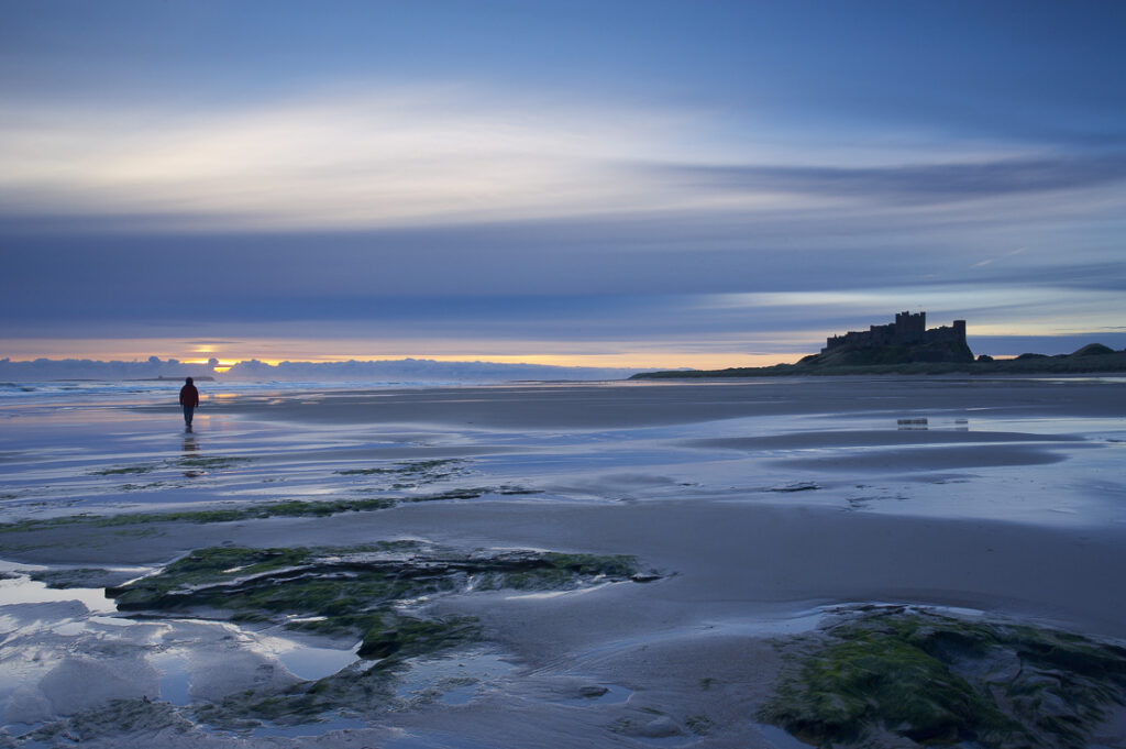
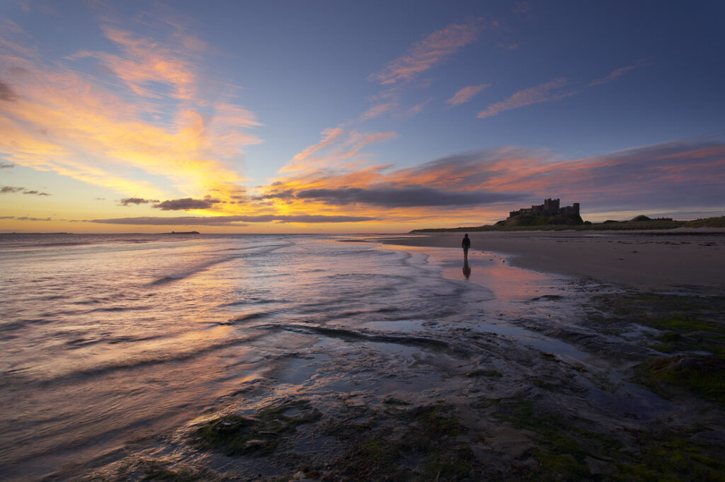
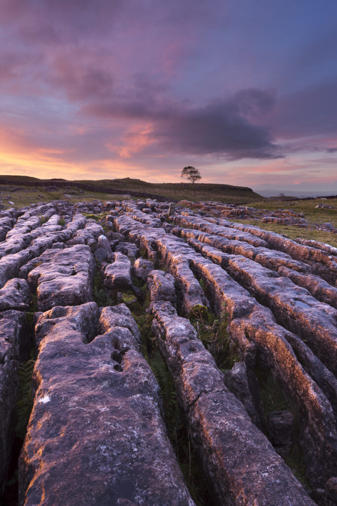
Artist 3 – David Noton
David is a landscape and travel photographer with 37 (and counting) years’ experience as a professional. He was born in Bedfordshire, England in 1957, but quickly emigrated with his family to be with his aerospace engineer father in California as his father was recruited to work on the then rapidly expanding American space programme. He says that trans-atlantic migrations shaped his child hood as later in the early 60s him and his family returned to England only to then again re-emigrate to Canada, in 1965. He says the later 6 years growing up in Ontario where life-shaping and that he still feels a strong bond with Canada all these years on and says he still has maple syrup in his blood.. haha But he says “That Canadian connection has permeated through my photographic career; we’re back there every year or so, and it’s where some of my best work has been created.” He graduated in 1985 and jumped straight in at the deep end as a freelance photographer based in Bristol. Where he then later went on to win awards and then later further grow his photographic career.
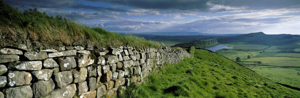
David’s work feels perfect and surreal. Landscapes with vibrant colours where you can place yourself right in the image. In image one we can see a landscape but with a focus on the stone wall, a tight aperture has been used (probably around f8-11) which means both the very near wall and the very far hills are in perfect focus. The colours in the image are natural while still being enhanced enough to show the dramatic, moody sky and all the intricut details in the stones, with their moss and other natural growths. Image 2 follows on from this beautifully, deep depth of field with a foreground subject that adds without distracting from the rest of the image but allows you to easilly place yourself in the location with a true to life image. Image six is very similar to image one, a deep depth of field with a detailed image of a stone wall seperating two parts of land and he has shot down the wall and into the distance capturing a lake surrounded by woodland and lush green fields all seperated by stone walling. Showing the true beauty of the North Yorkshire Dales. The sheep are also in perfect focus and tell us that this most likely was a shutter speed of around 1/80+ as the sheep are not blurred from their movement. The slight fringing on the grass between the very near walls of the grass dying back where it is growing on the rocks is detailed, colourful but not distracting and completely unnatural. The left side of the wall looks like it has been masked with an exposure mask to add more depth to the shadow behind the wall and work in connection with the mask on the opposite side of the image (above the lake) where we can see a mask with the opposing purpose has been applied to blow out the sky with harsh highlights from where the sun is. This helps to balance the photo but also make it not flat and show the idea of a dramatic evening sky, which is further developed by the deep grey bluey clouds in the distance.
Sources
David Norton’s Website: https://www.davidnoton.com/
F11 Magazine Website: http://www.f11magazine.com/
Book Research
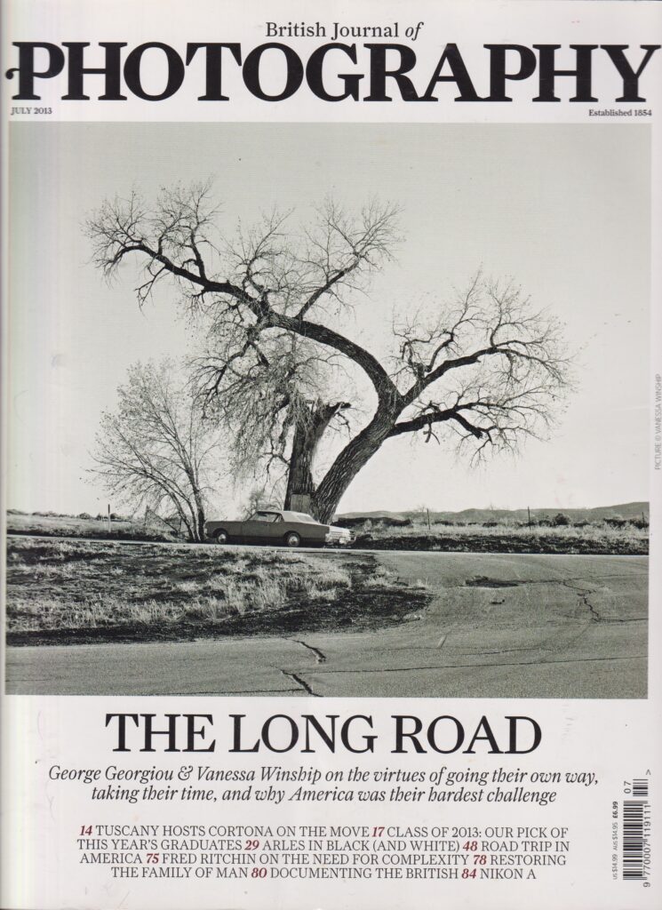
Book 1 – BJP Magazine
BJP is a Photography magazine that journalises Photography in Britain. I have chosen this particular issue for its uniqueness and relevance to my project. From the BJP Website: “We publish British Journal of Photography — the world’s oldest and most influential photography title. We are home to some of the photography industry’s most prestigious awards. And our in-house agency connects the best photographic talent with major international brands to produce game-changing visual campaigns.”
Sources
1854 Photography about page: https://www.1854.photography/about/
BJP Magazine Issue (from July 2013, possibly Volume 160, Issue 7814)