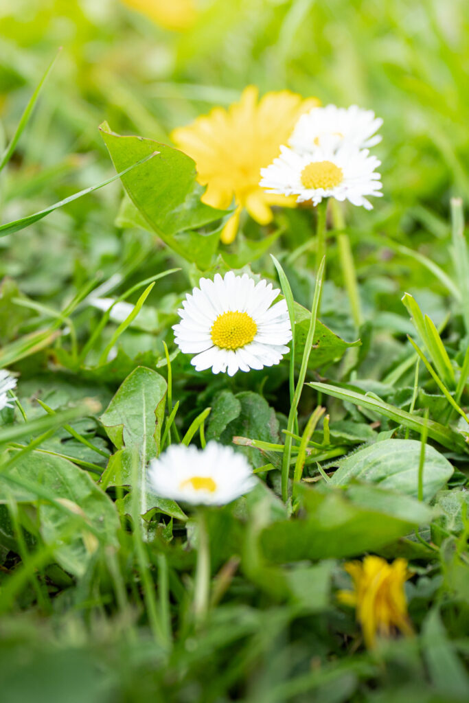
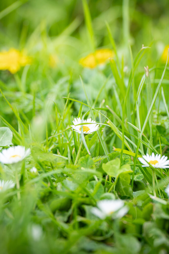
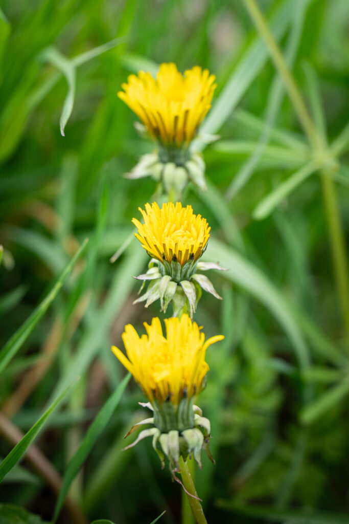
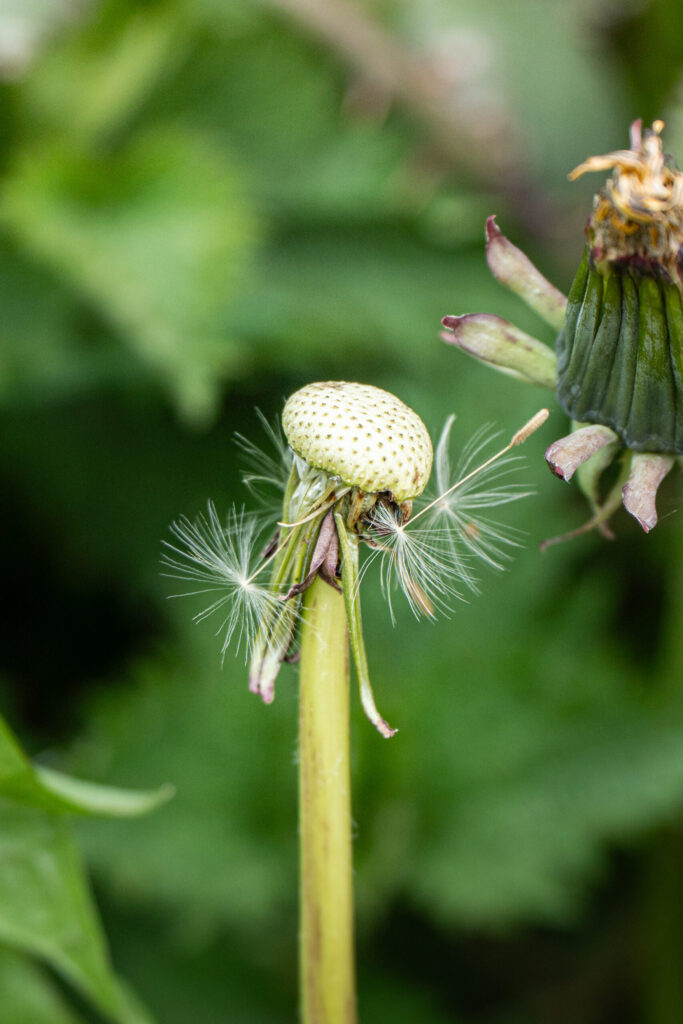
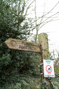
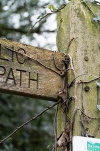
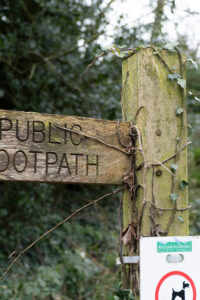
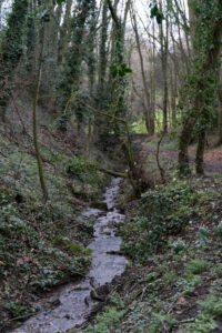
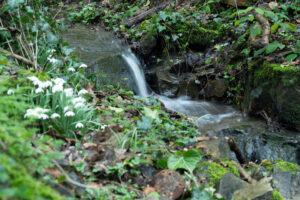
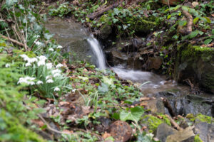
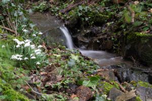
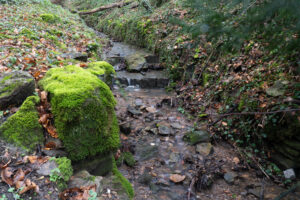
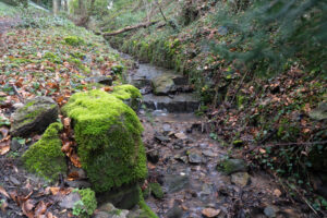
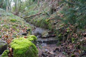
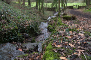
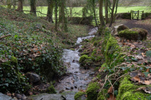
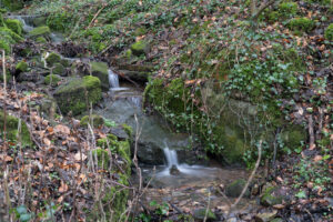
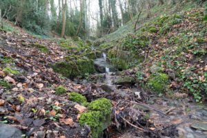
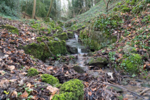
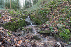
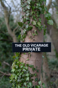
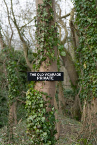
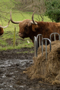
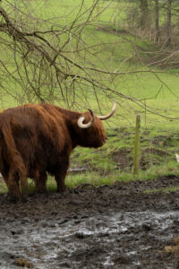
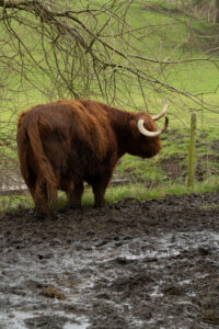
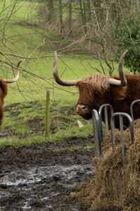
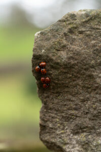
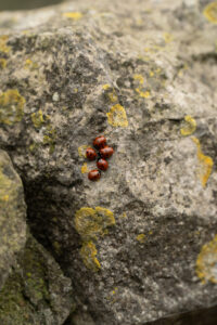
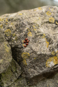
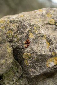
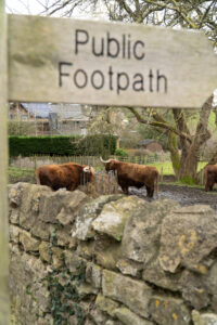
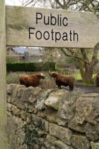
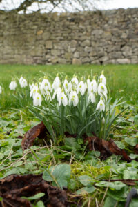
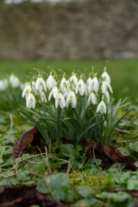
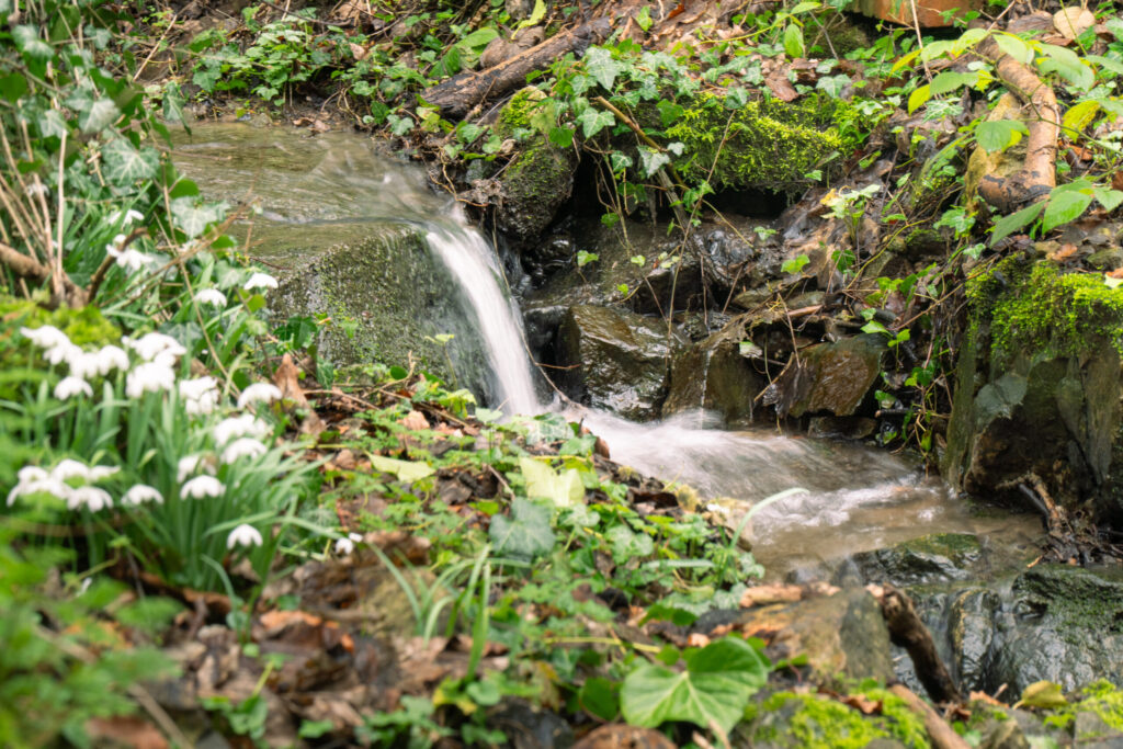
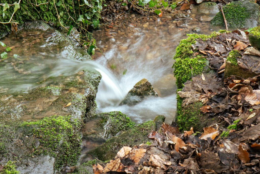
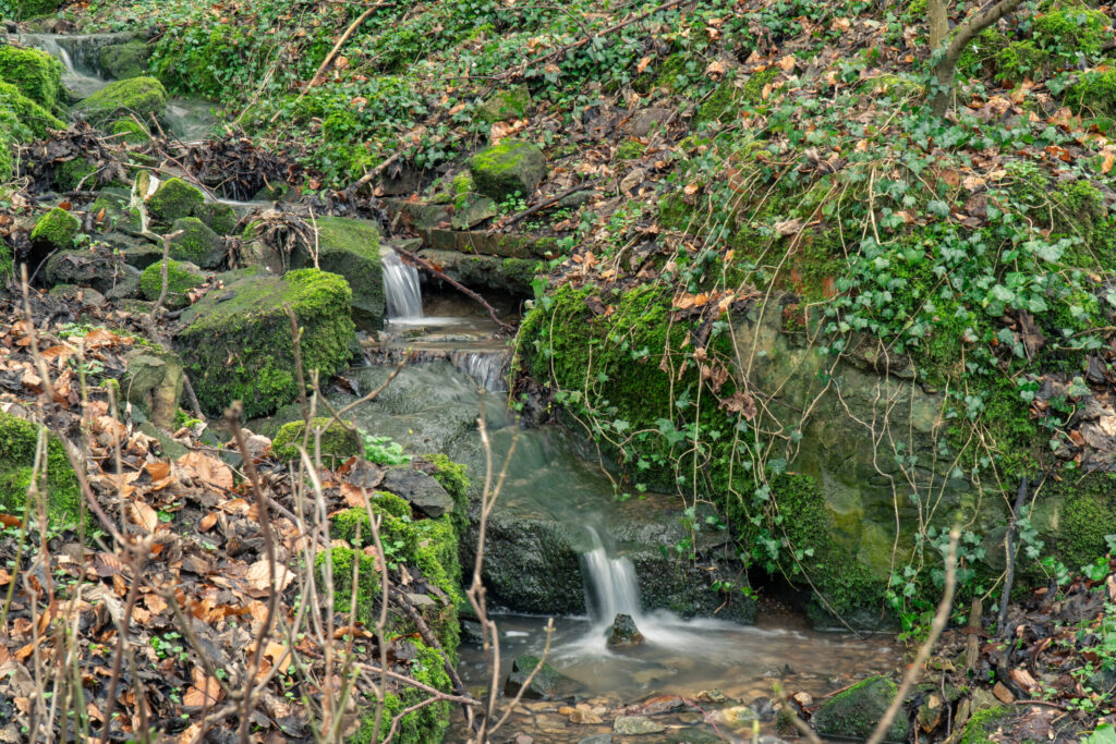
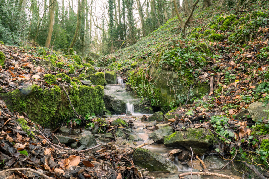
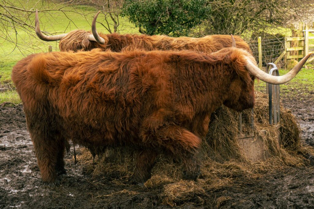
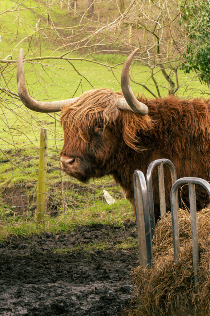
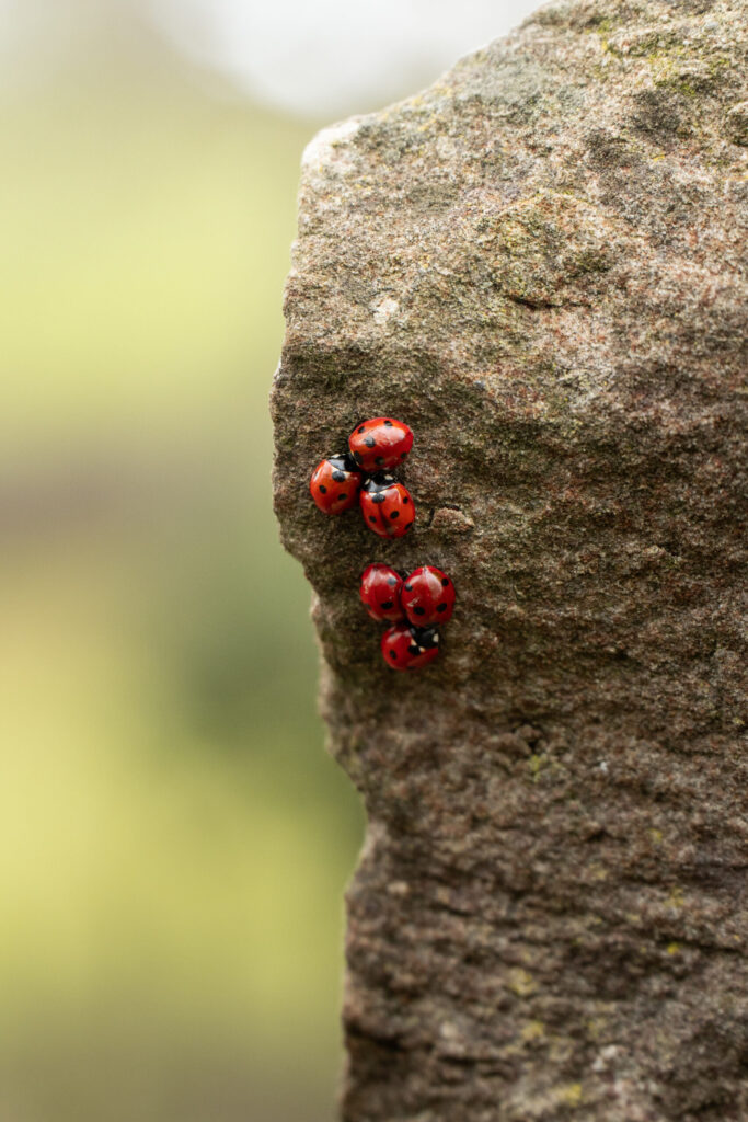
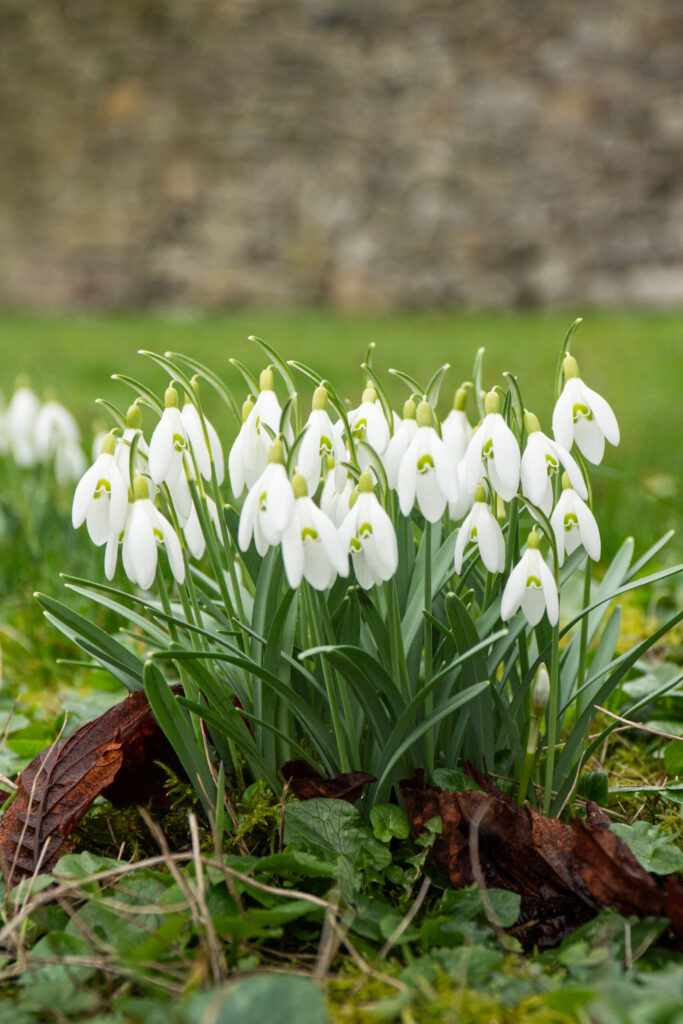
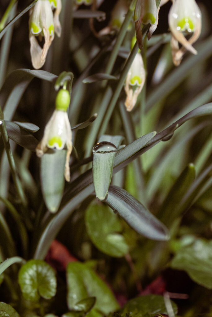
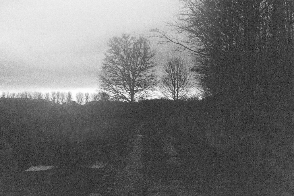
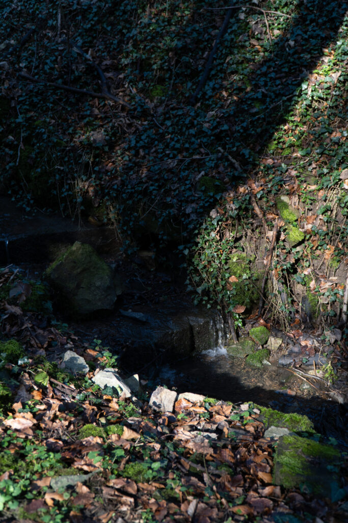
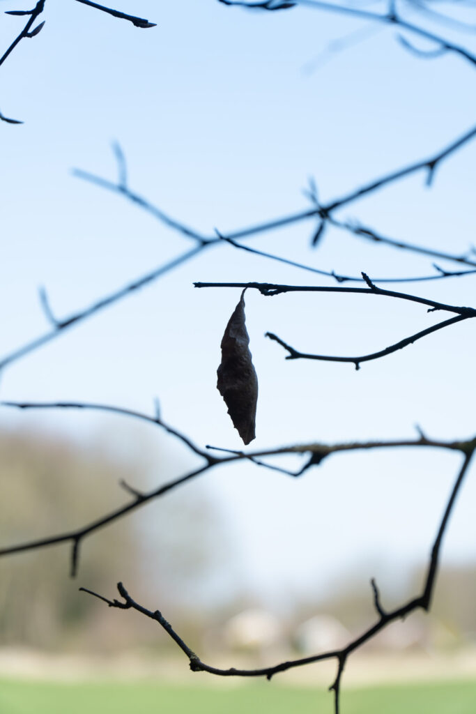
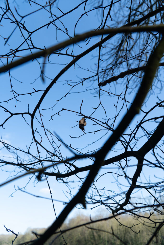
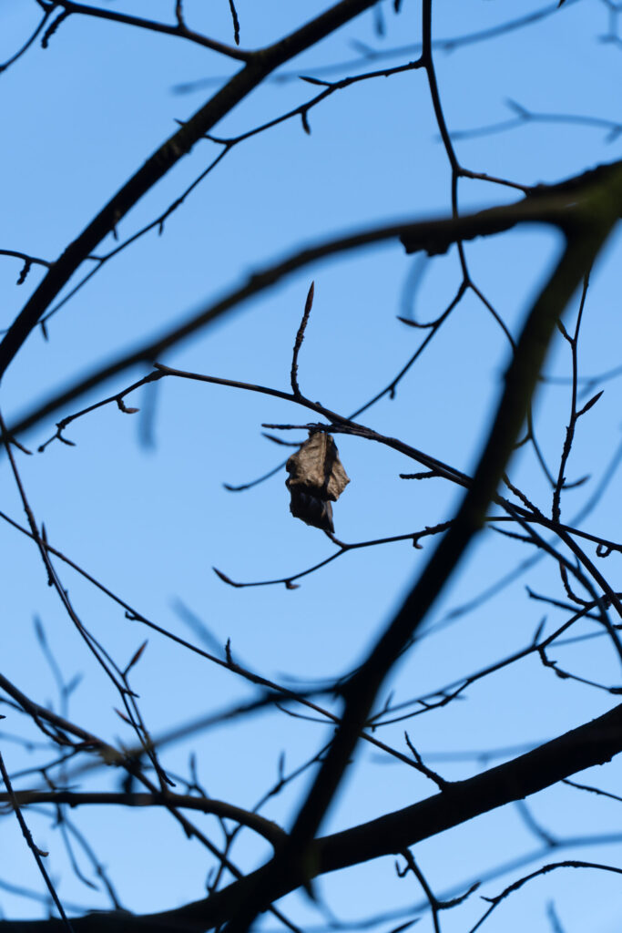
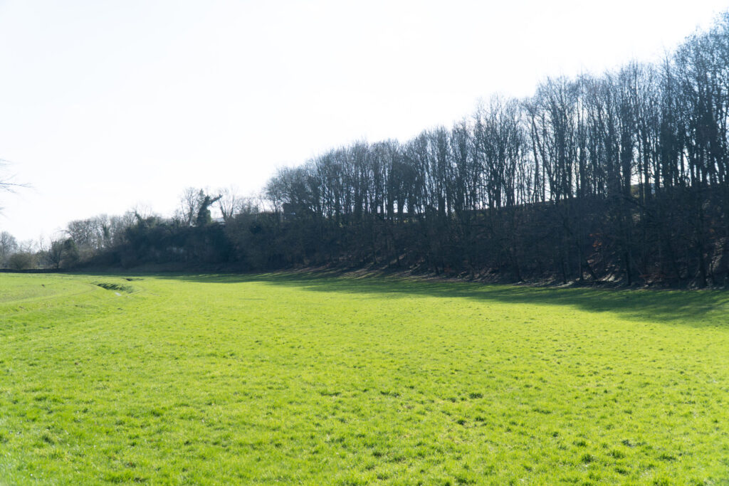
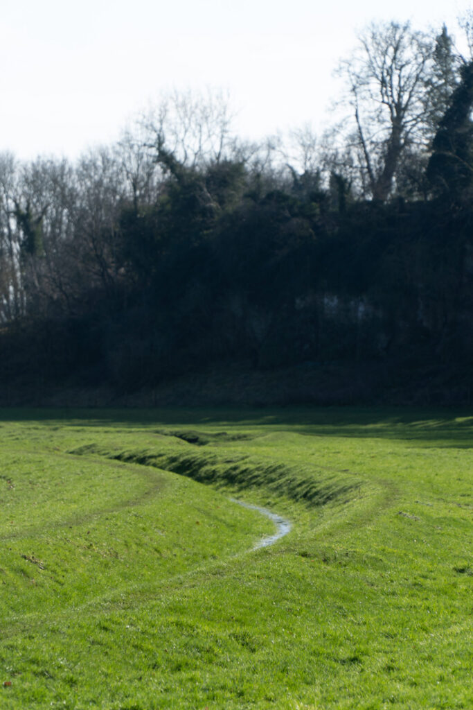
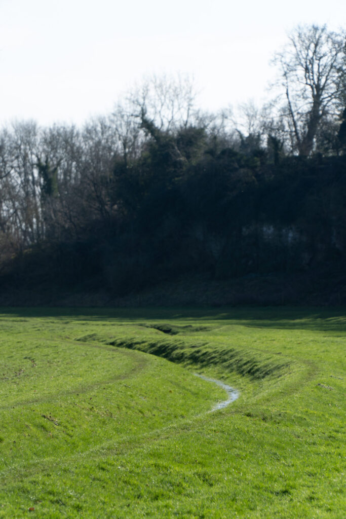
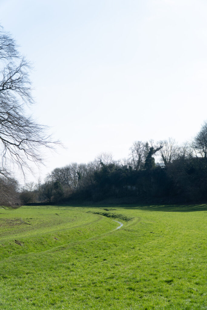
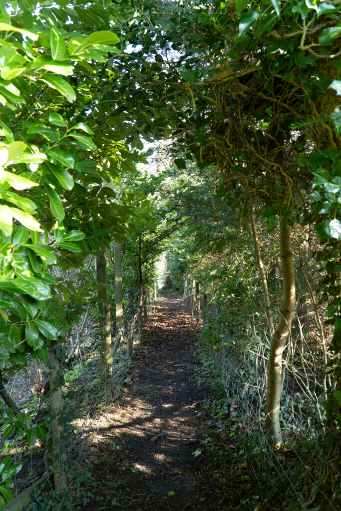
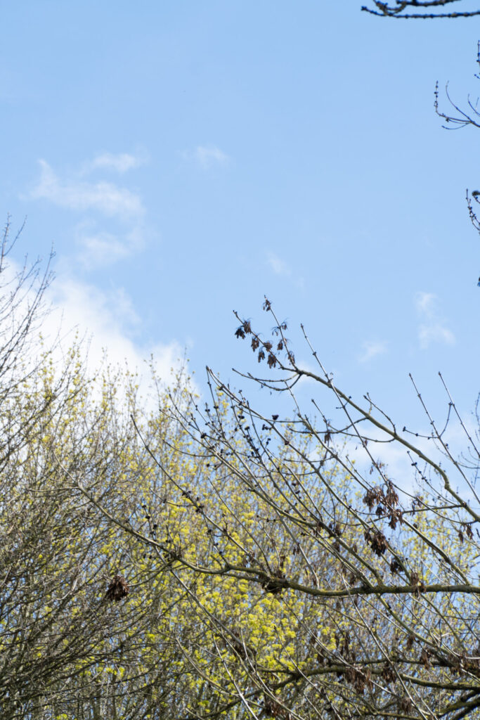
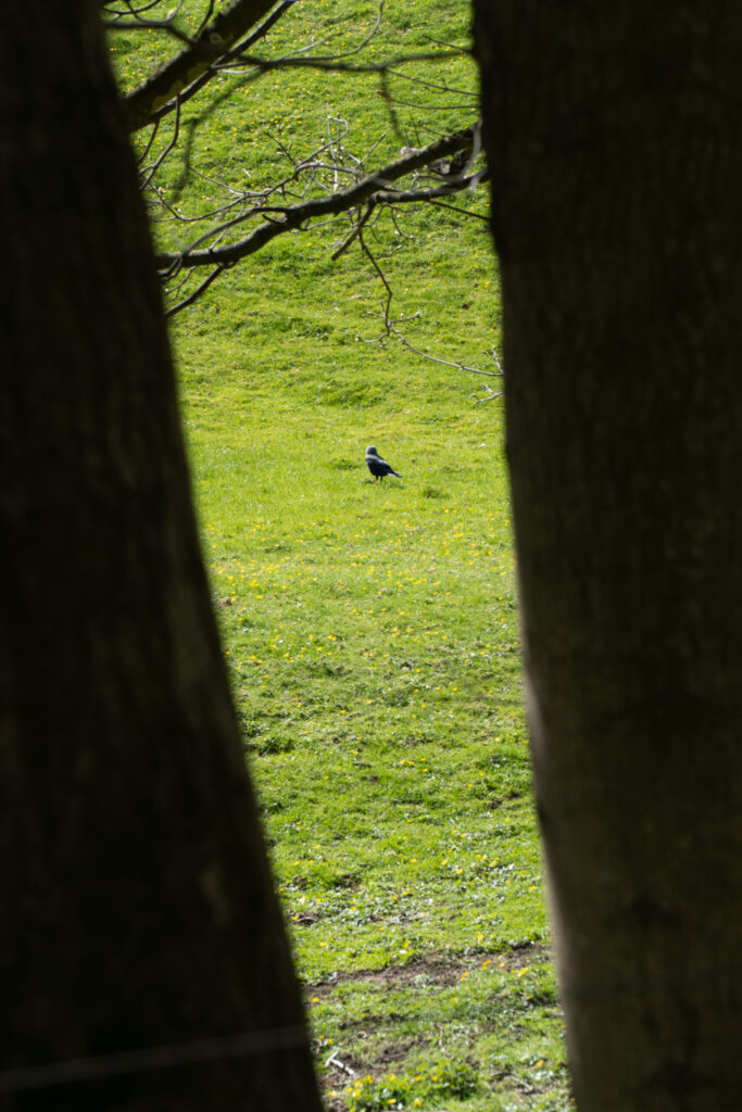
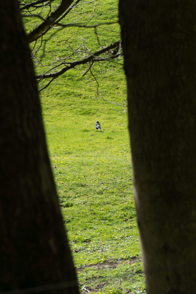
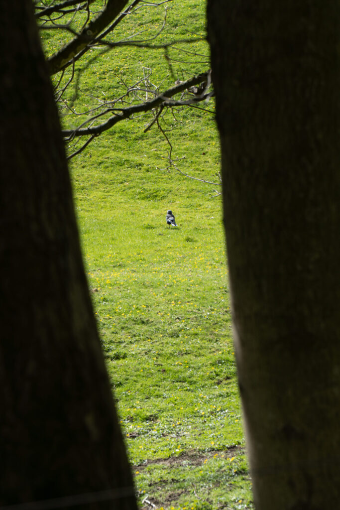
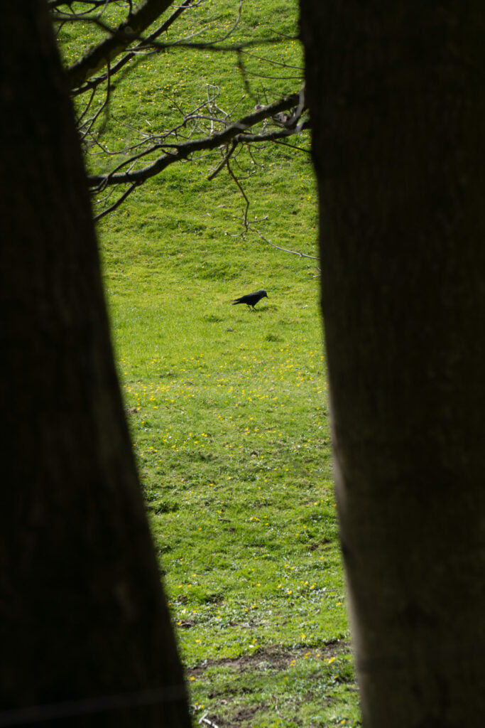
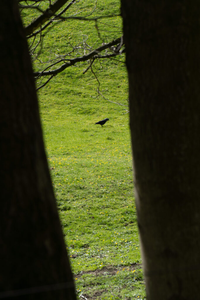
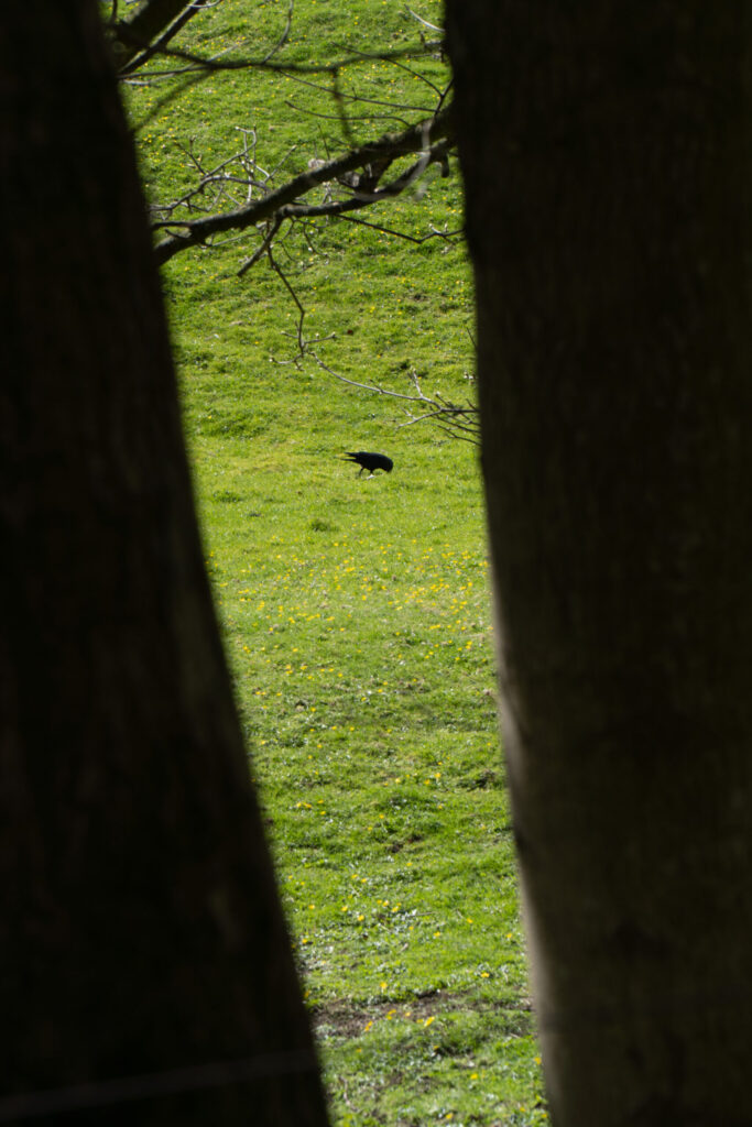
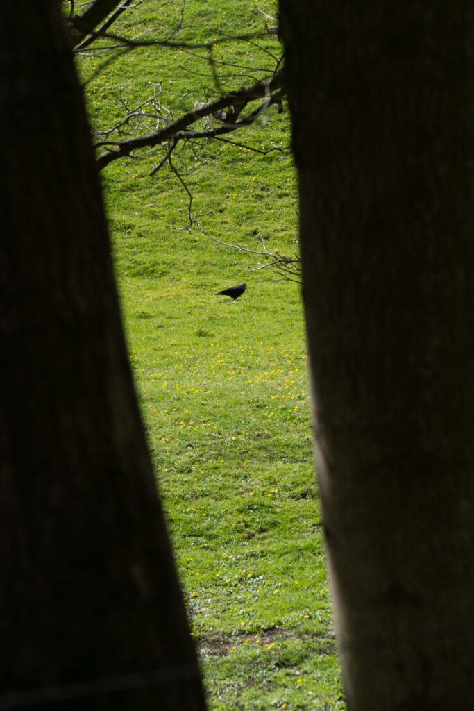
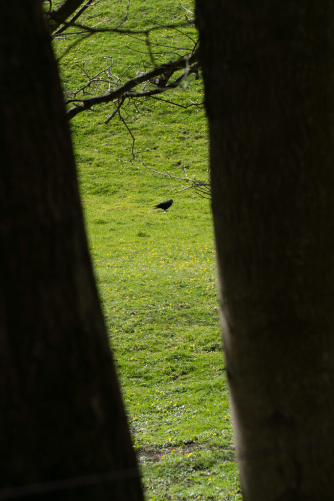
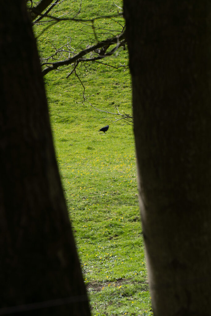
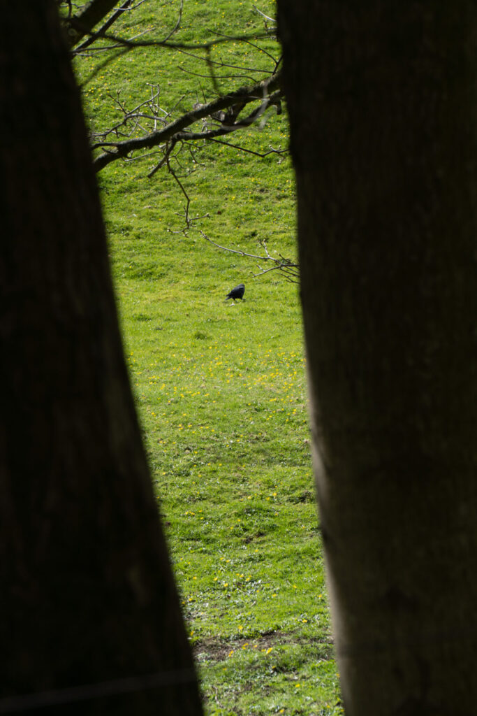
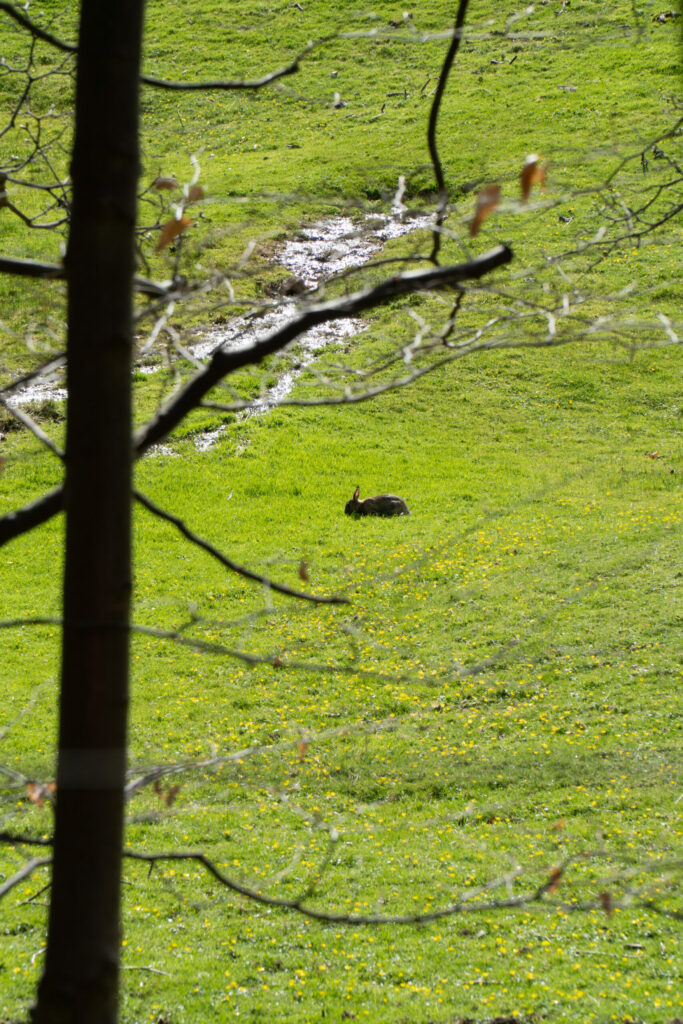
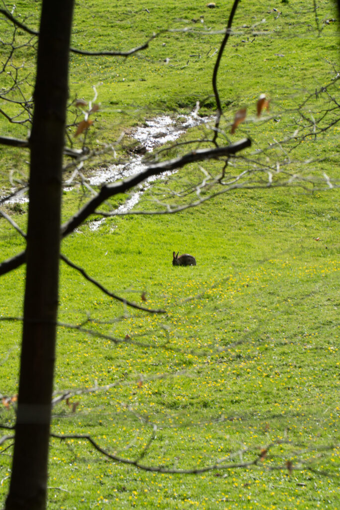
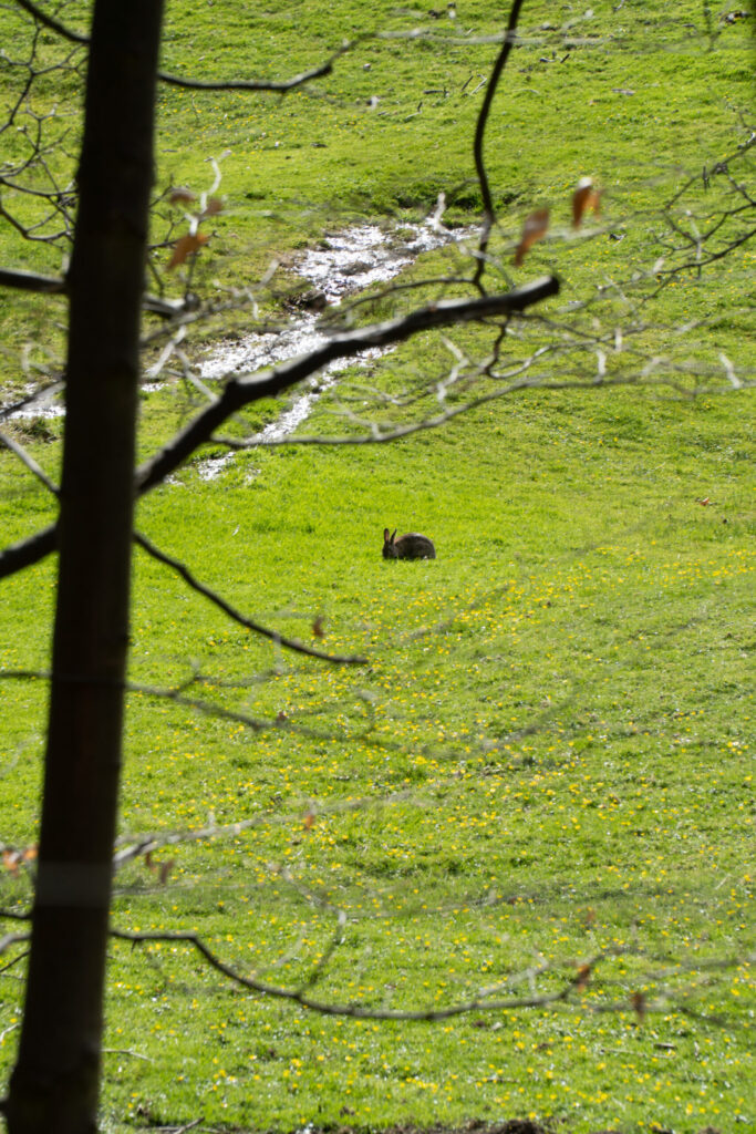
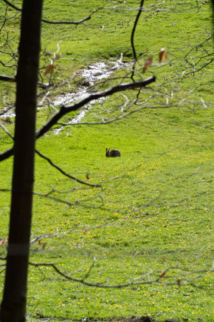
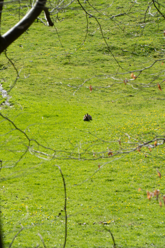
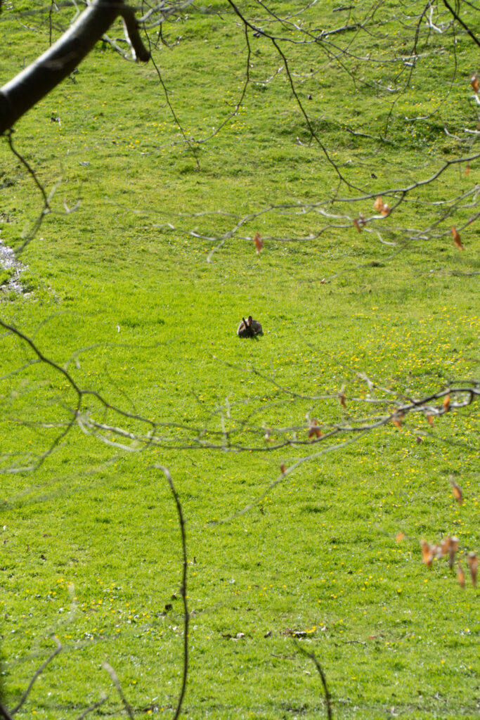
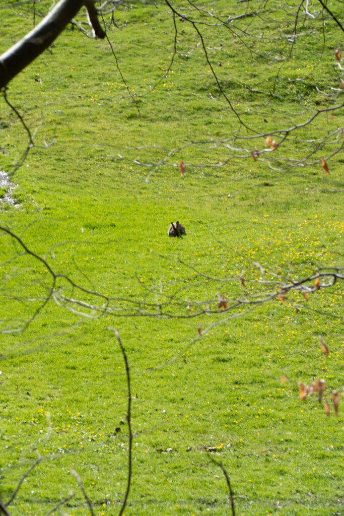
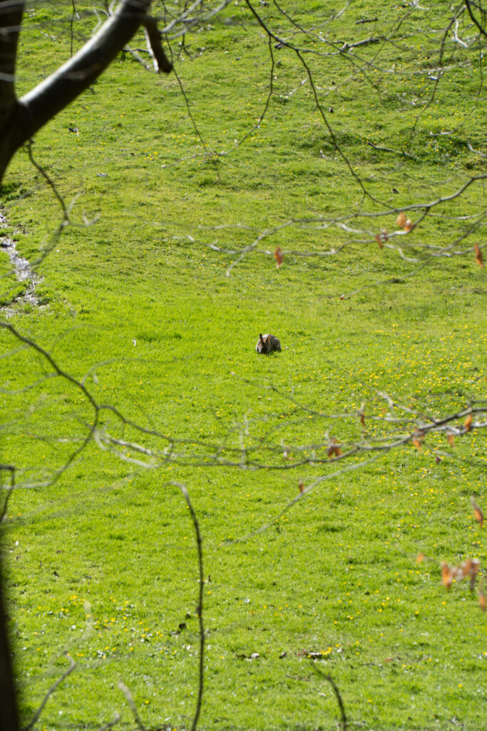
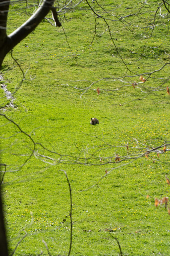
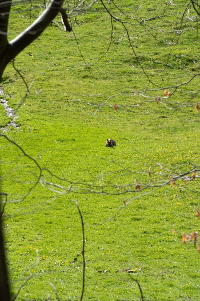
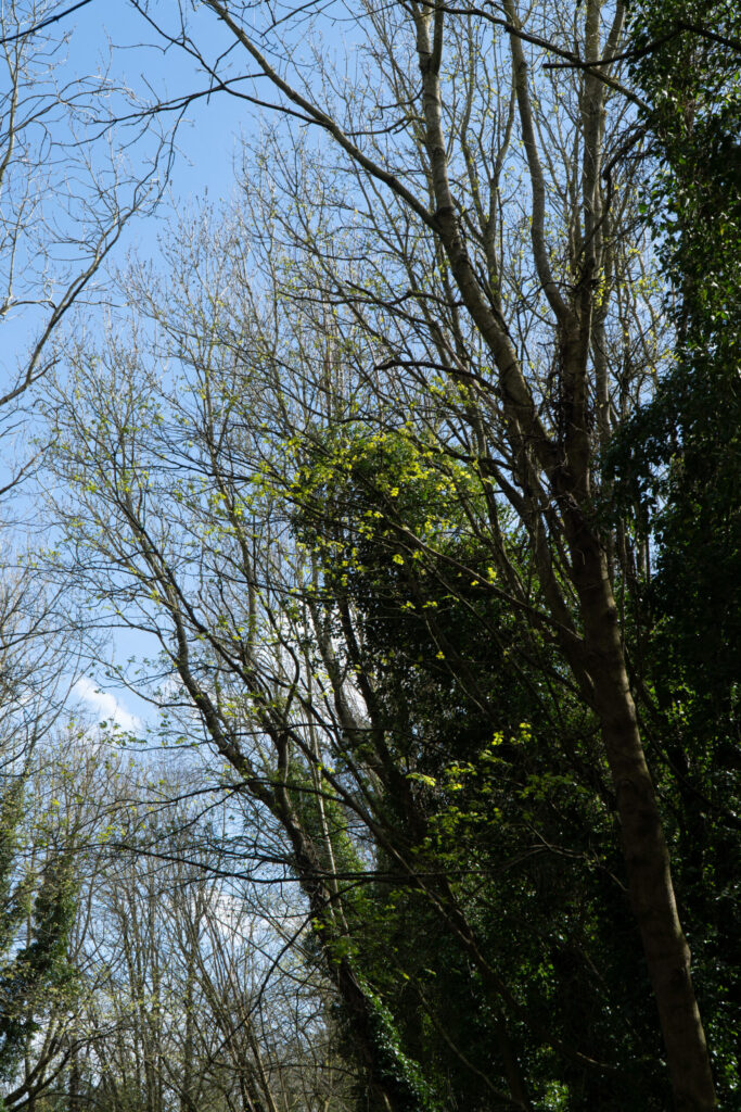
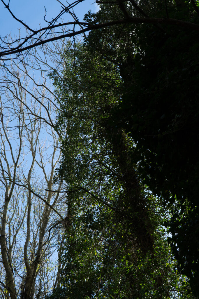
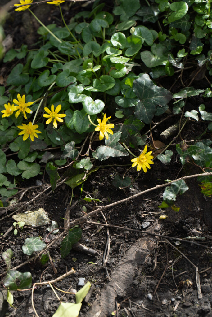
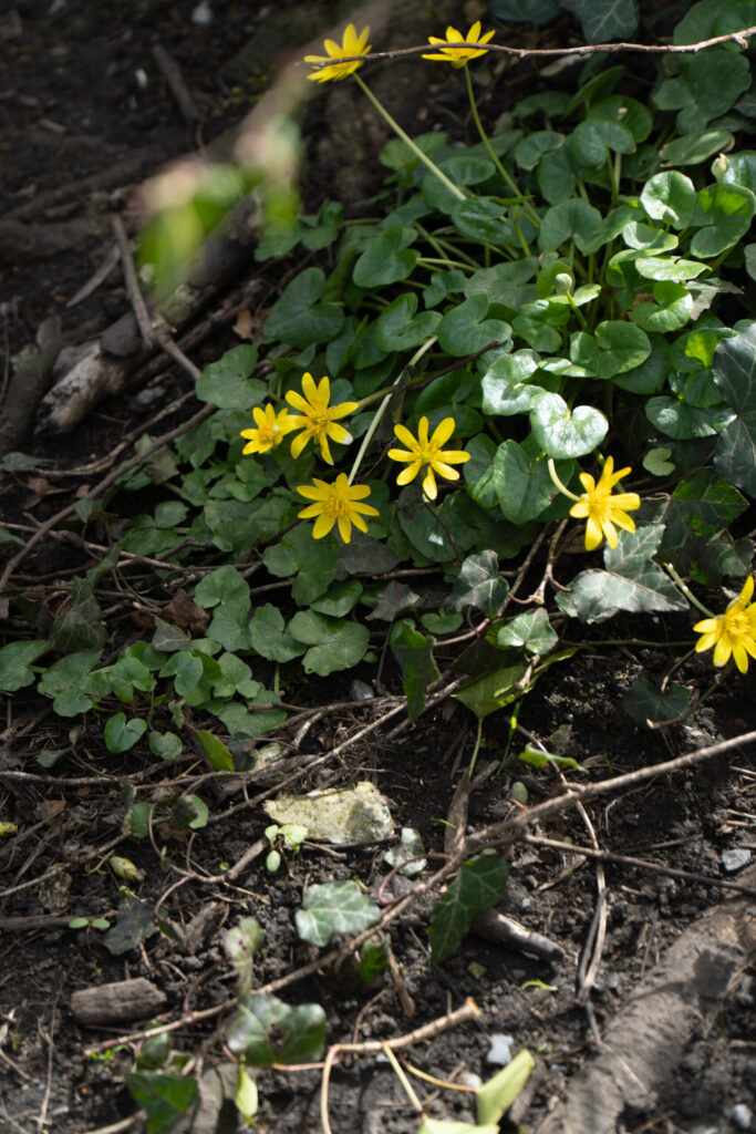
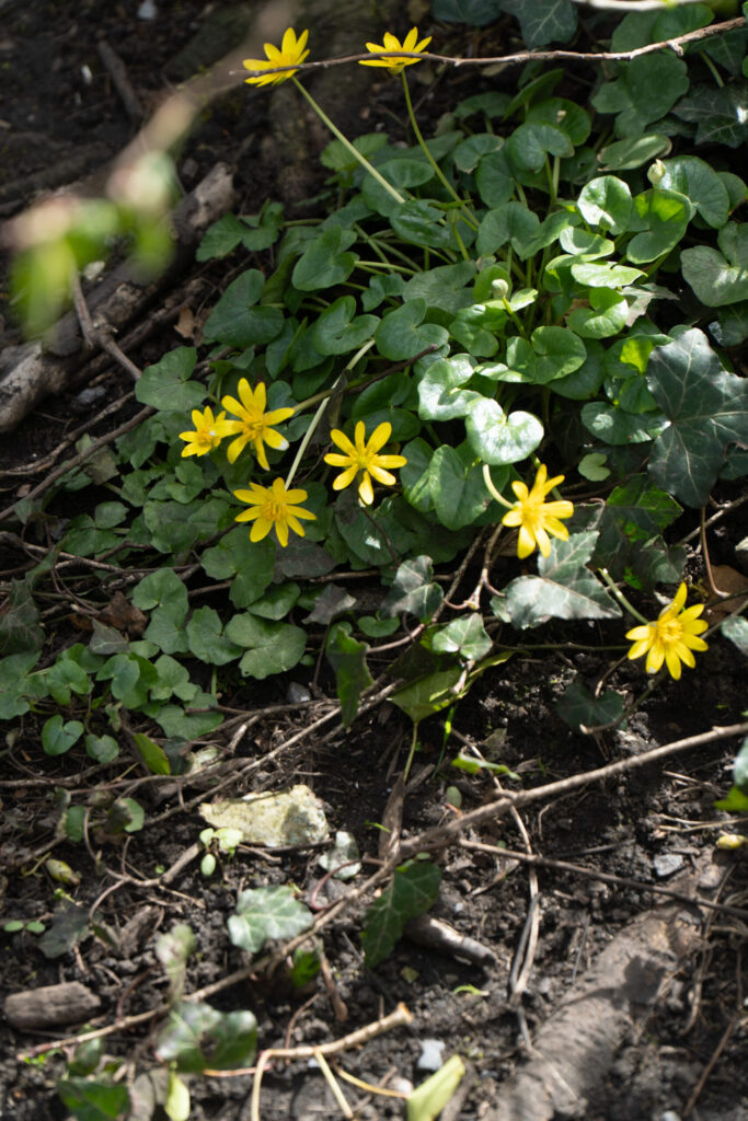
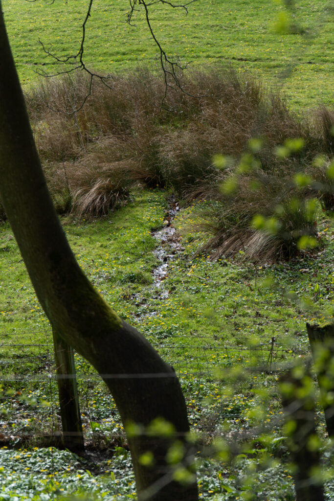
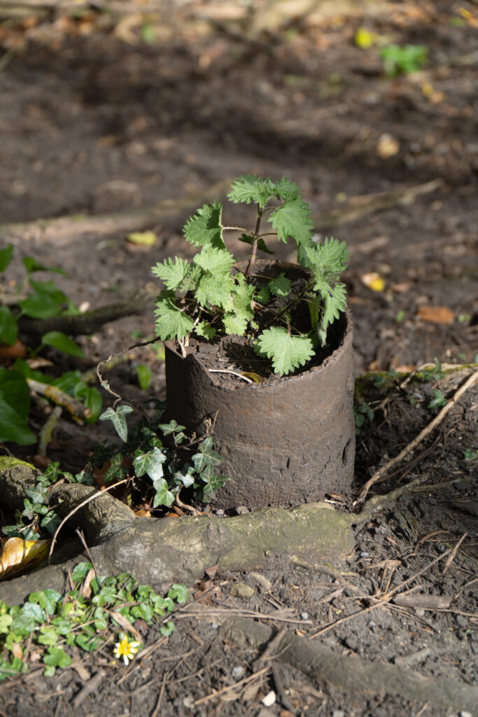
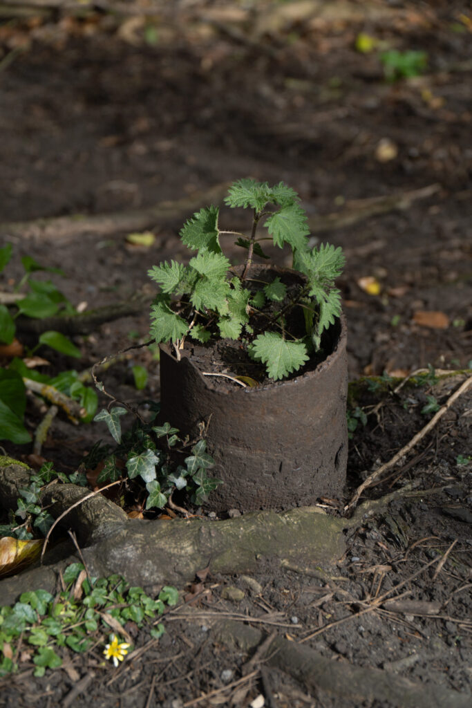
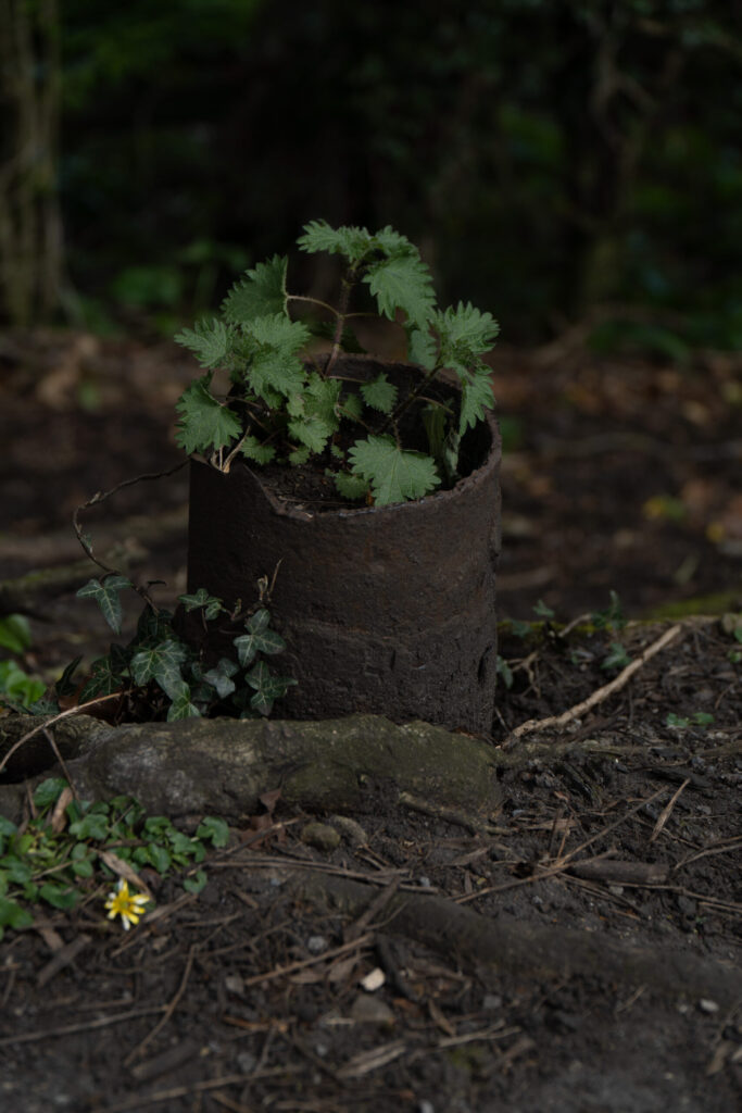
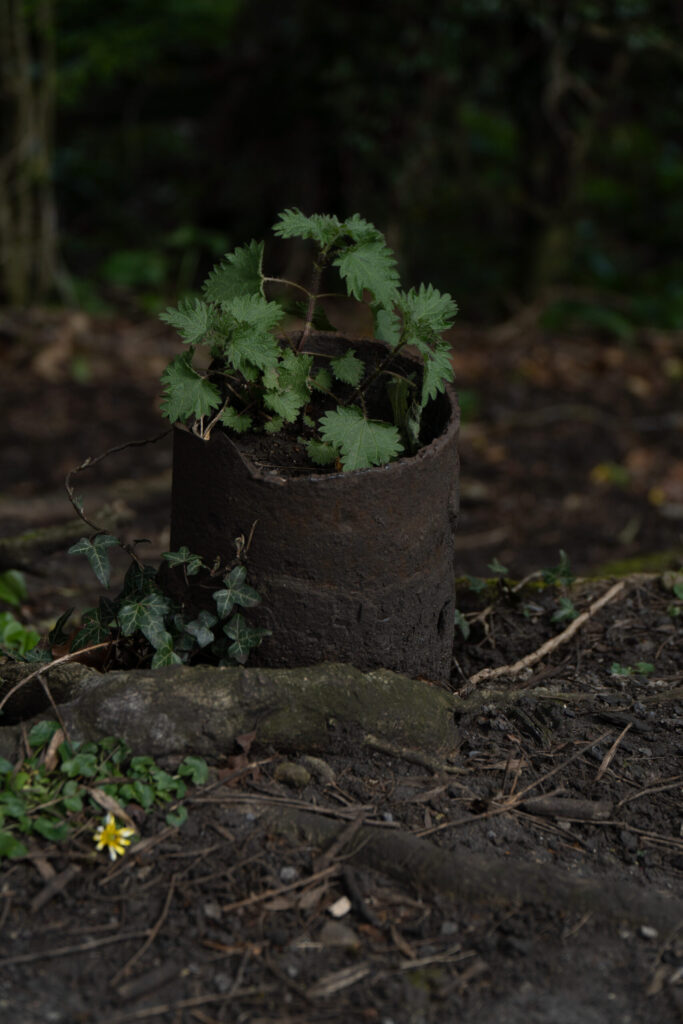
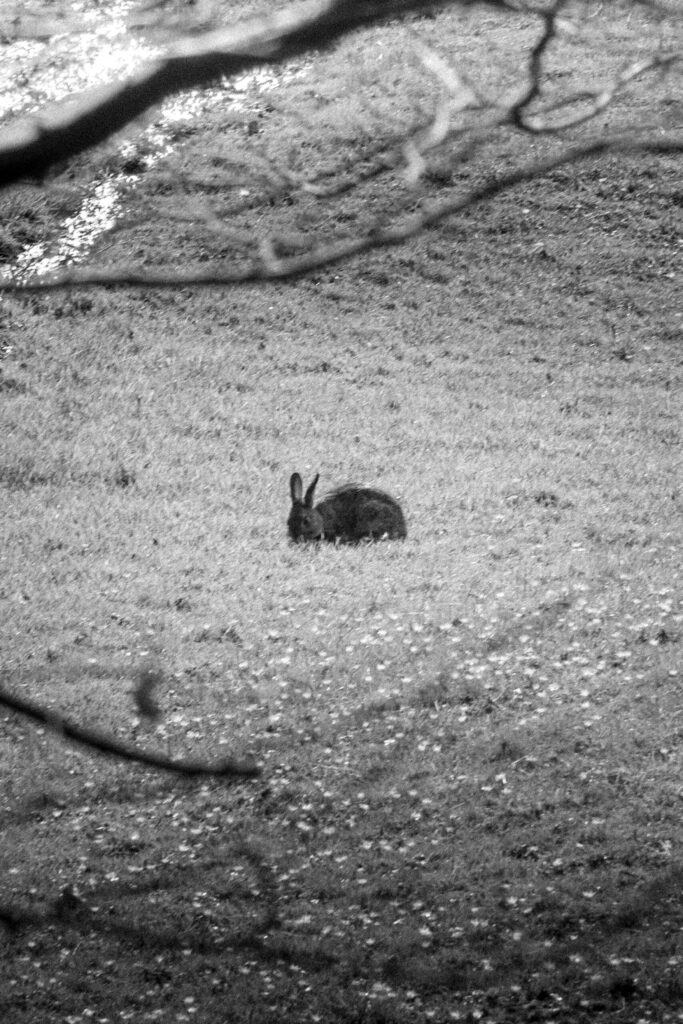
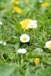
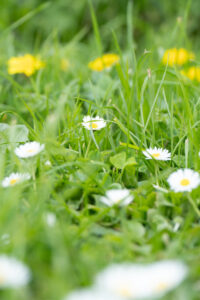
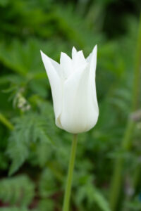
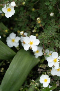
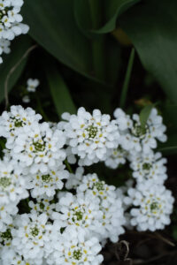
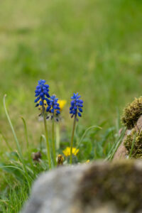
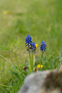
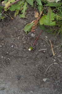
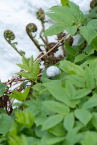
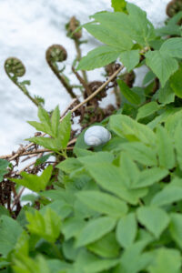
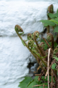
Shoot 1 – Spring is coming
For this shoot I wanted to focus on the idea of everything coming back to life after the winter and autumn months. To do this I wanted to focus on everything beginning to turn green again, brown leaves rotting away and animals coming back out to play.
View Full Shoot

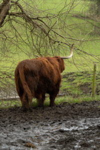
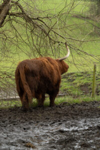

Lightroom Enhanced Edited Selection
In these edits I focused mostly on making the colours feel life like and help place the viewer into the frame.
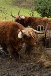
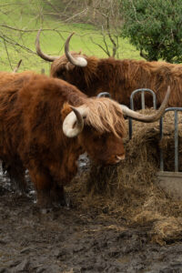
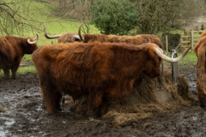
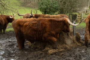
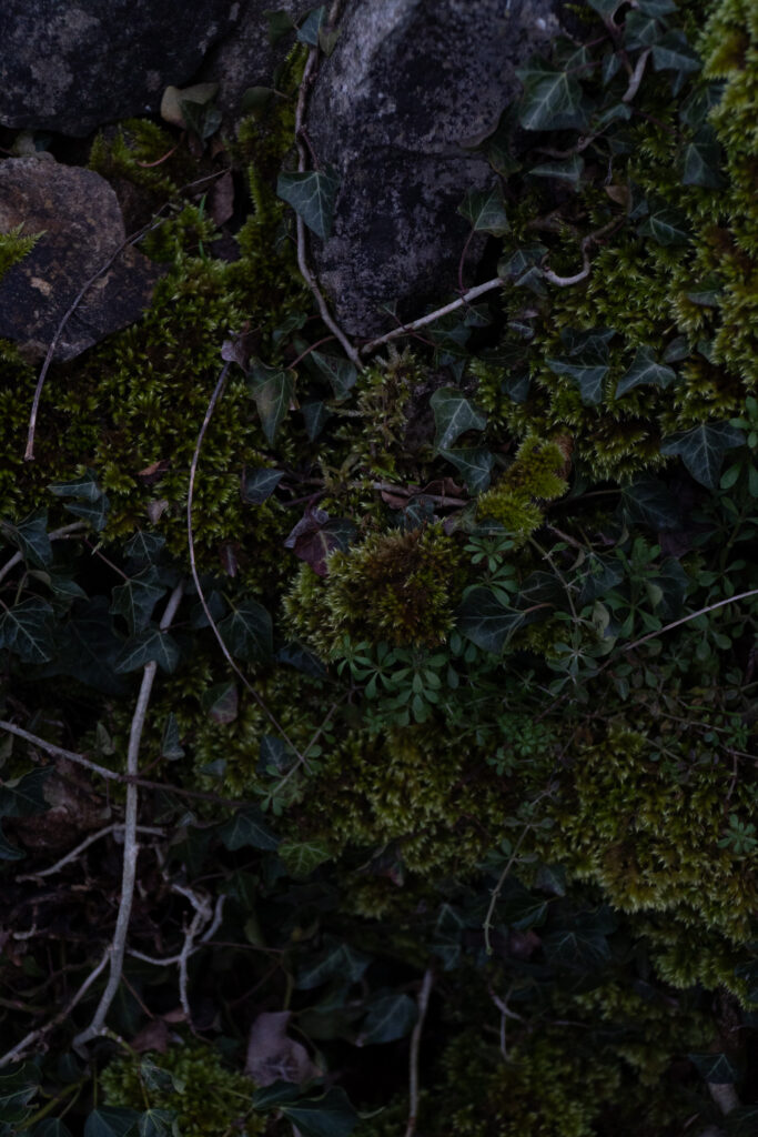
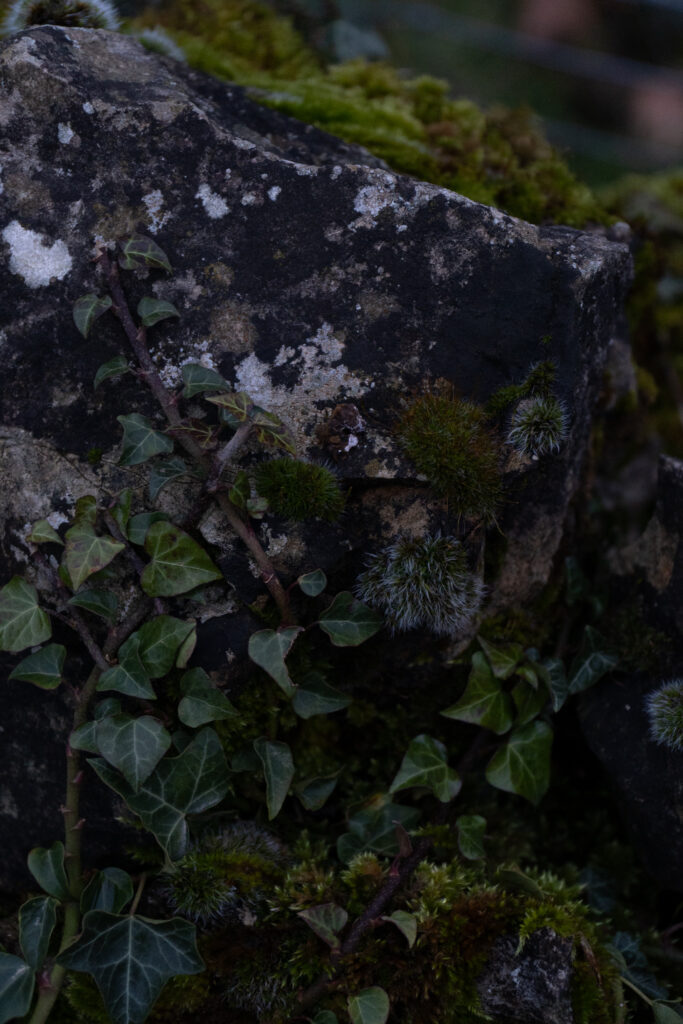
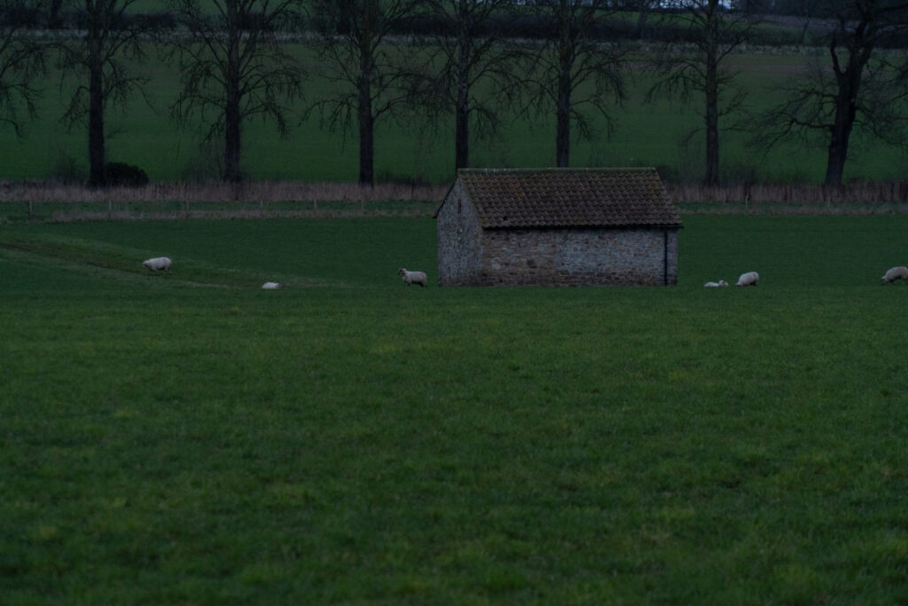
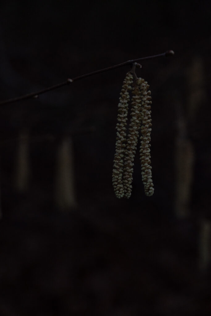
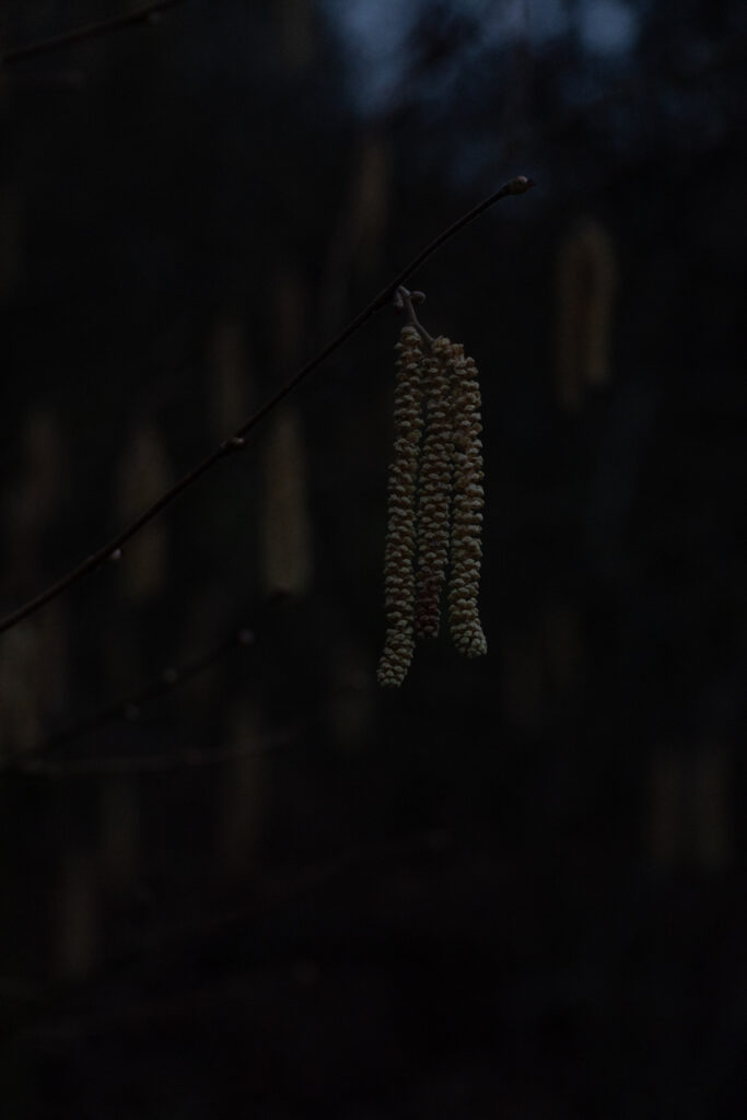
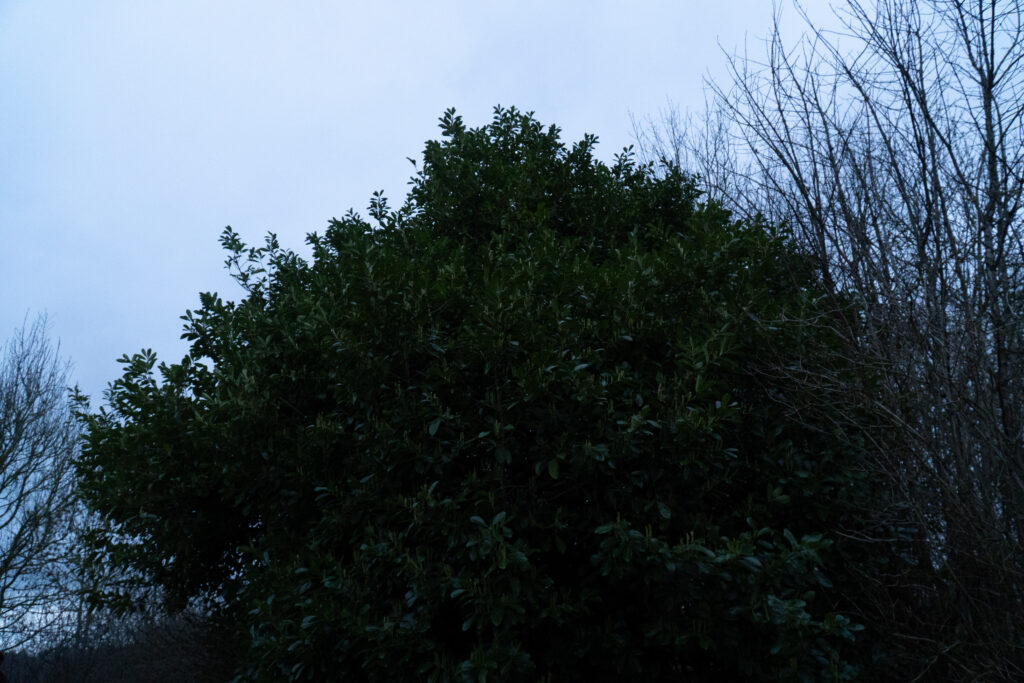
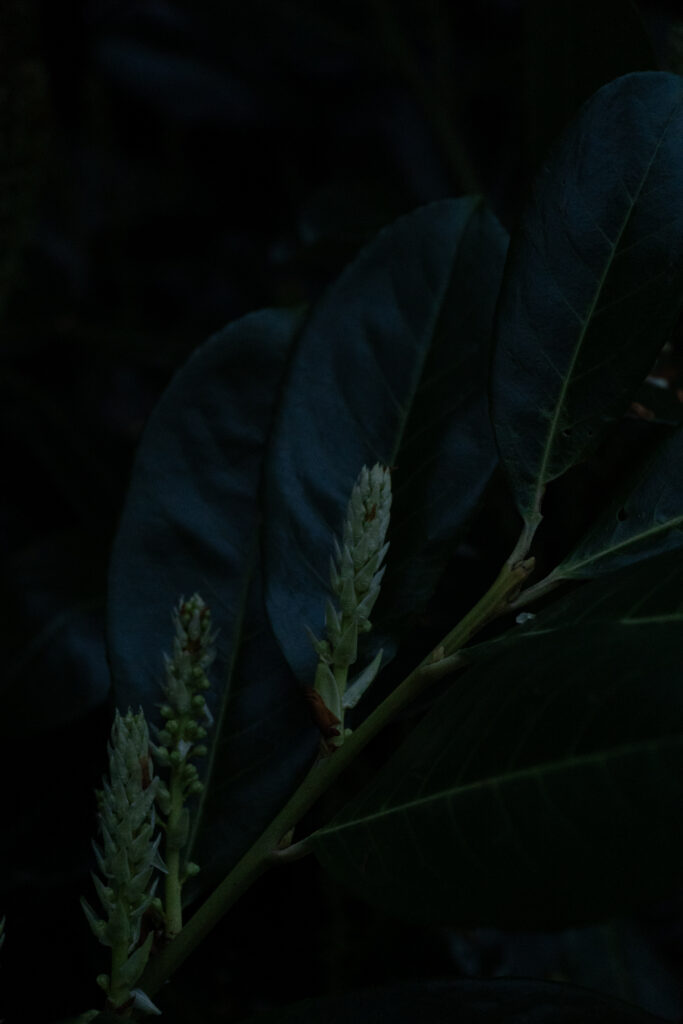
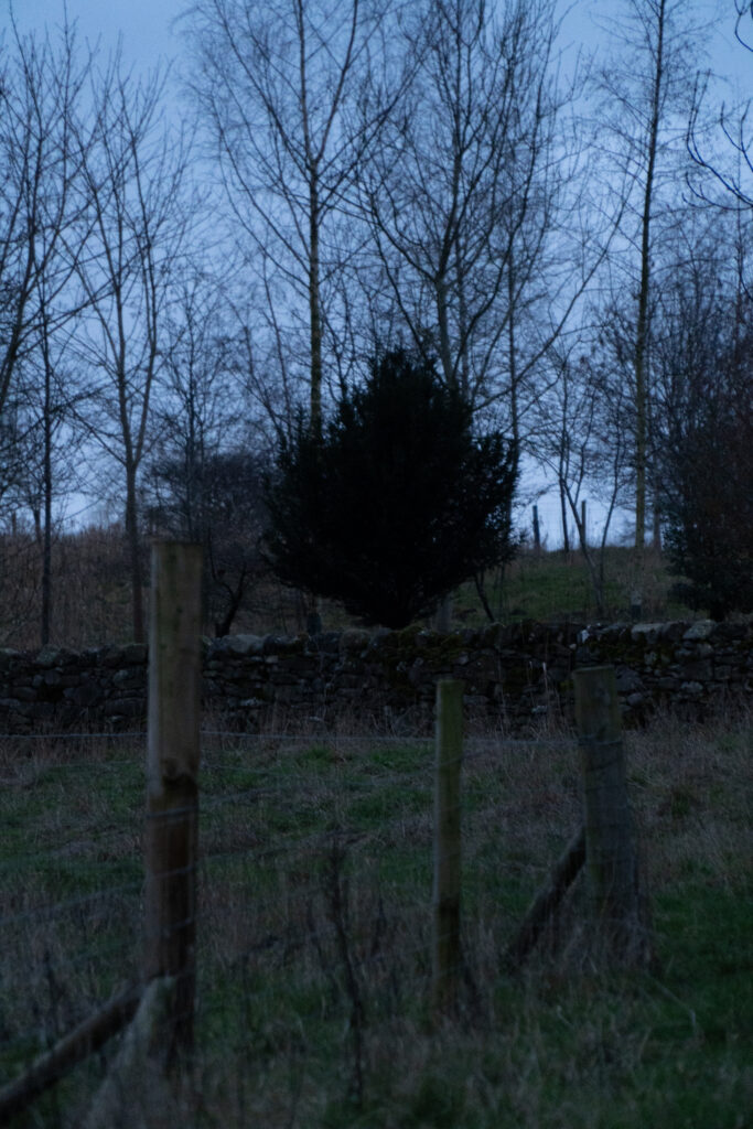
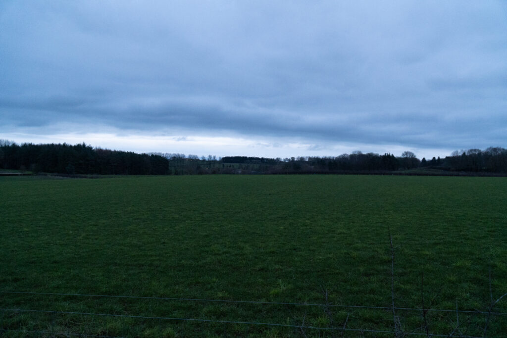
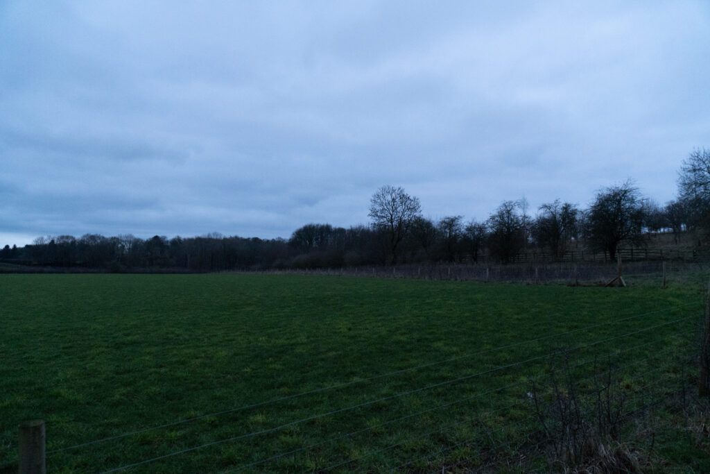
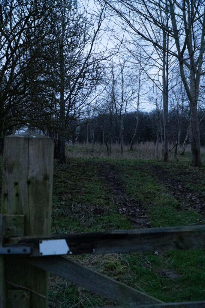
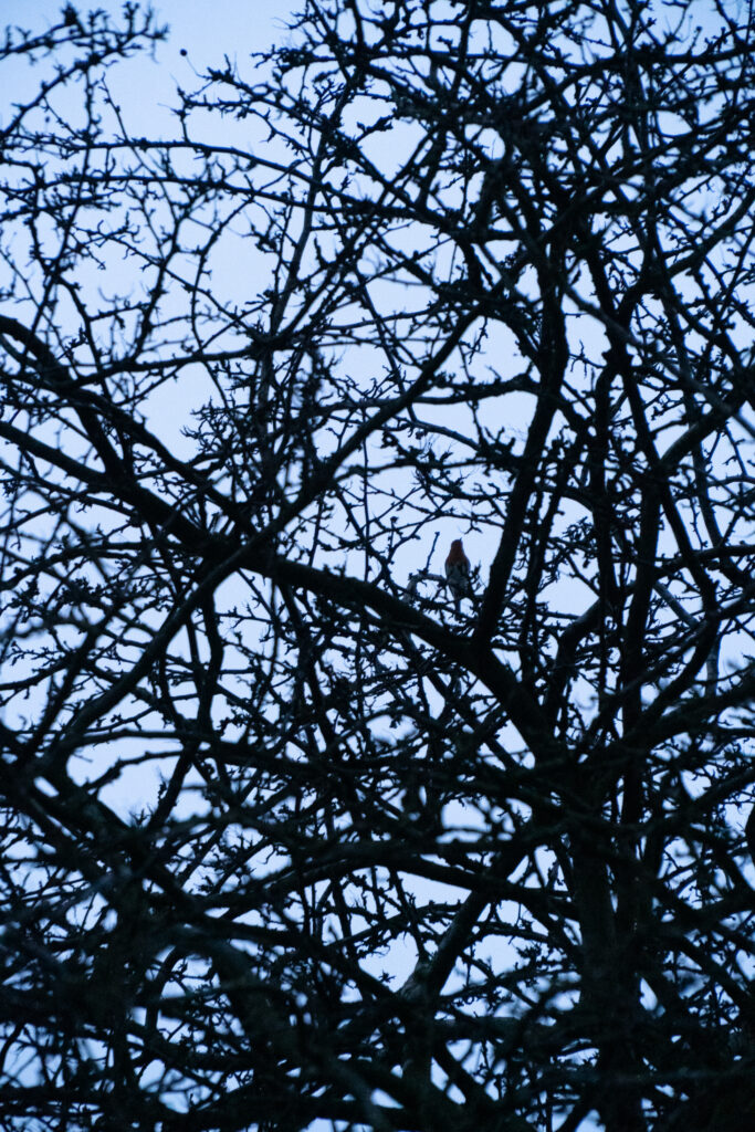
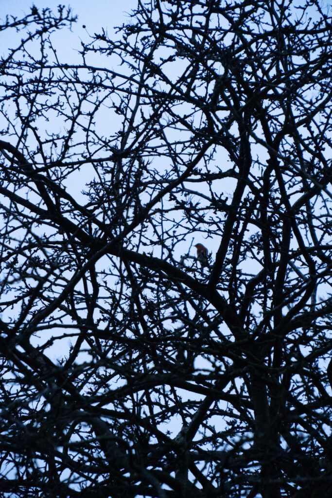
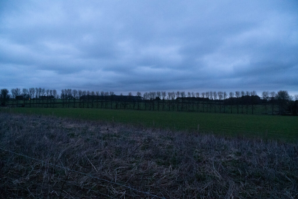
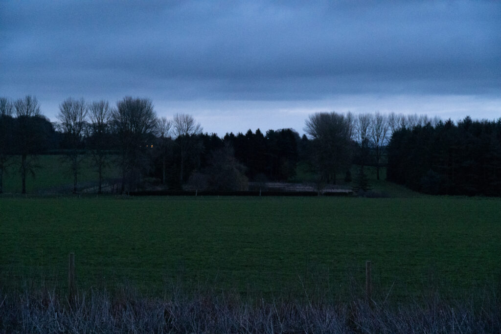
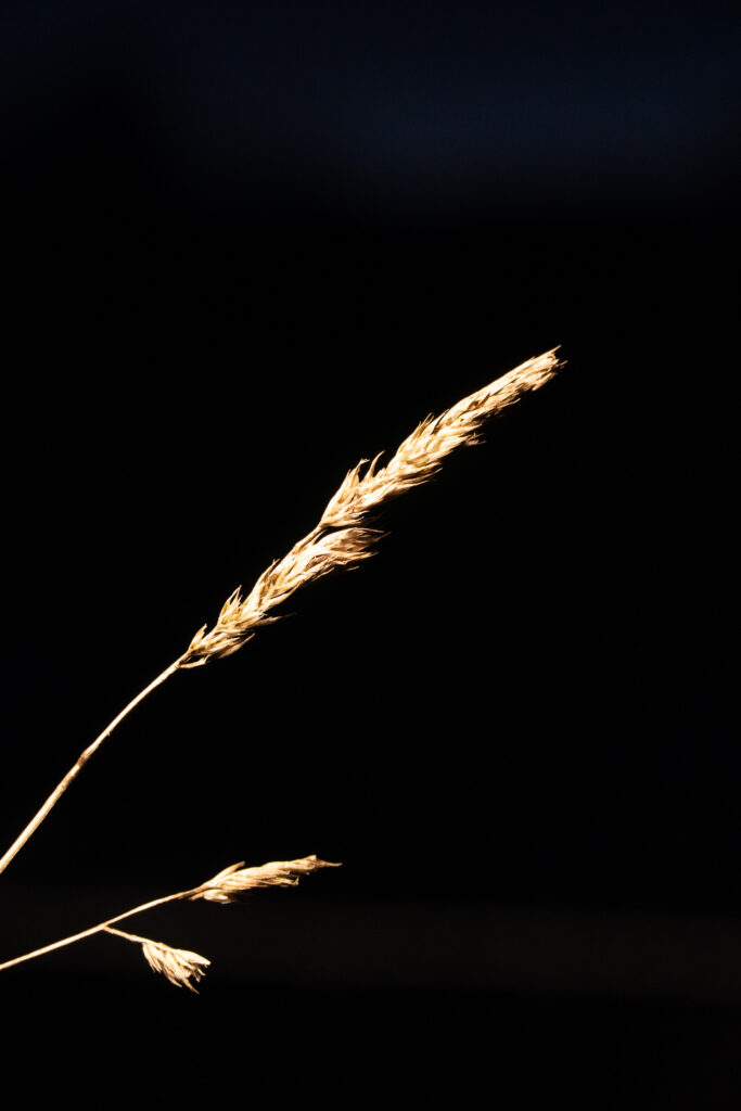
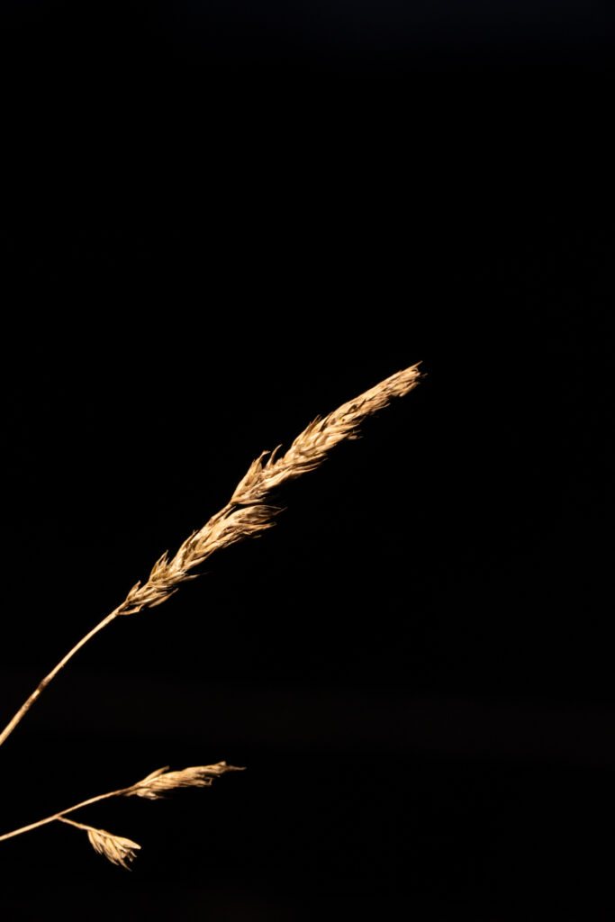
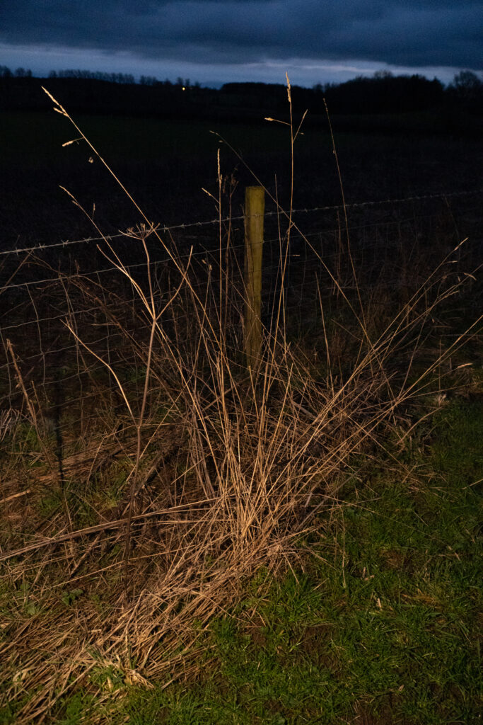
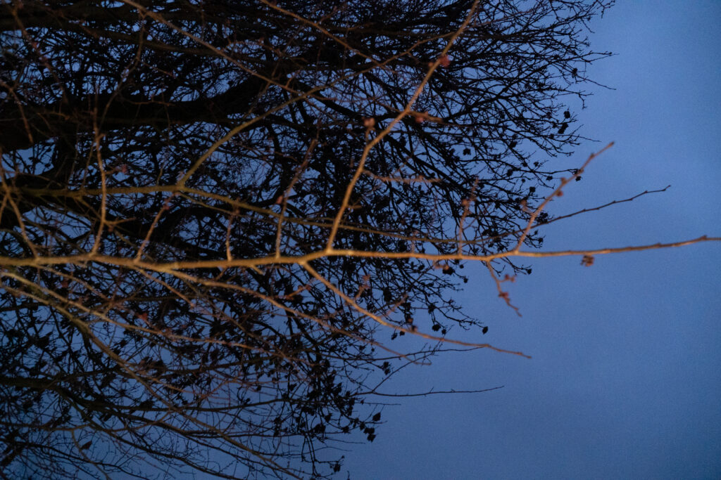
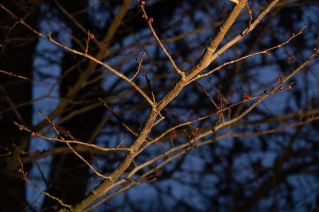
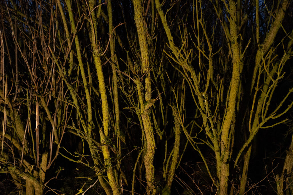
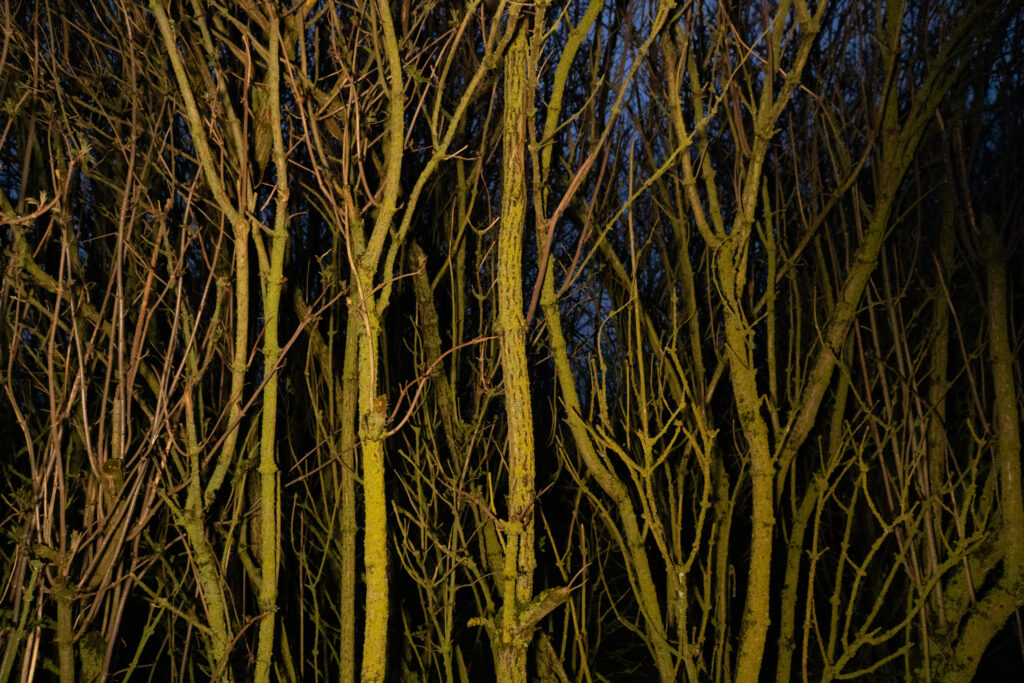
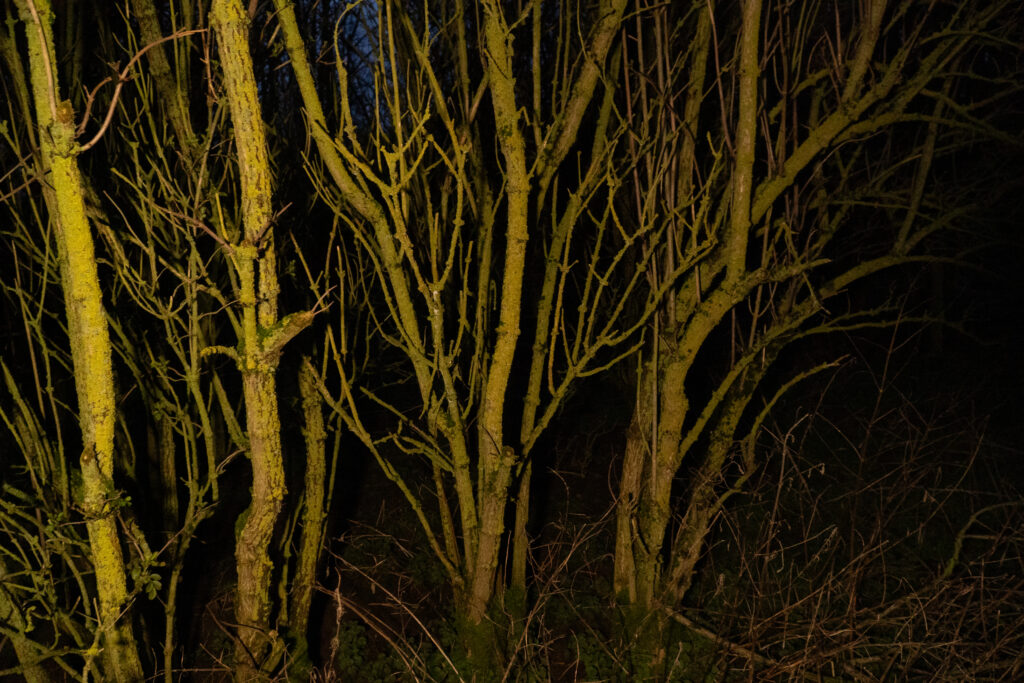
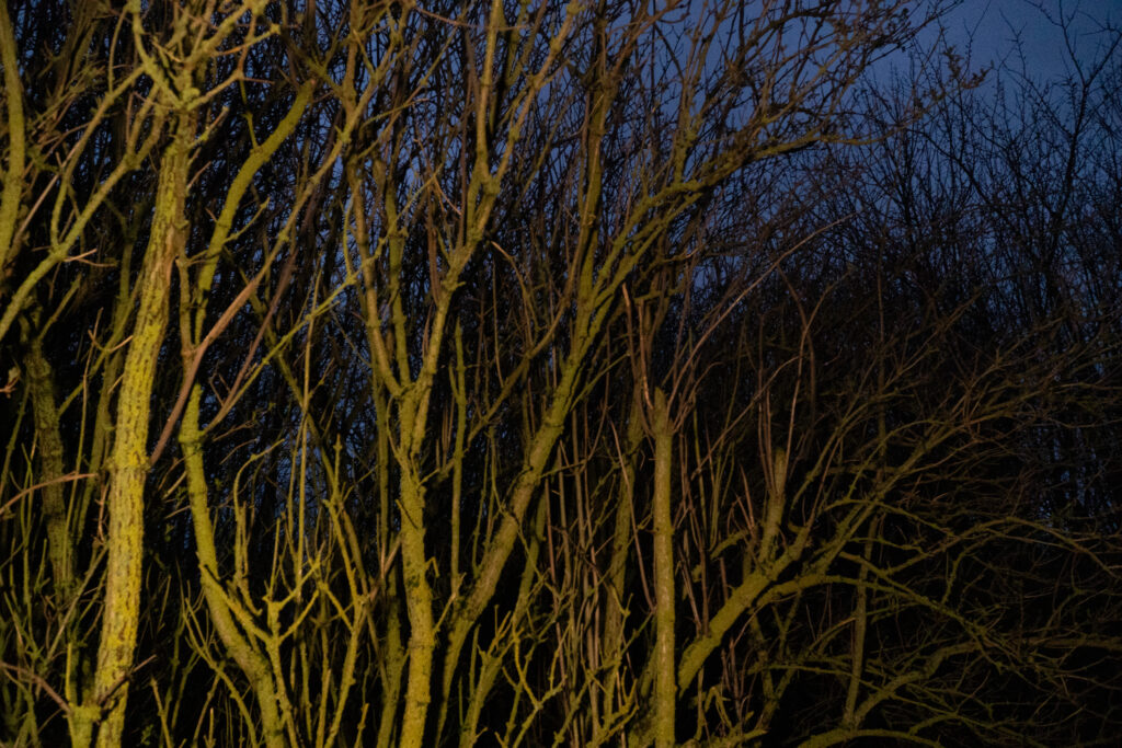
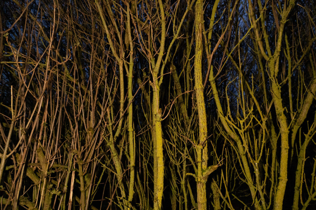
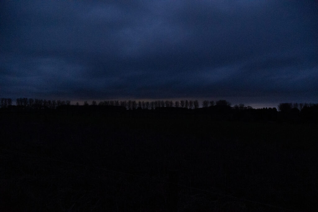
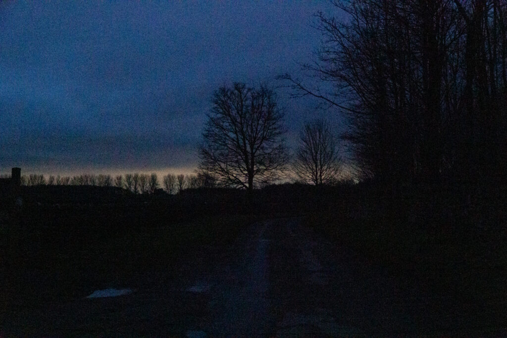
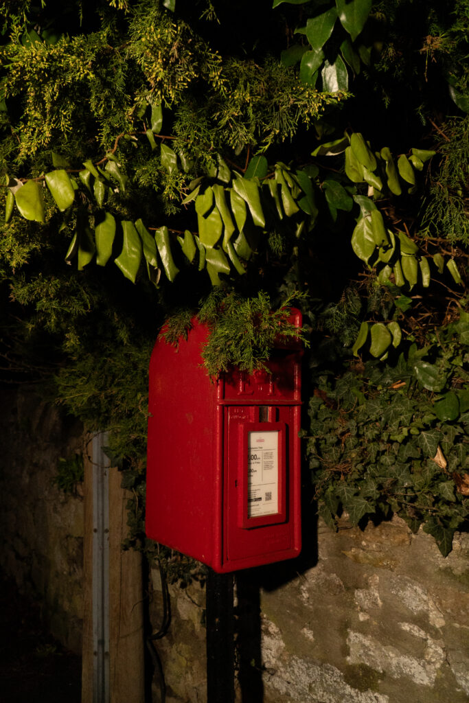
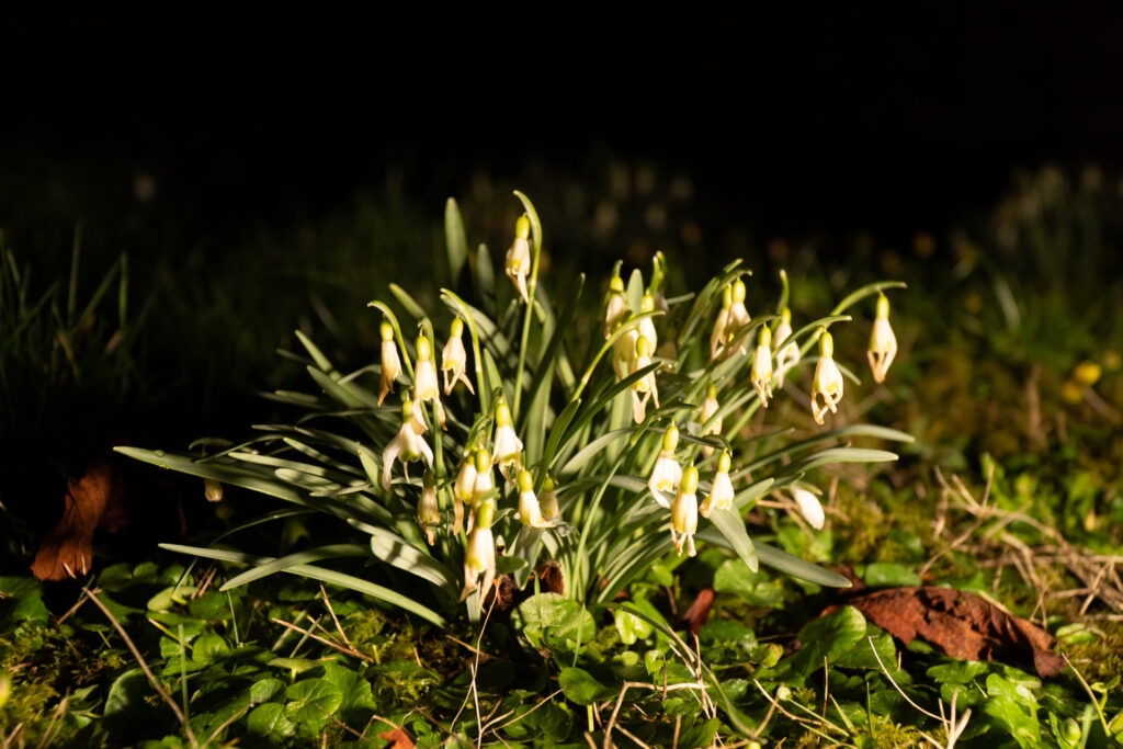
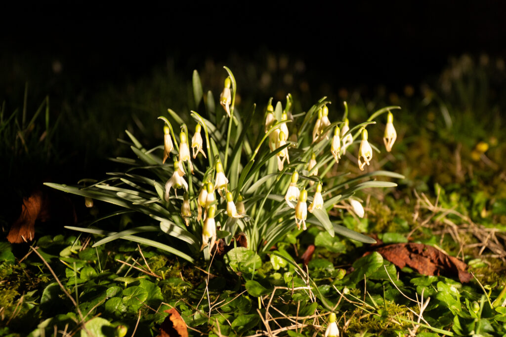
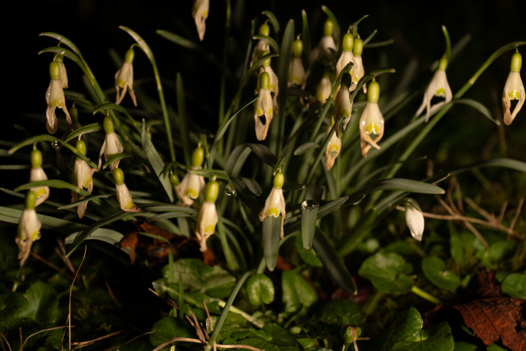
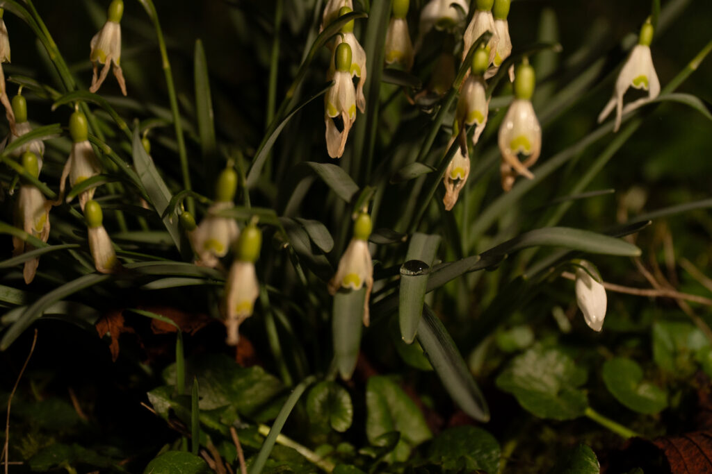
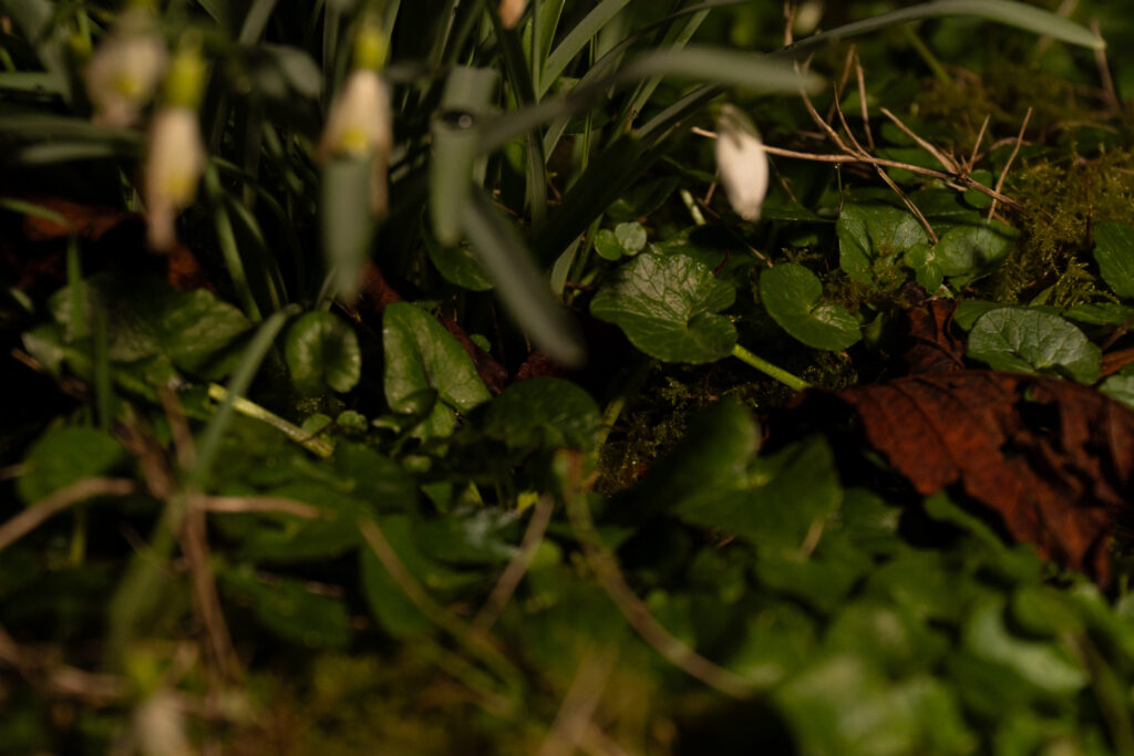
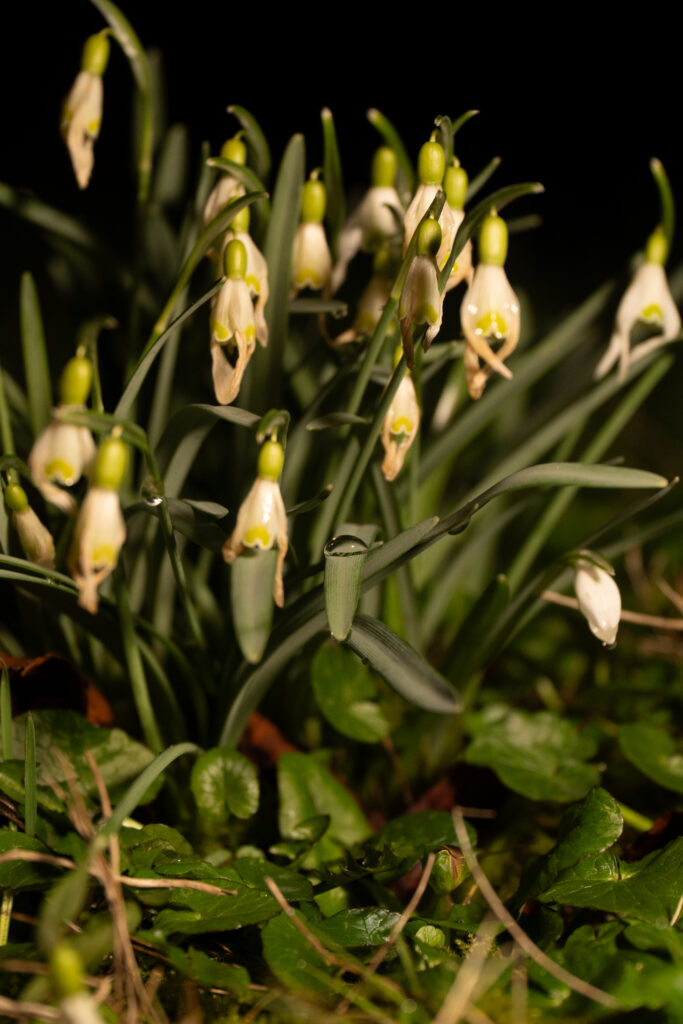
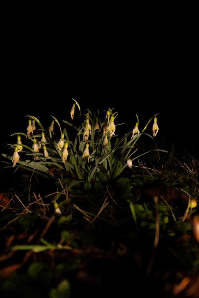
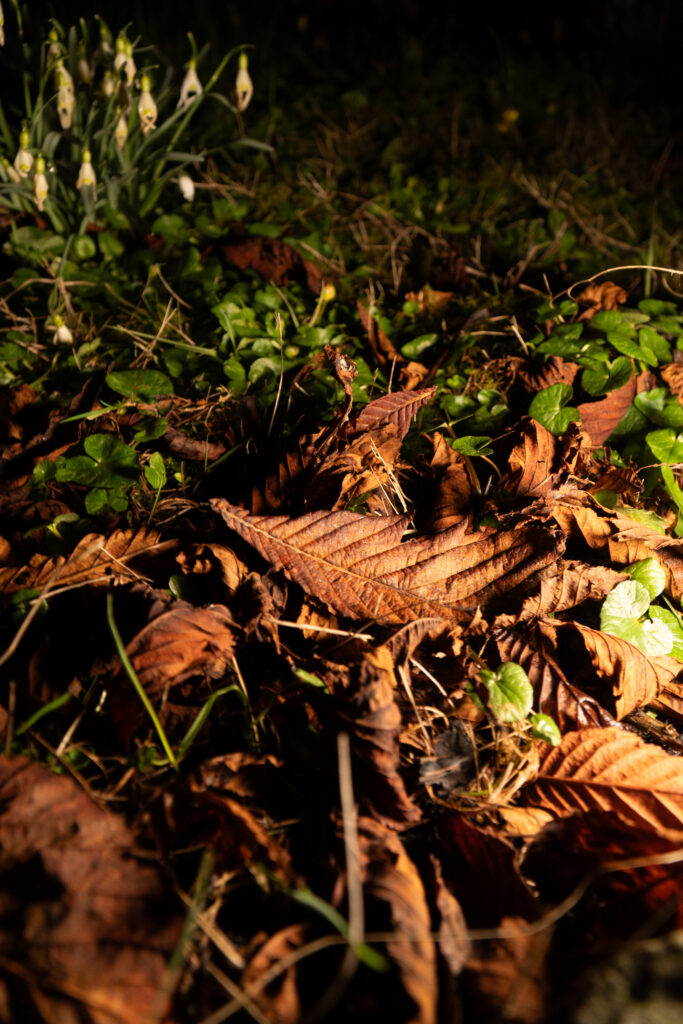
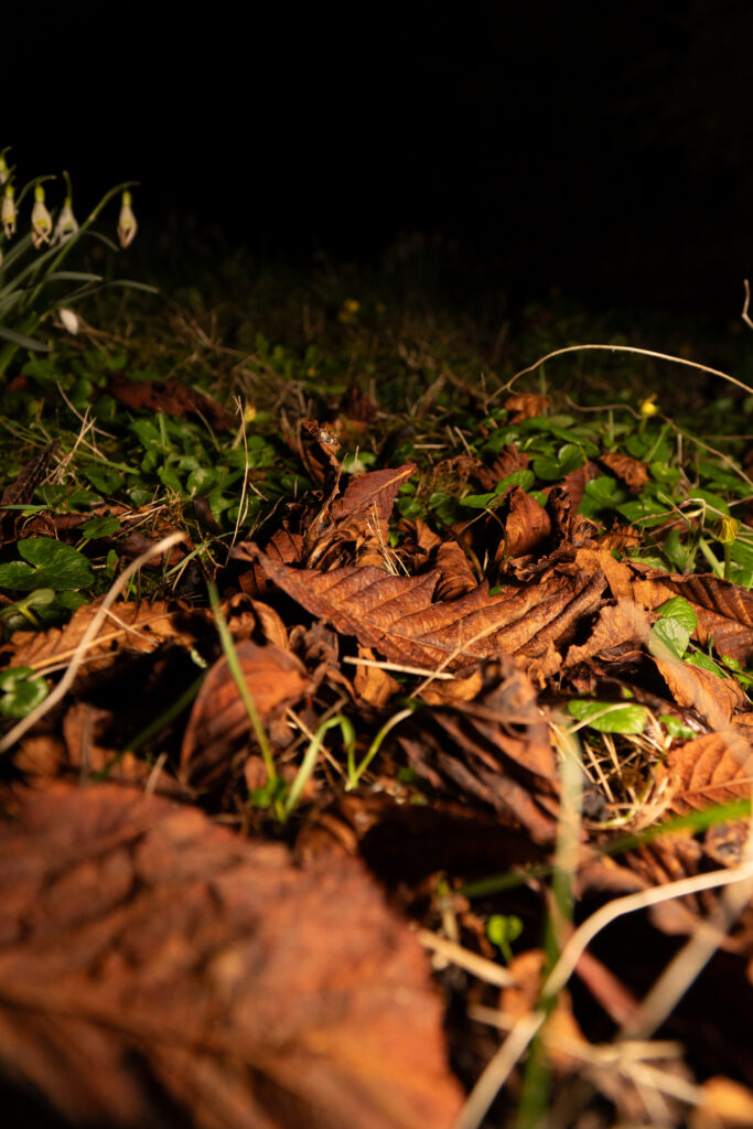
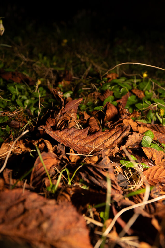
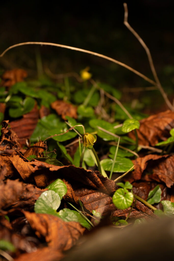
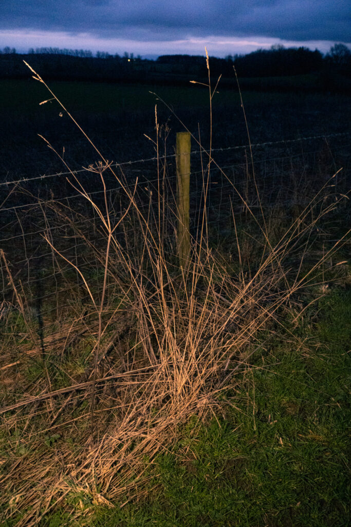
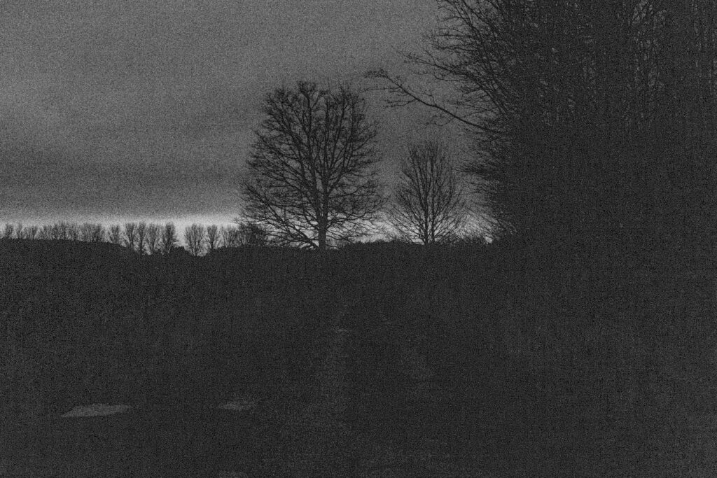
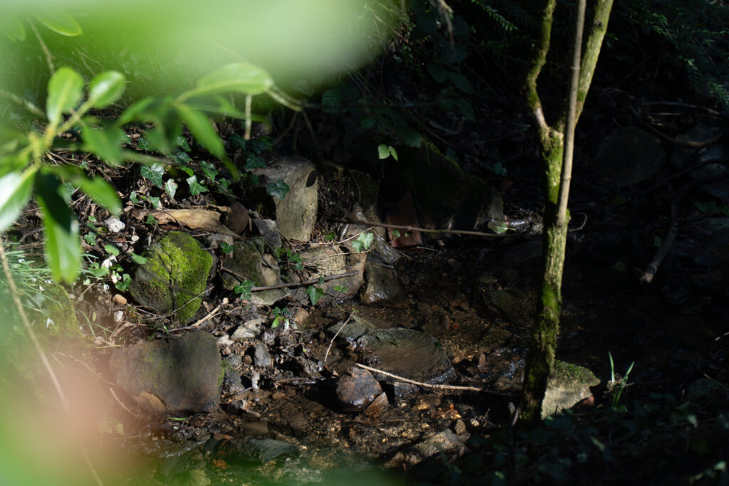
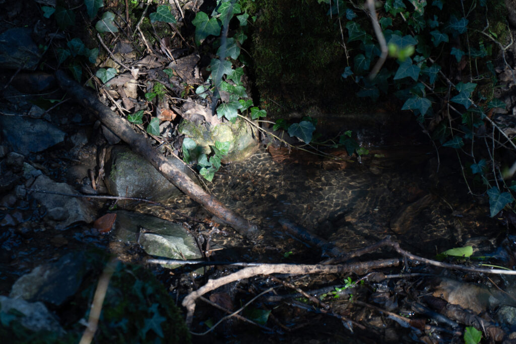
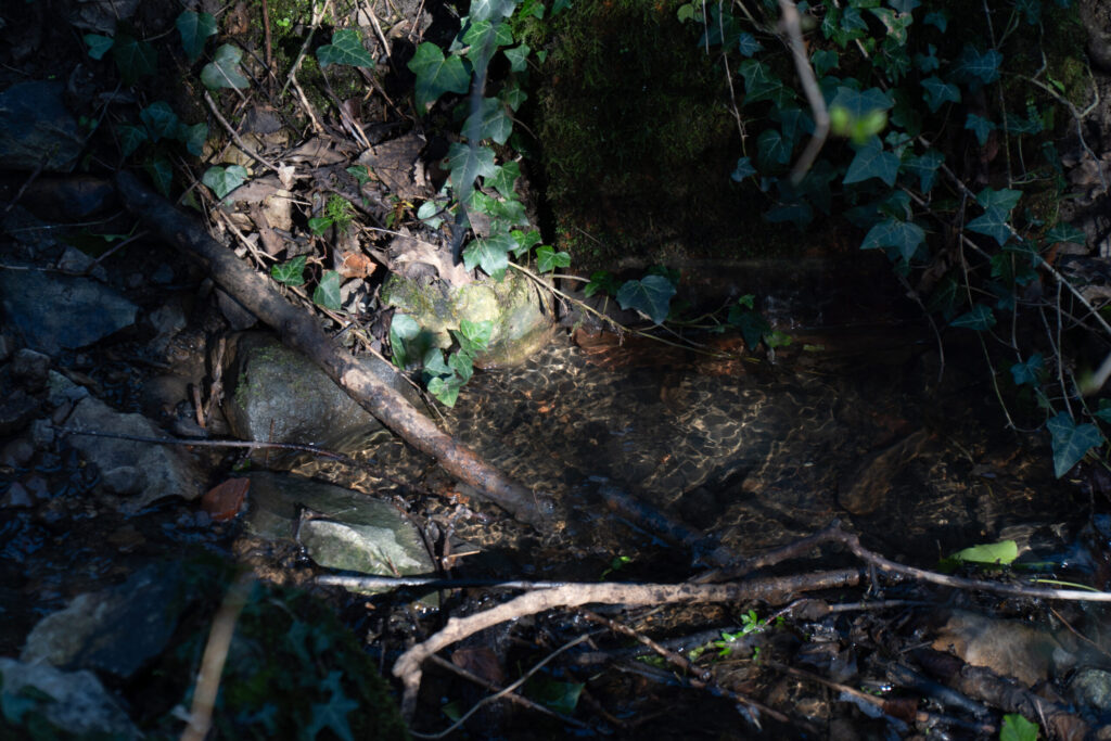
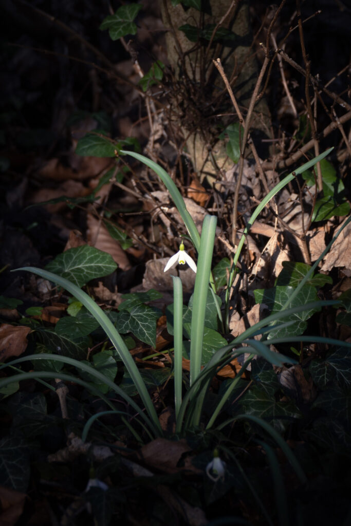
Shoot 2 – Sun down
For this shoot I went out from blue hour into darkness. I wanted to try and make more use of artificial light, so for this shoot I used a small panel light. This would allow me to generally light up subjects with a soft glow, to create a focus on them and seperate them from the background.
View Full Shoot

Lightroom Enhanced Edited Selection
These edits were minimal as I wanted to keep the real feeling of the blue hour and the colours of the subjects true to life.
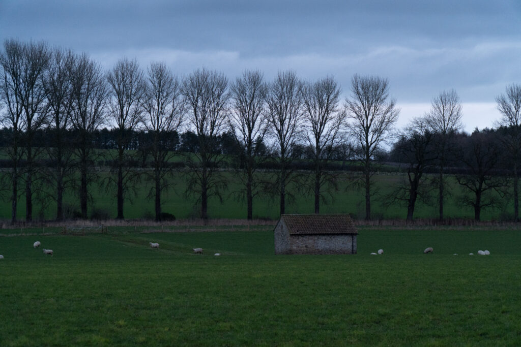
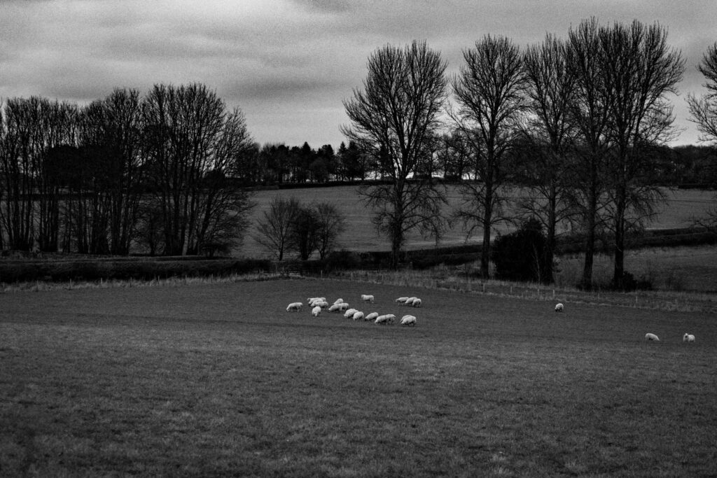
Lightroom Black and White Edited Selection
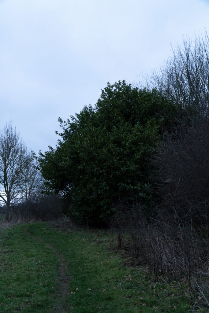
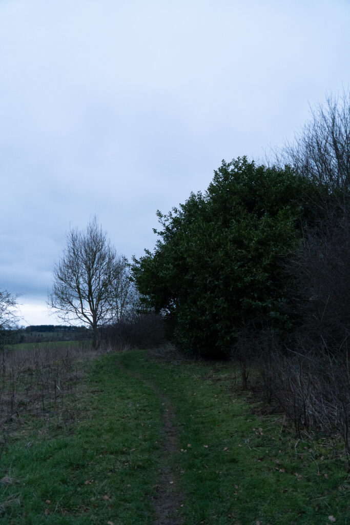
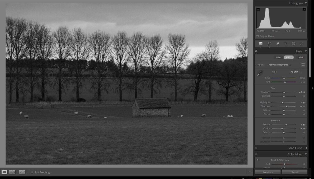
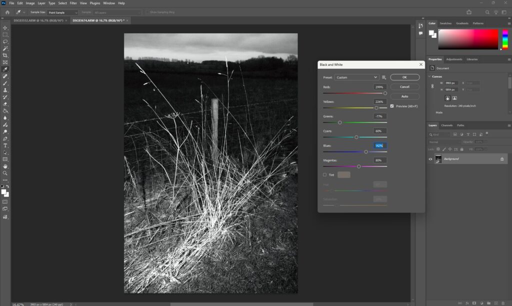
These edits are in response to Ansel Adams, I have tried to focus on creating a flat light where everything is around the same brightness. I have tried to make the sky dark and moody while retaining all details in the clouds. These were some inital ideas which are more greyscale.
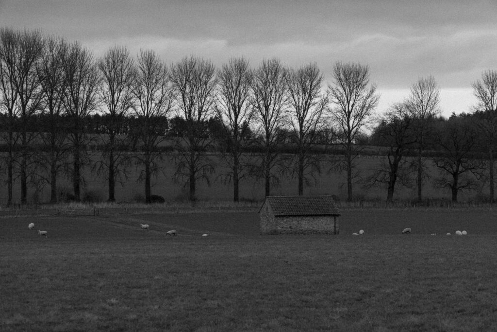
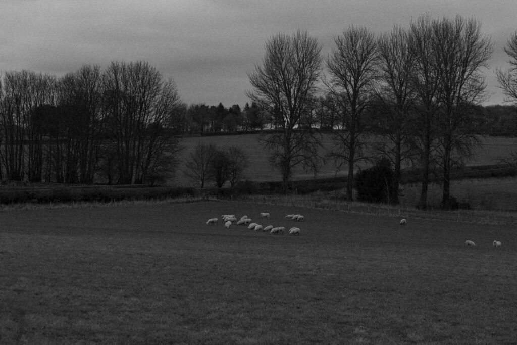
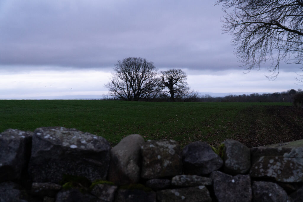
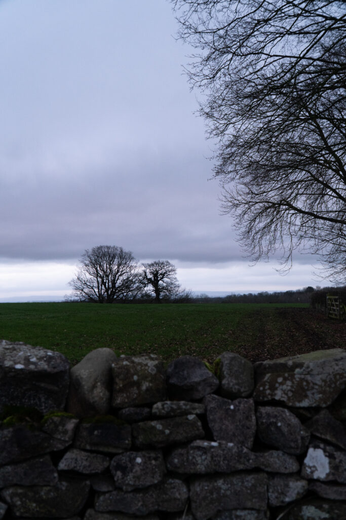
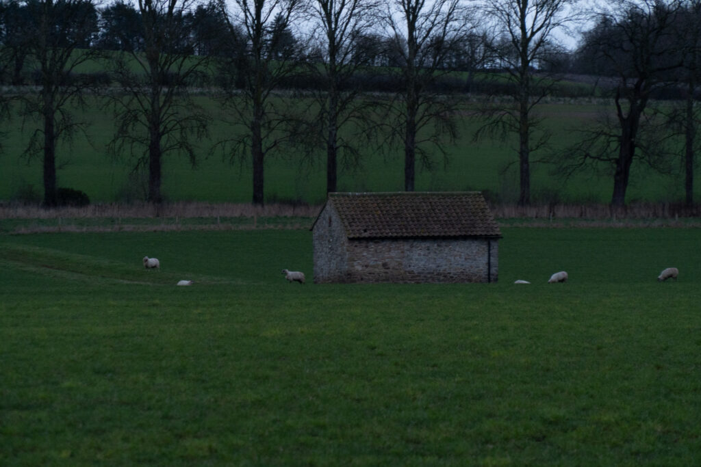
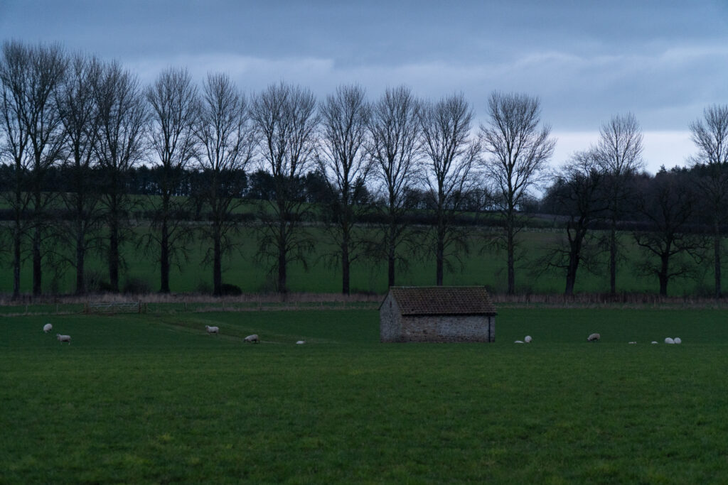
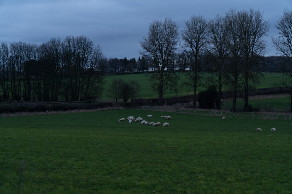
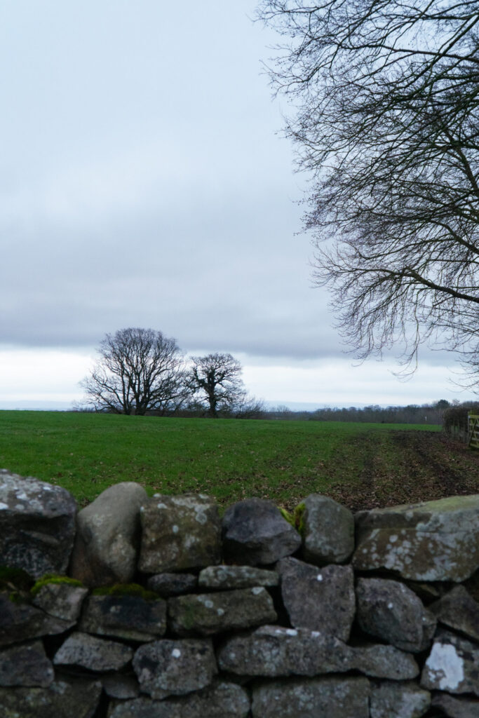
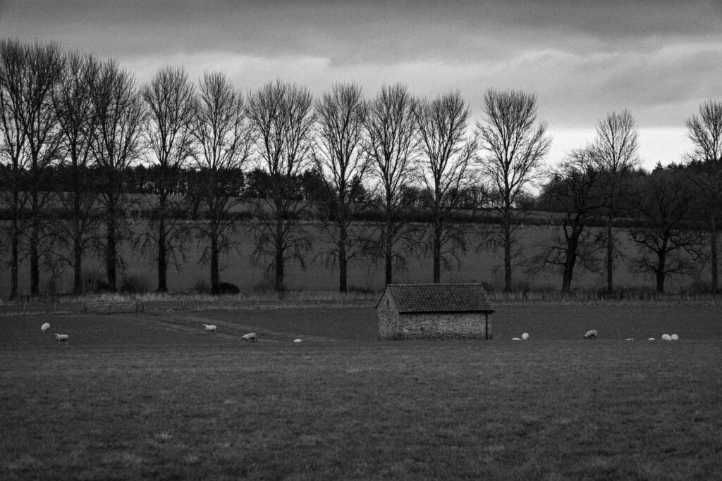
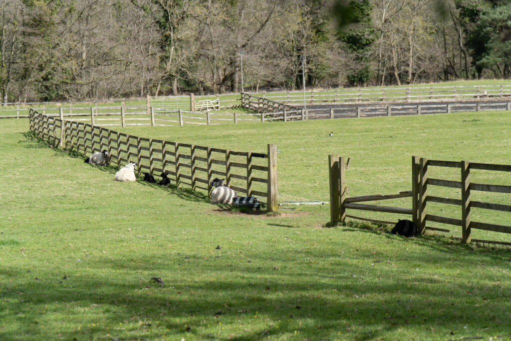
Lightroom Black and White Selection Refined
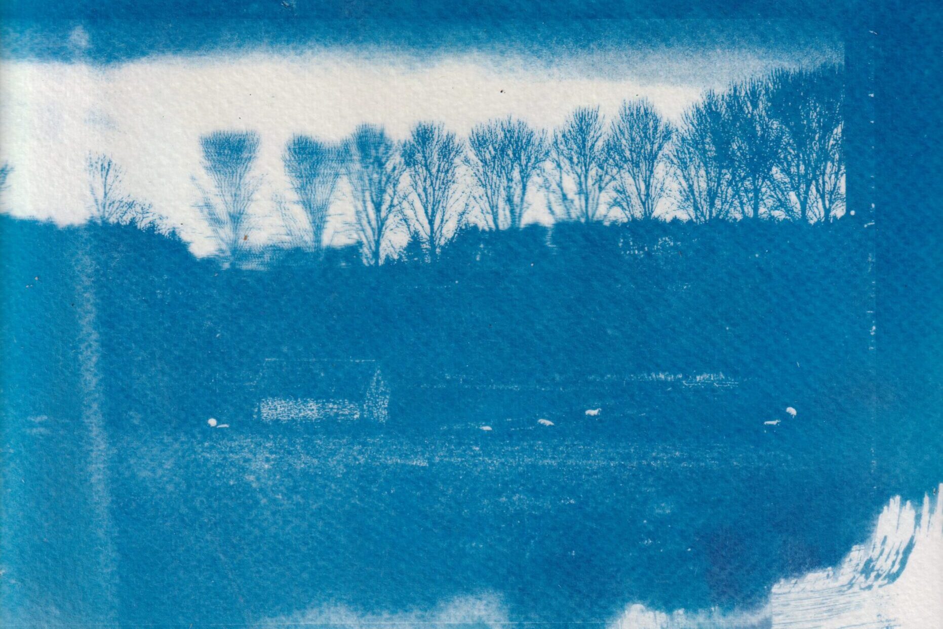
The last images were nice, but having reflected on them I have decided that they were too greyscale and flat. Below I have refined the edits to add further definition in order to see the layers of the land the the subjects. I have increased my exposure, adjusted the dehaze and clarity to add more definition and then made final adjustments to the highlights, shadows and whites and blacks. Lastly I added a black vingette to the images and set it to the colour setting so it was not as harsh to emulate a film print similar to my artist selection of Ansel Adams works.
What I did differently in the proccess
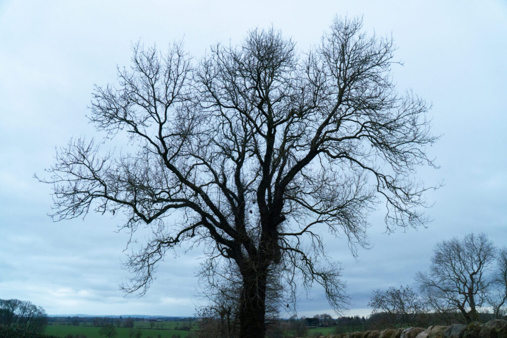
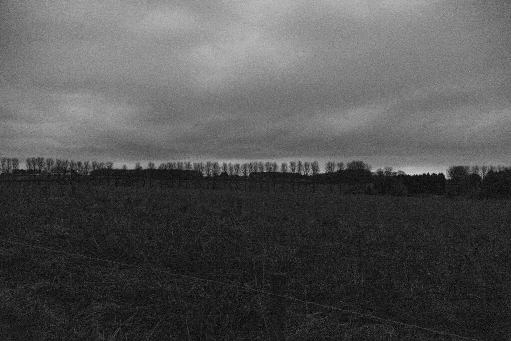
Before
Not much seperation between layers of the image and feels more greyscale
After
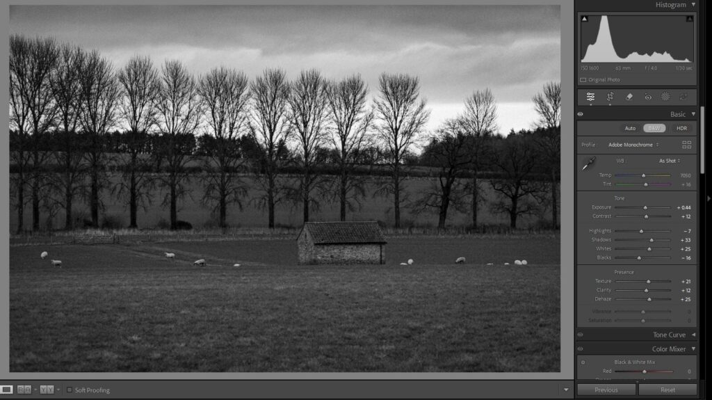
More contrast between layers of the landscape and more detail in the subjects (sheep and building)
I decied that I had taken away a bit too much clarity and that ended up removing some of the texture from the treeline and the building which made the image feel too flat and greyscale, so I decided in the refined version to boost the clarity and to add a little bit of dehaze to the image too to further define the treeline and onwards. Doing this also boosted the depth of the clouds and made them feel more dramatic and lively.
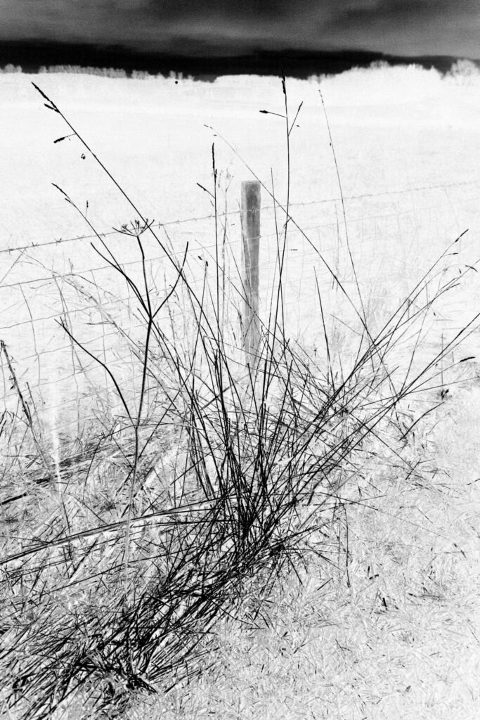
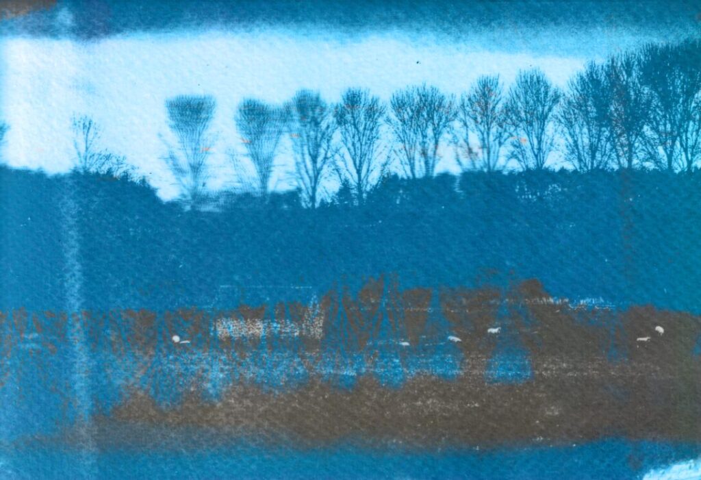
Creating a Cyanotype
For my cyanotypes I wanted to try and aim for a final product that looks similar to Ansel Adam’s photos in tonal range, to do this I have tried to create rich contrast between the foreground and the sky.

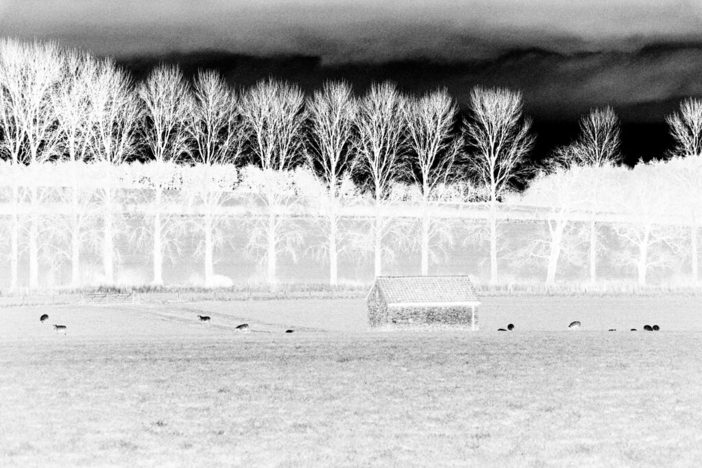
Photoshop Process – Creating a digital negative
Step 1 – Get the image into Photoshop from Lightroom
Step 2 – Make the image black and white
Here I have made the image black and white and then tuned the different colour levels to end up with a good base black and white image that has enough seperation between the different parts of the image.
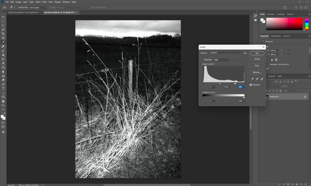
Step 3 – Levels adjustment
Now I will adjust the levels to ensure there are areas of contrasting blacks and whites to ensure that the areas of light and shade are hightended for the soon to be negative.
Step 4 – Invert the image and then layout for printing on acetate
Now I need to layout the image for printing. To do this I will make another image that I can print next to this one so I can make full use of an accetate sheet which will be used as my physcial negative of my images. The white or transparent areas of my accetate will allow the UV light to react with the chemical on my paper.
Physical Process
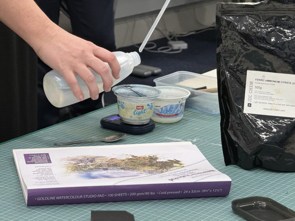
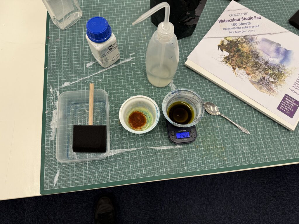
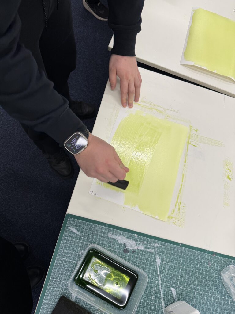
Step 1 – Coating the paper
First of all we need to mix the chemicals then we can coat the paper with the chemical in subdued light to ensure we do not expose the print early. We mix 3g of ferric ammonium citrate with 12ml of distilled water for solution A, then we mix 1.5g of potasium ferricyanide with 12ml of water. We then mix these two solutions together to make the final solution. Once this solution is mixed we must work under subdued light to stop the chemical reaction from taking place. We use a foam brush to apply to chemical to water colour style paper. The foam brush is used to apply an even coat to the paper of the final solution.
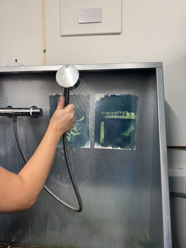
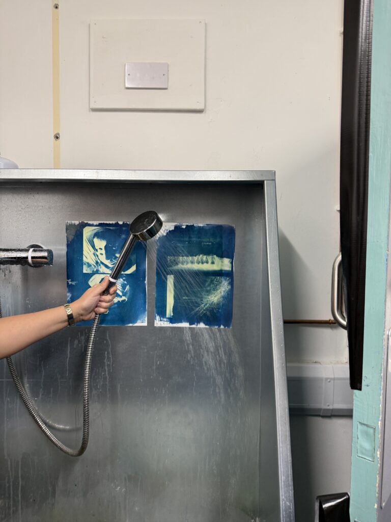
Step 2 – Exposing the Print
For exposing the print we will be using a UV light exposure unit. This is purely to speed up the process. We could leave the negative on top of the paper outside in the sun but this would take much more time. On the UV exposure unit we will set the vacumm to 2 minutes so there is heavy direct content with the print and the negative to ensure a good, high resolution print. Once the print has been exposed we need to take it off of the UV exposure unit and then wash off the remaining chemical to ensure the print does not keep exposing once we have finished.
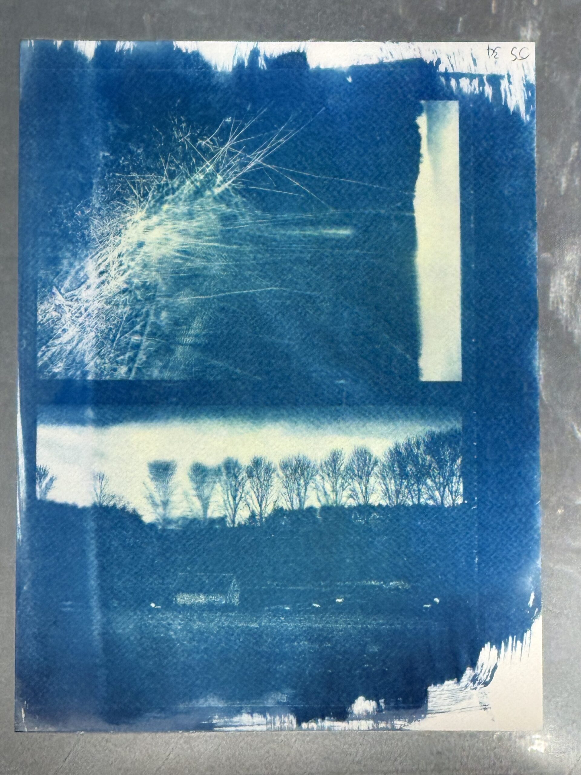
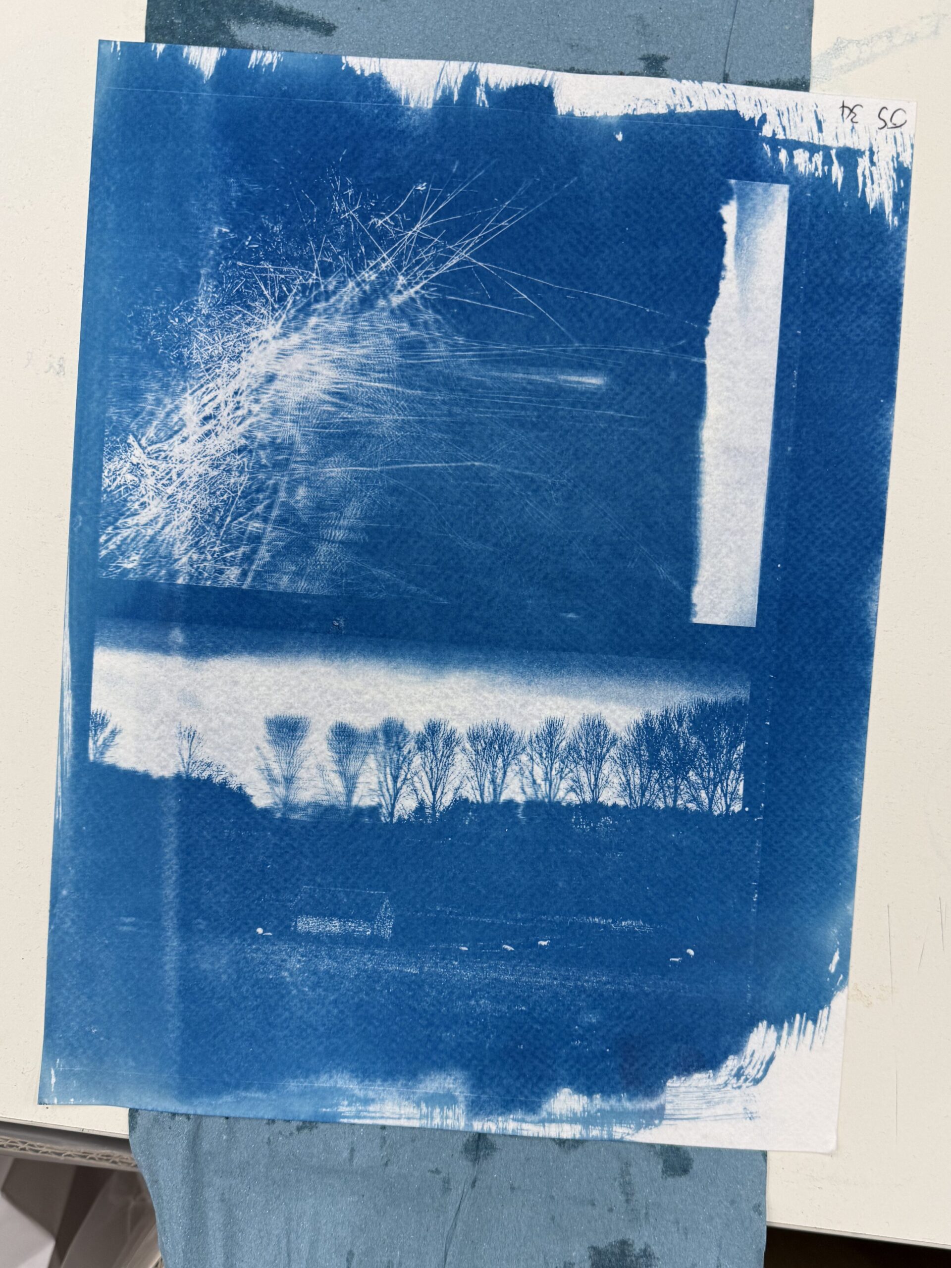
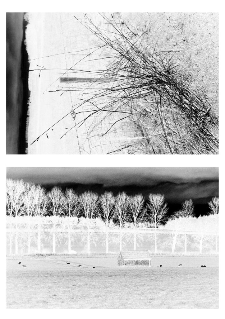
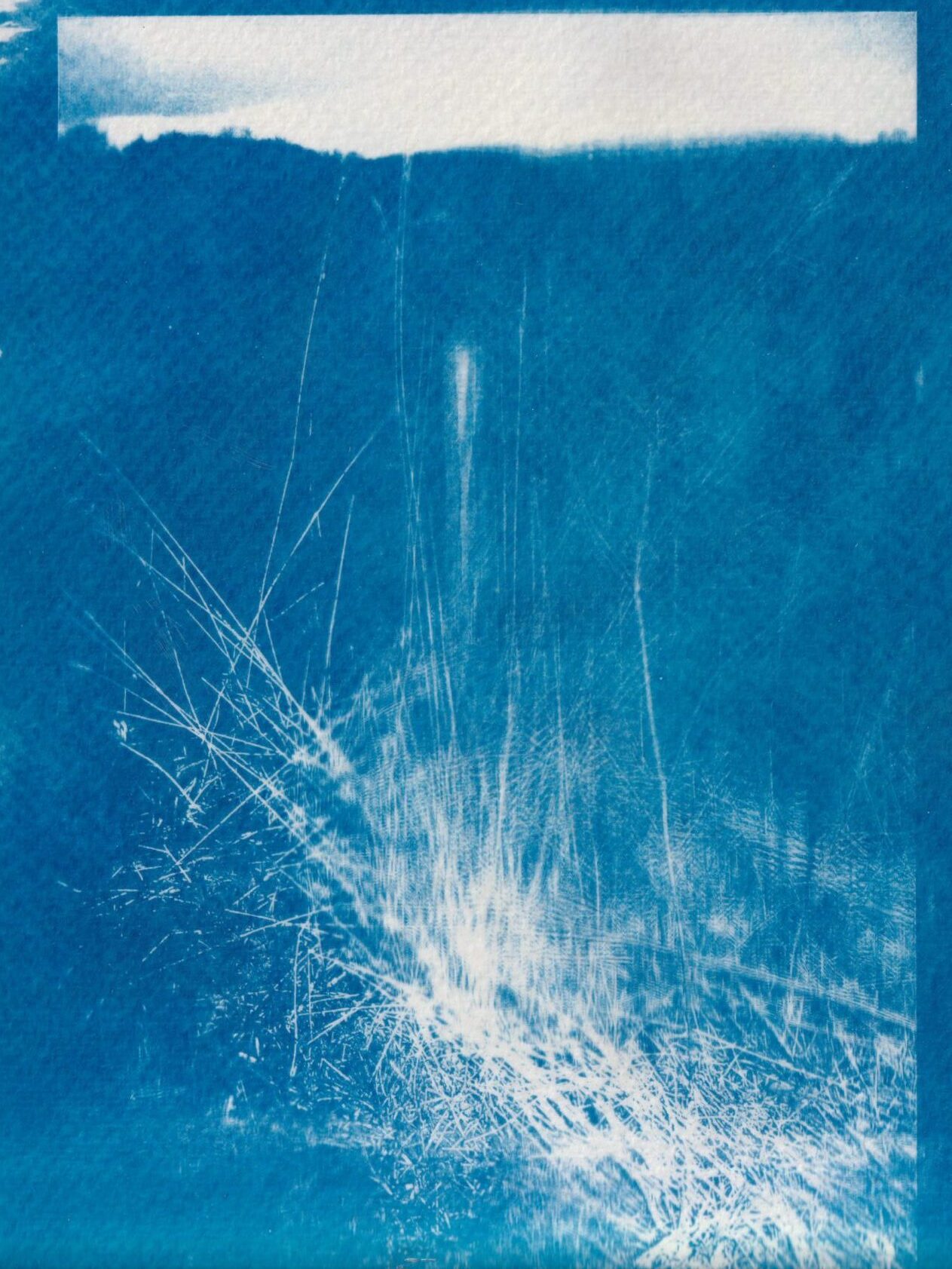
Final Prints
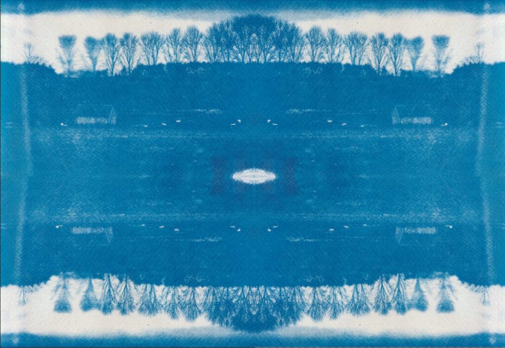
Cyanotype Photoshop Edits
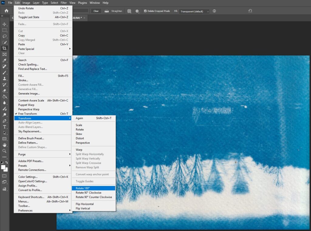
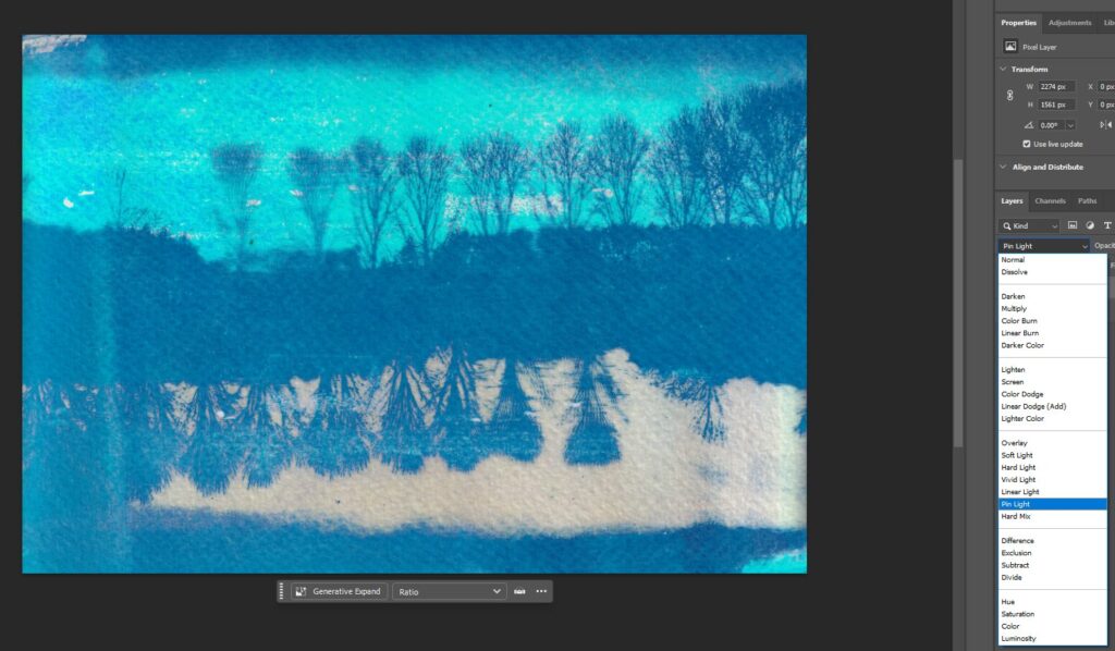
Edit 1: Rotate and Pin Light Blend Mode
Result
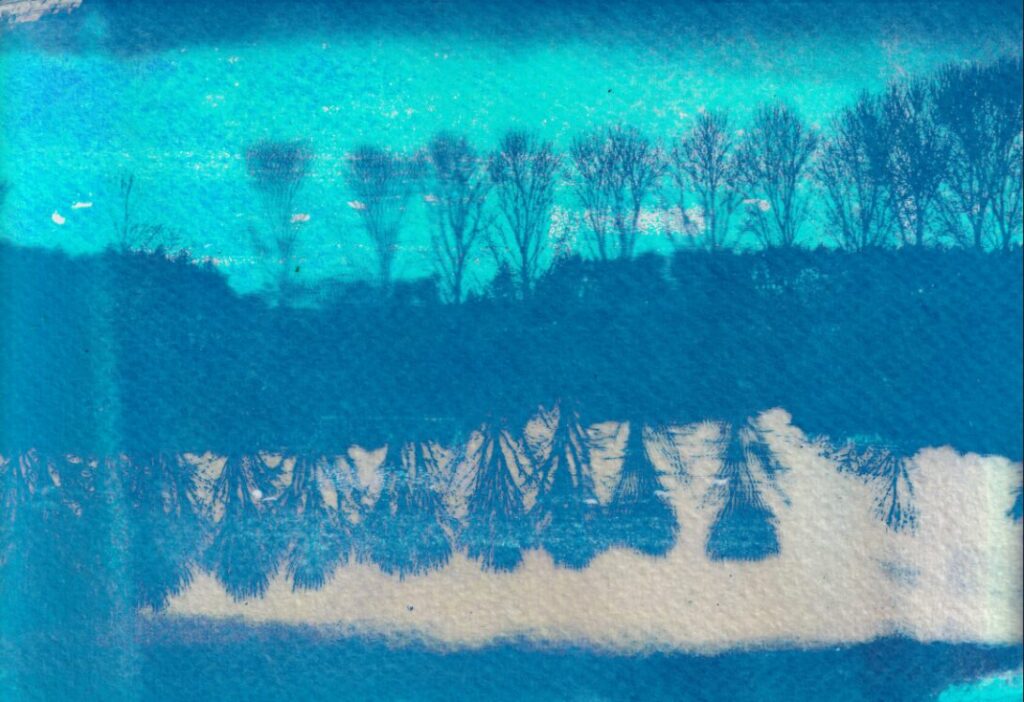
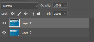
3 Step Process, duplicate, roate, change blend mode

Edit 2: Rotate and Difference Blend Mode
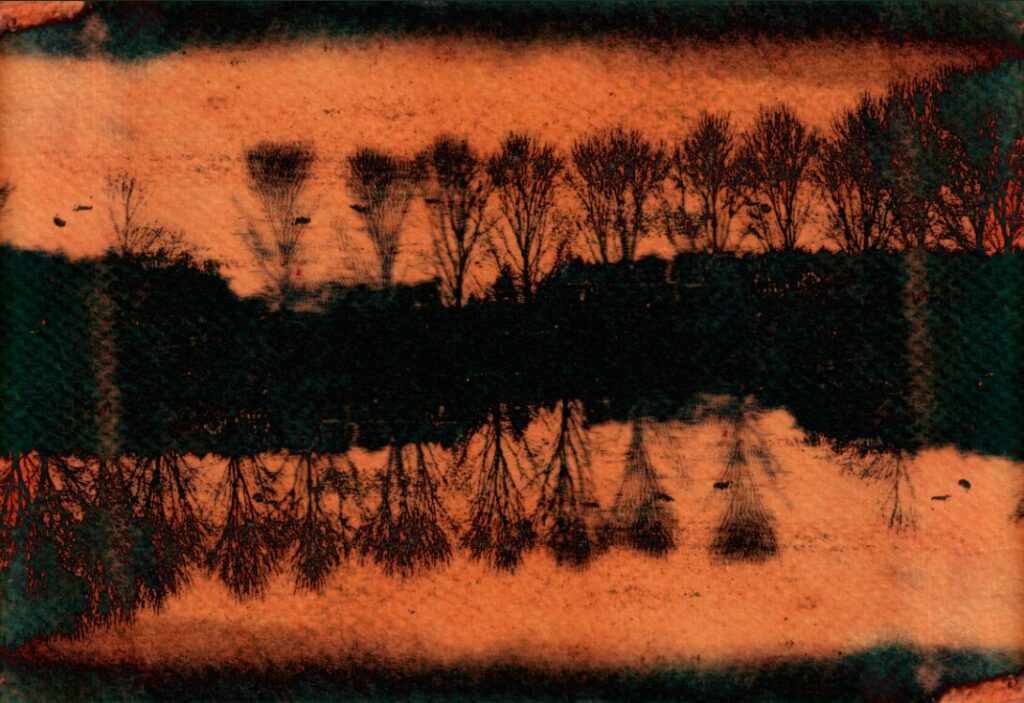
Edit 3: Rotate and Color Blend Mode
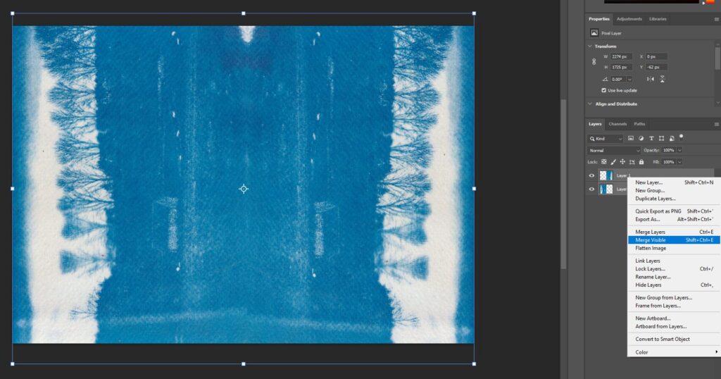
Edit 4: Duplicate image, rotate and then flip to make a mirror image on the left and the right, then merge layers and repeat to make a pattern
Results
Process
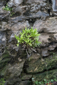
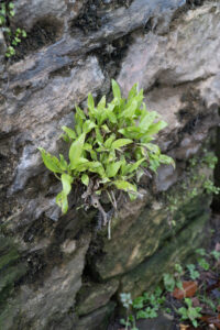
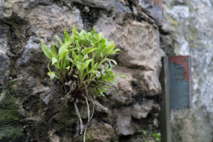
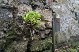
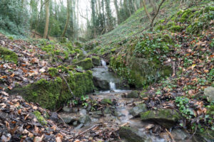
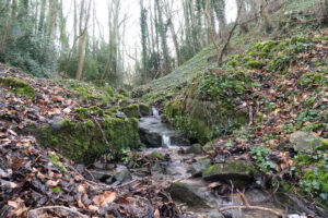
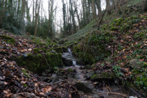
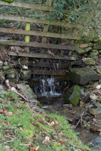
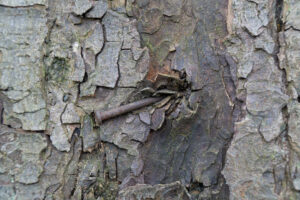
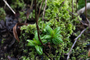
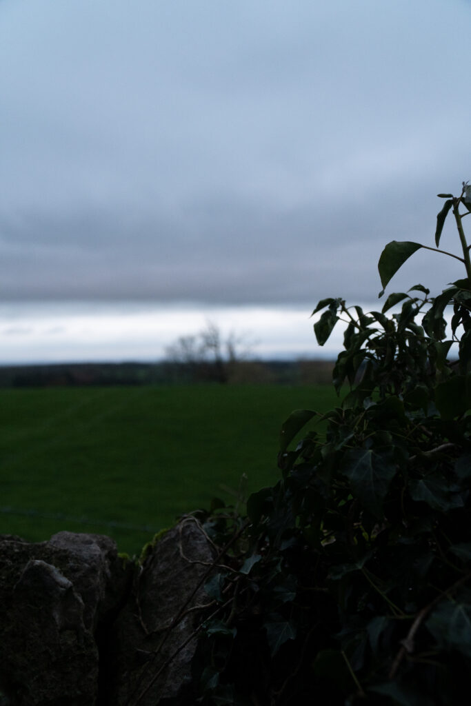
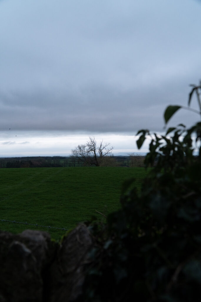
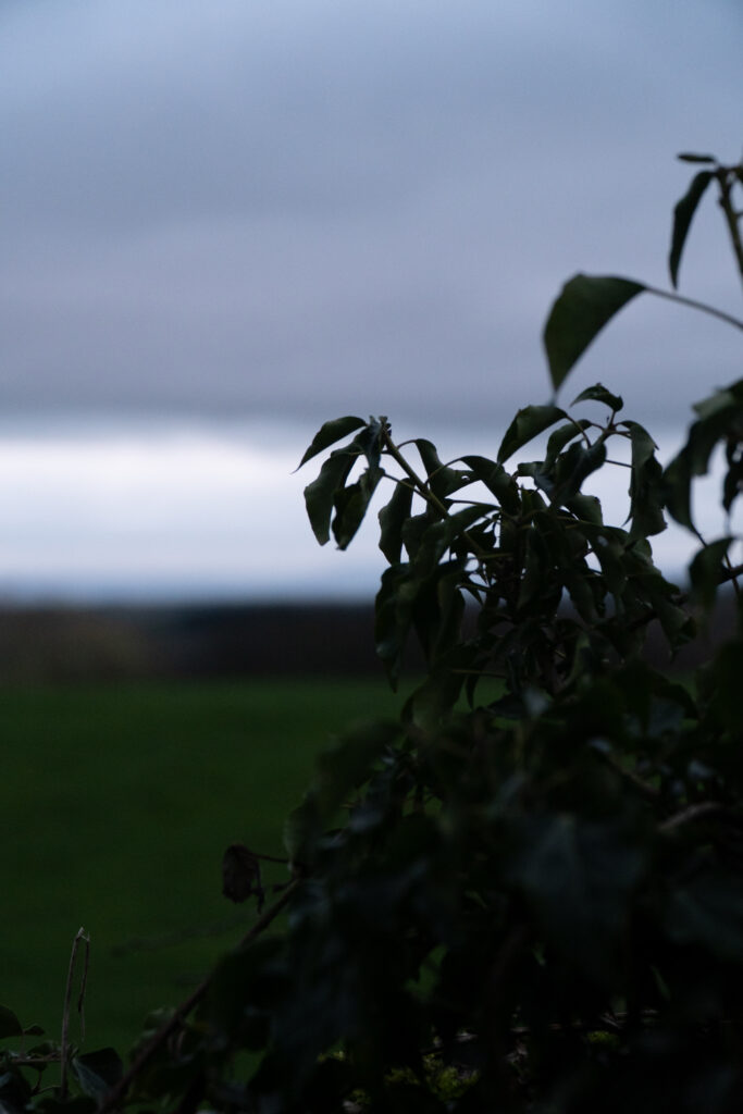
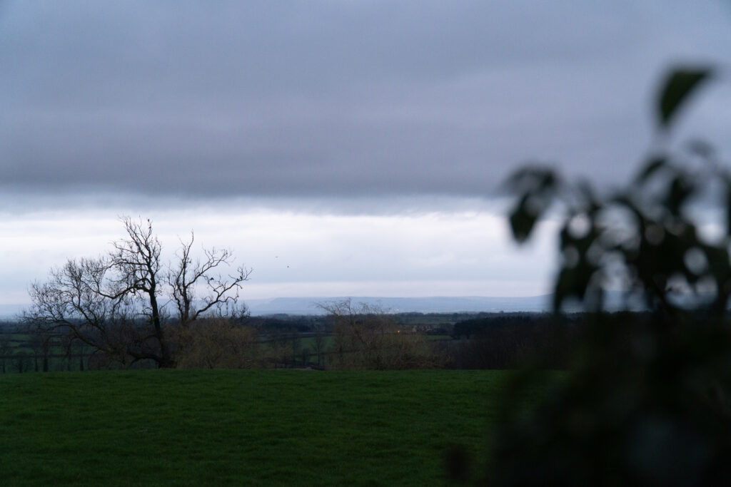
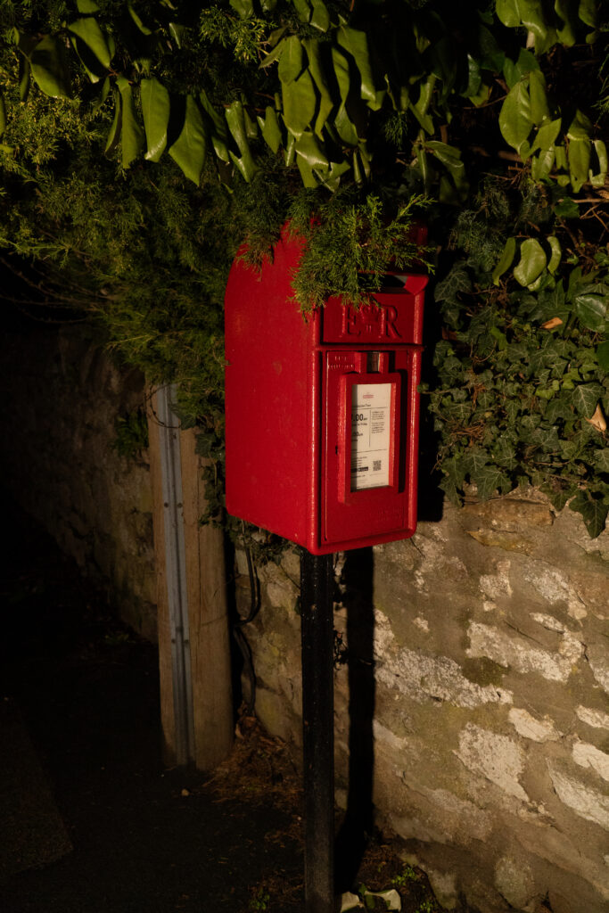
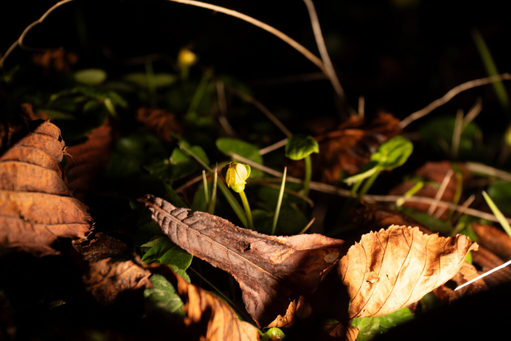
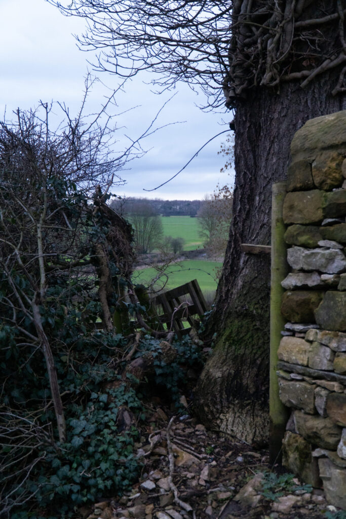
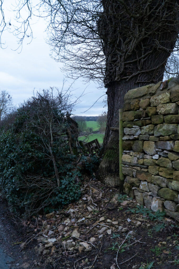
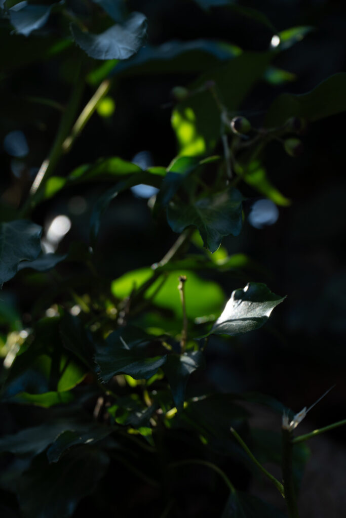
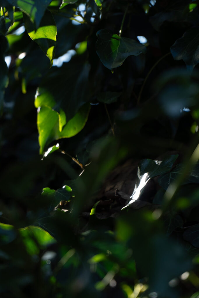
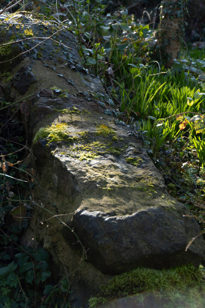
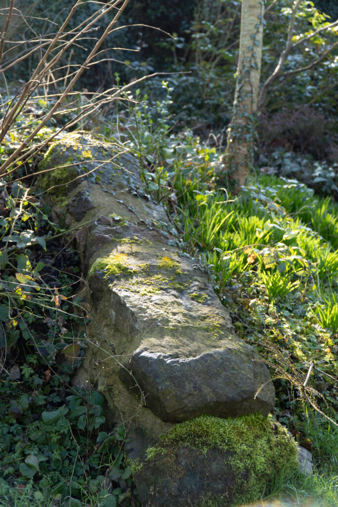
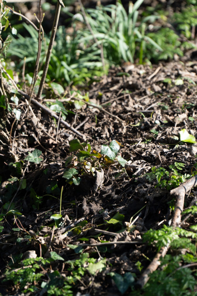
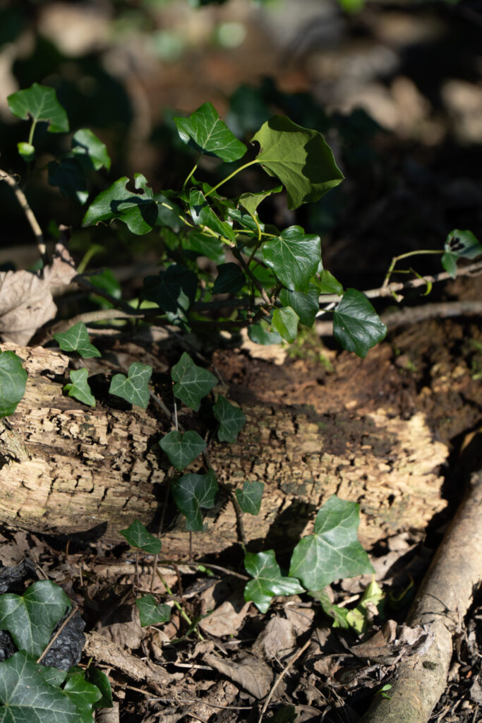
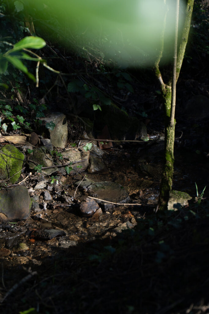
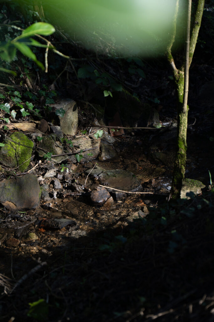
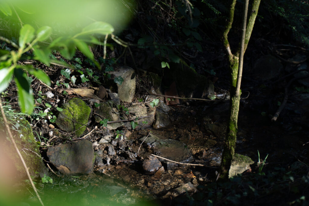
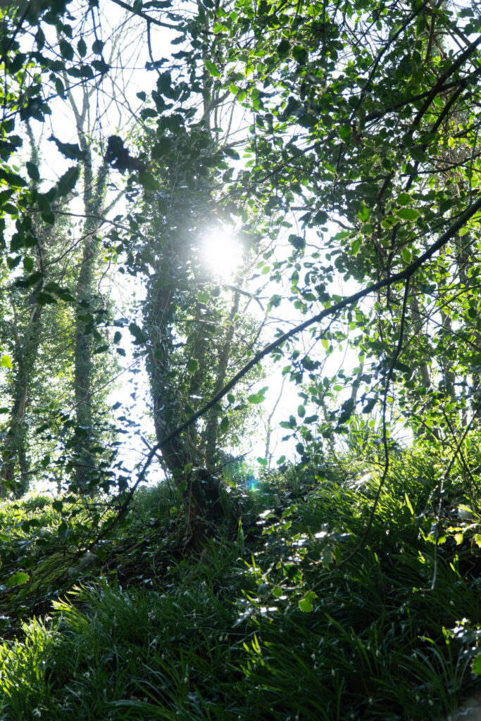
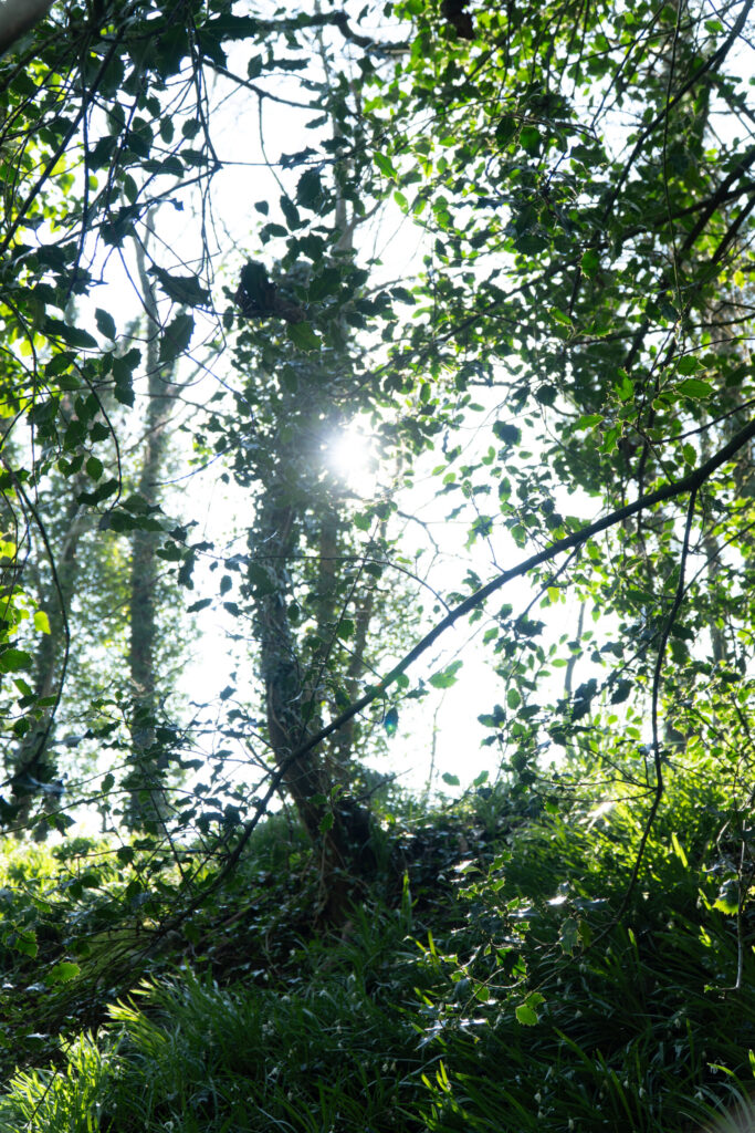
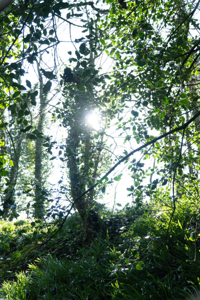
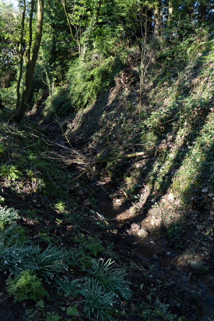
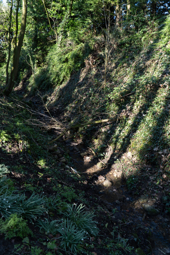
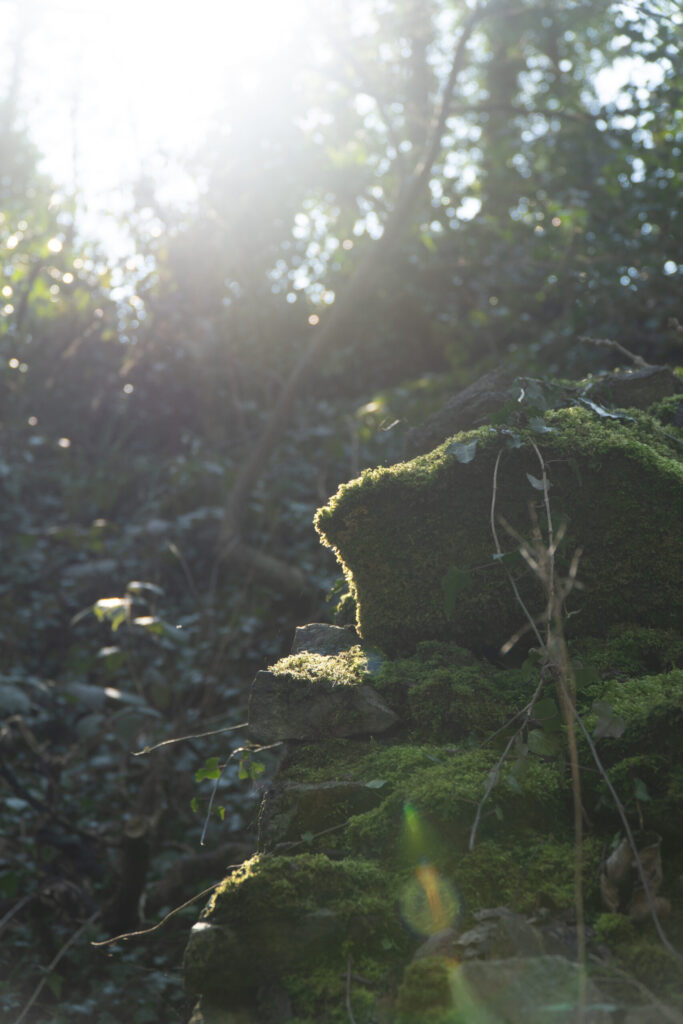
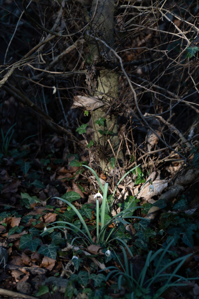
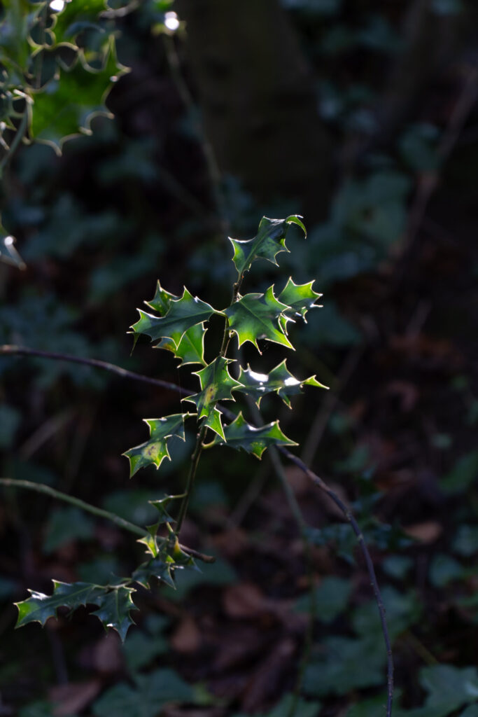
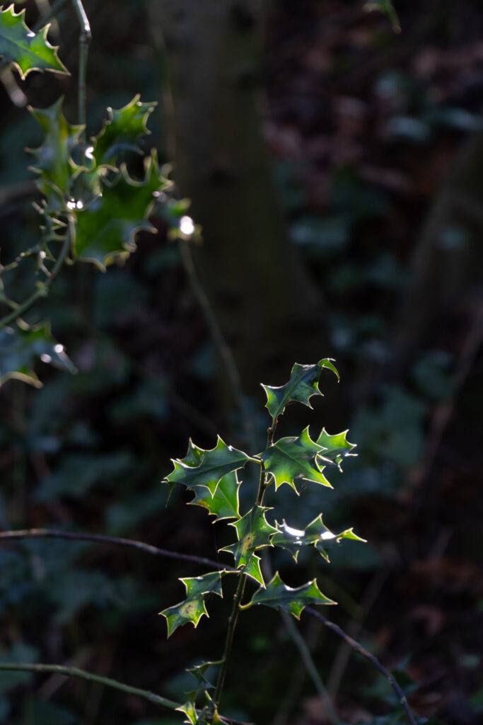
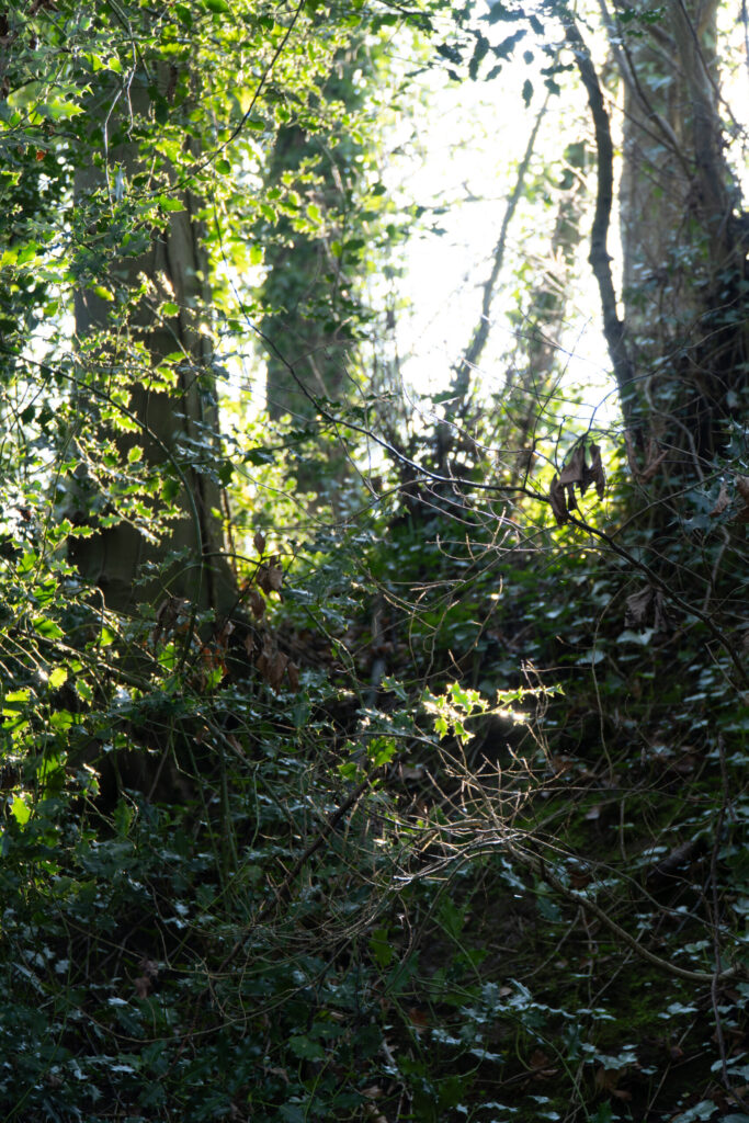
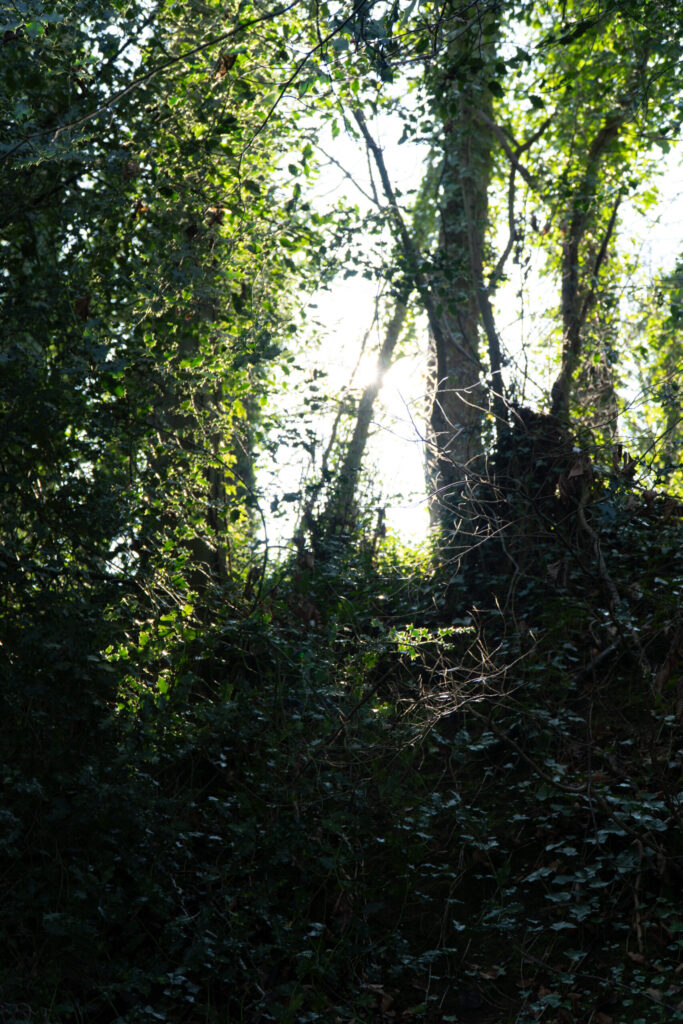
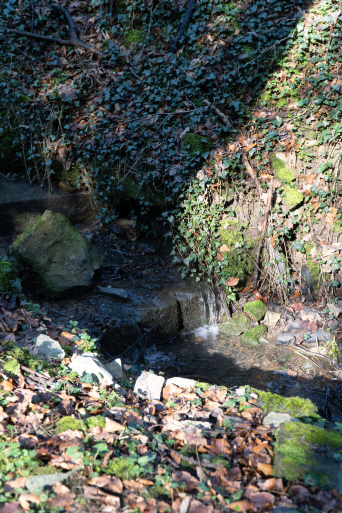
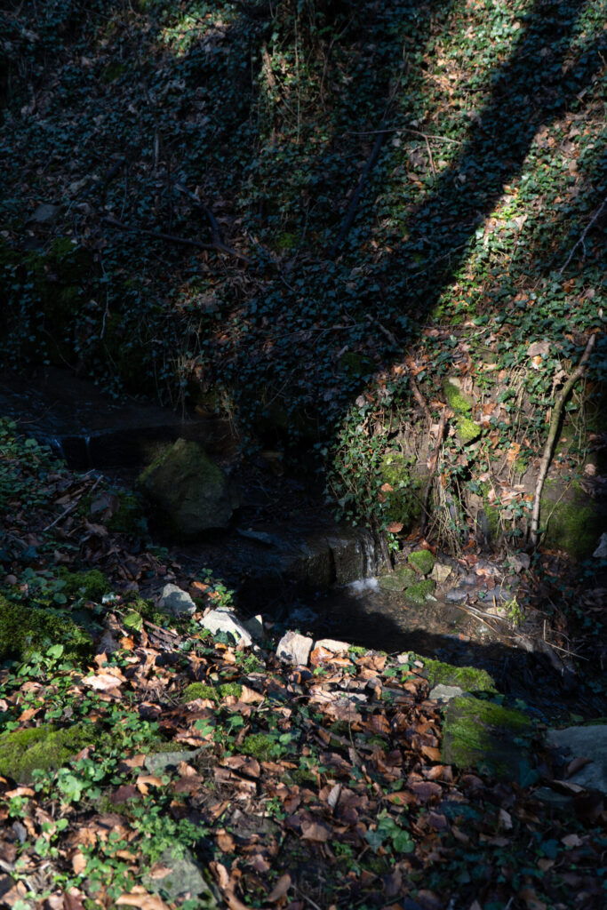
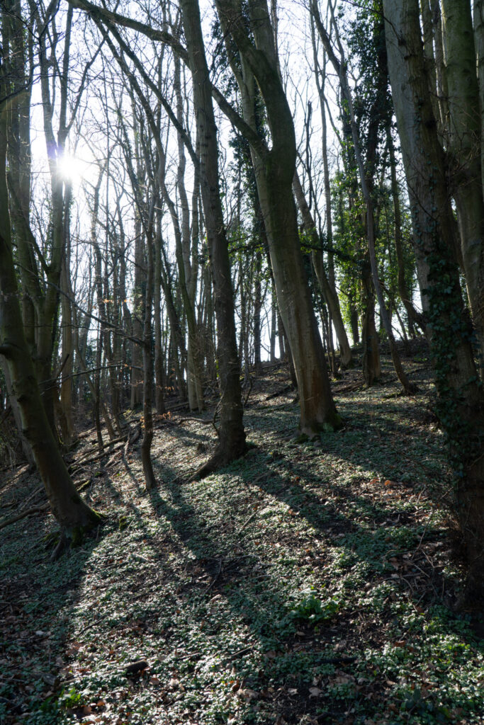
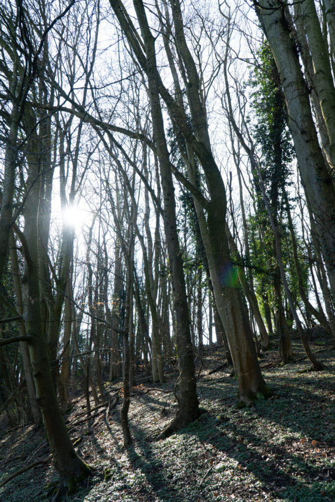
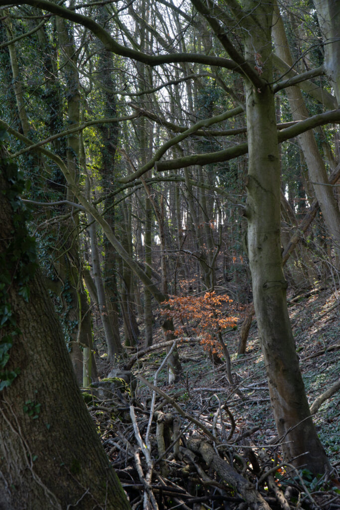
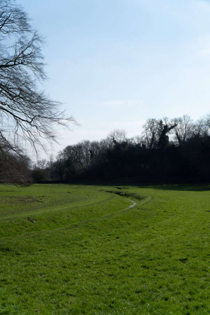
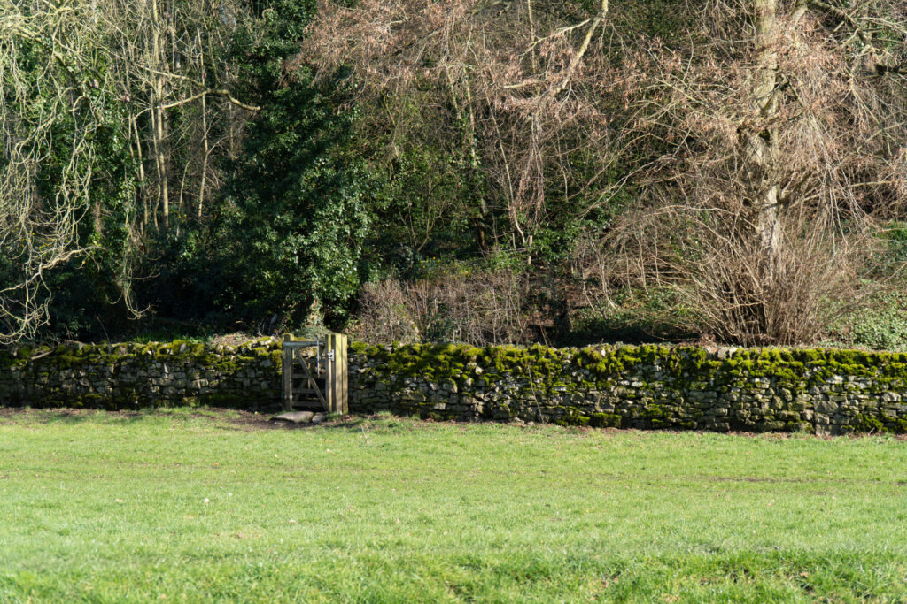
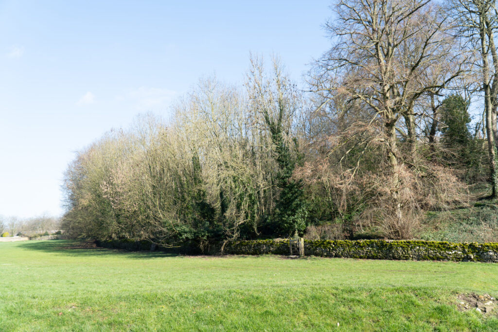
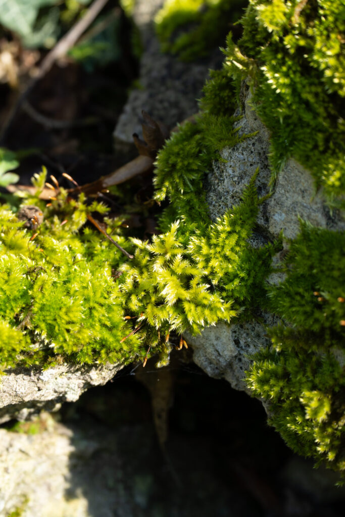
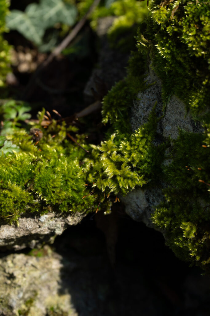
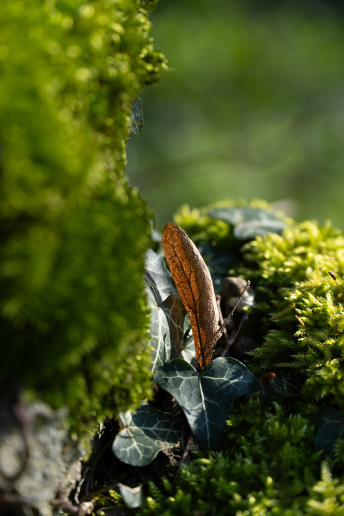
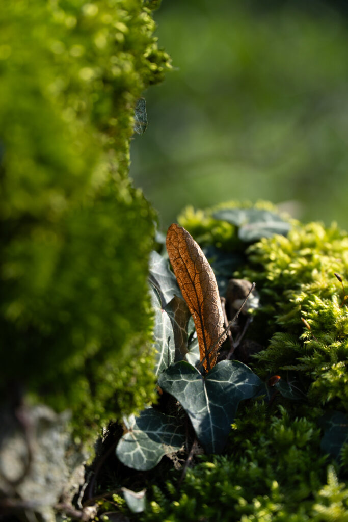
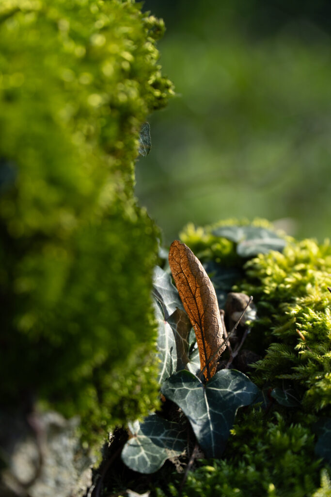
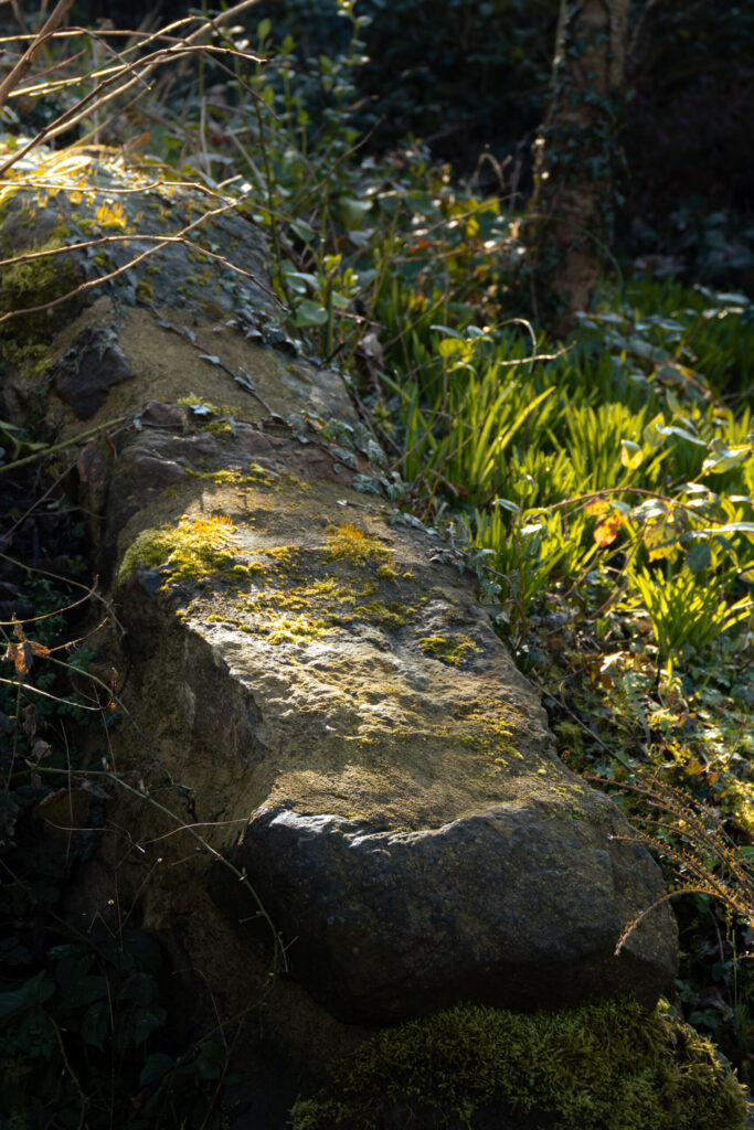
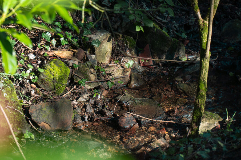
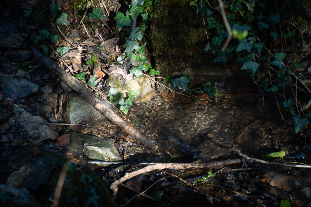
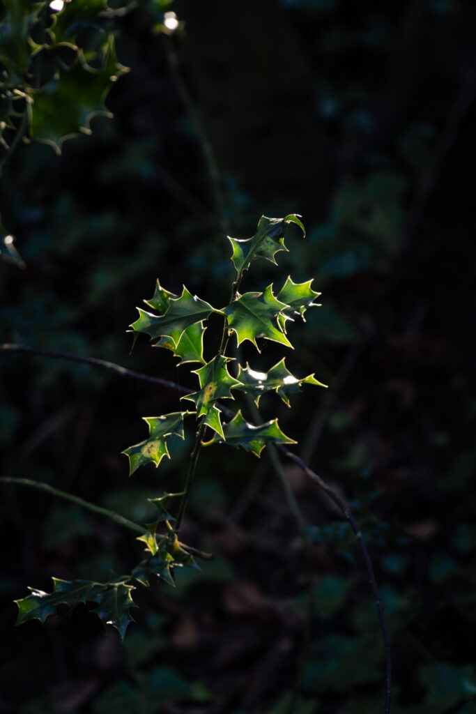
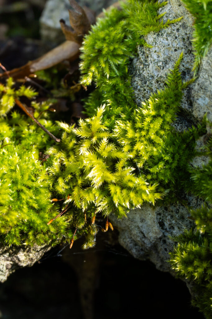
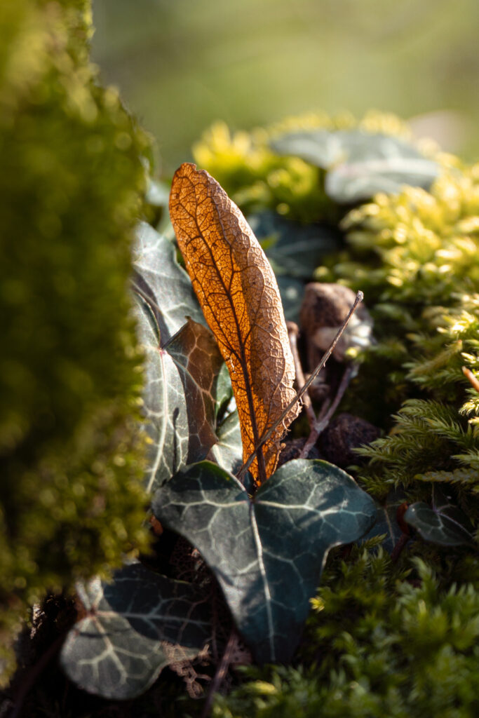
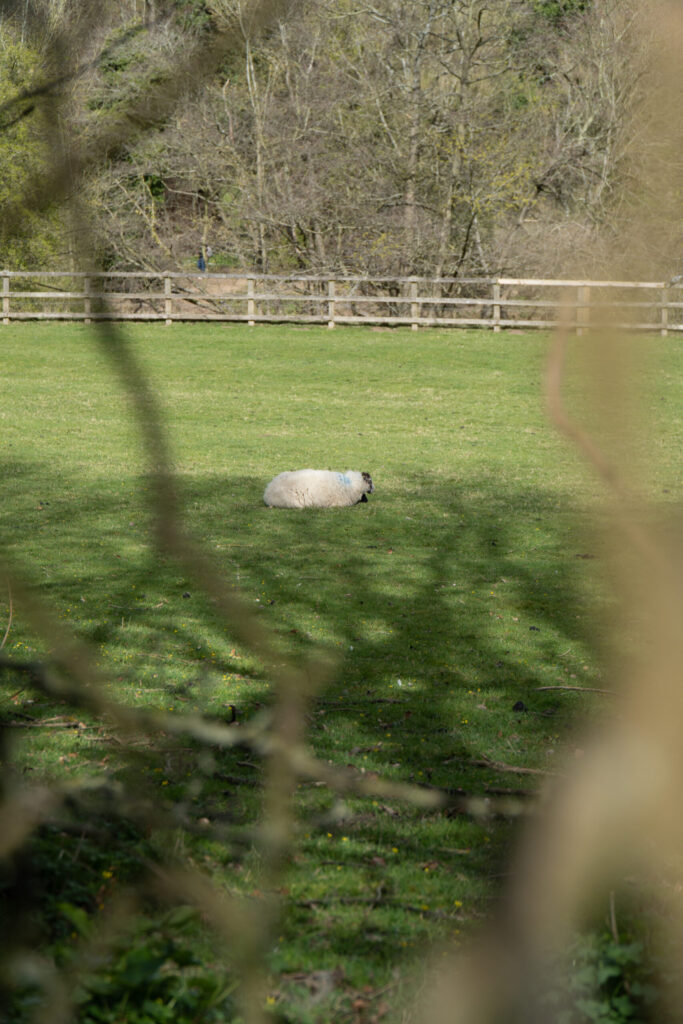
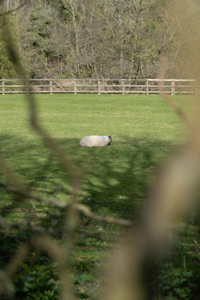
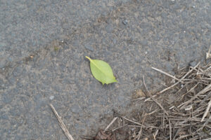
Shoot 3 – Light
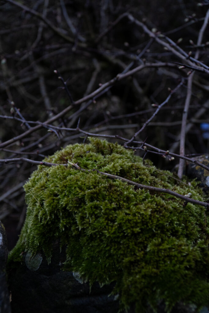
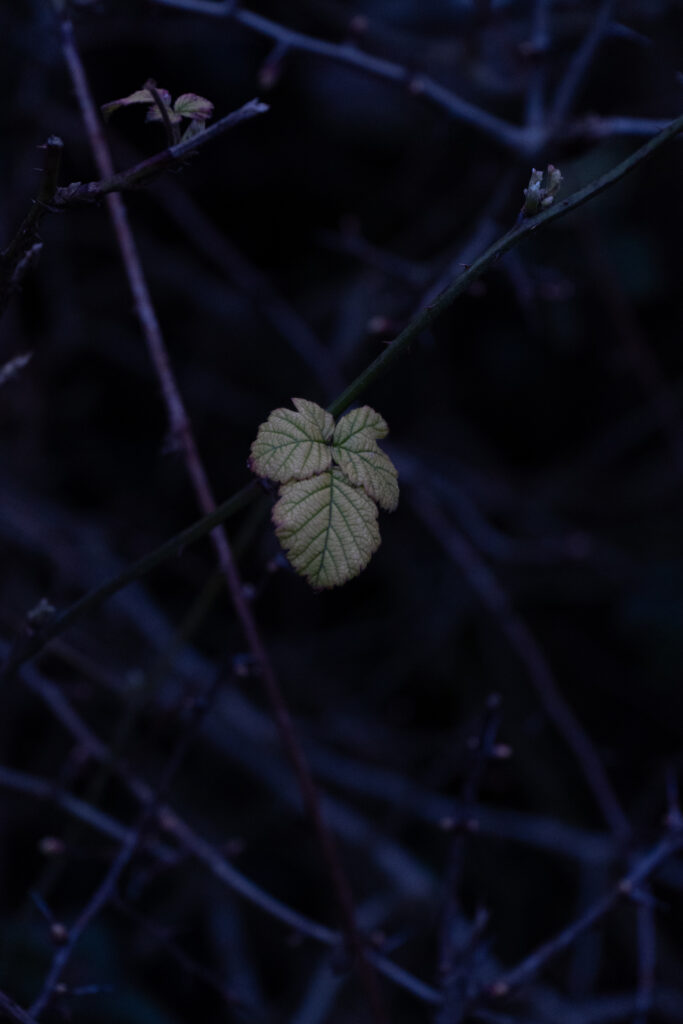
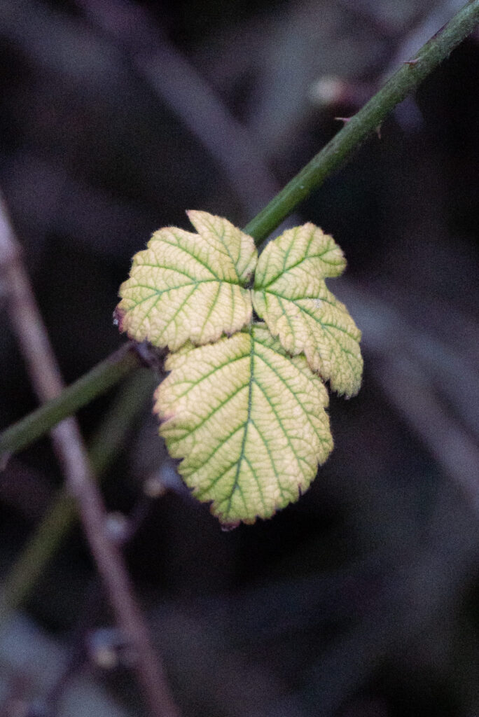
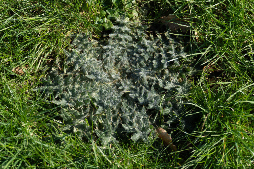
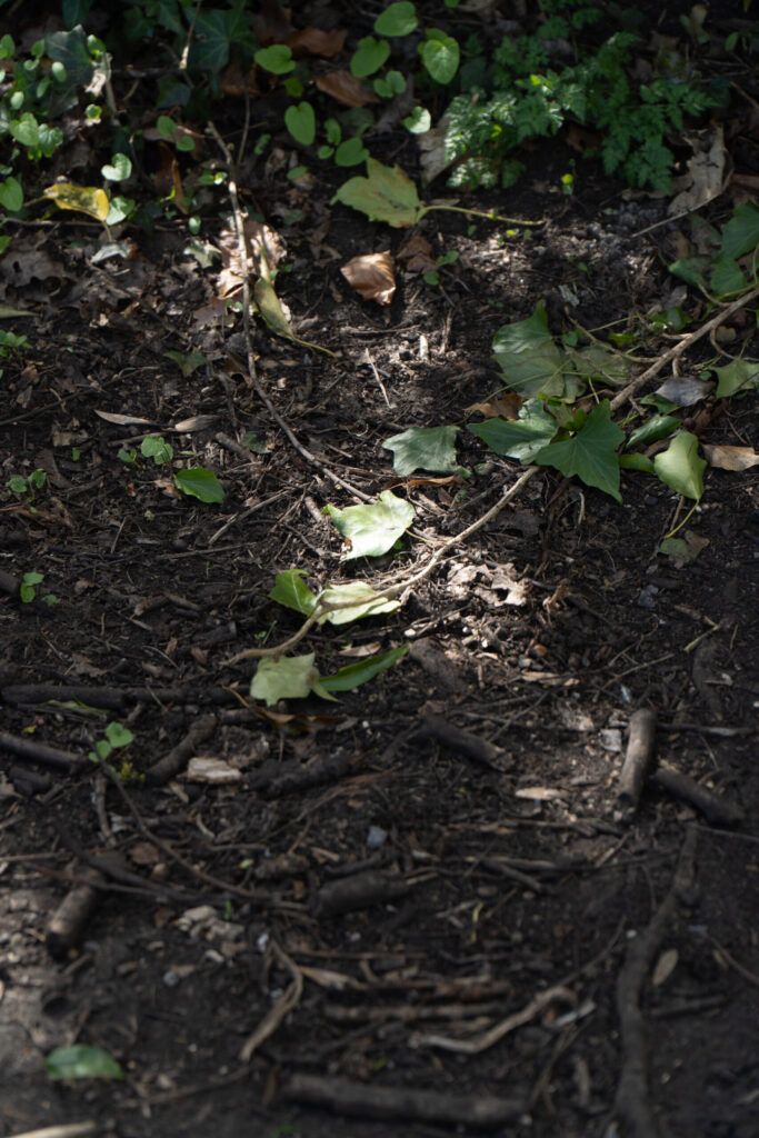
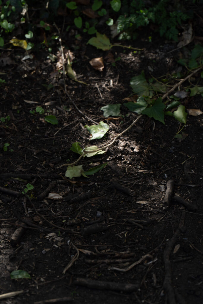
A shoot around mid-day walking through a forrest and then an open field with walls filled with details. I have tried to focus on the idea of isolation with individual places being lit up by the harsh mid-day sun. I have also played around wtih putting stuff in the foreground, out of focus. Which can be seen in my Lightroom Enhanced Edits where you can see leaves covering the left side of the screen that almost look like light leaks, which adds style to otherwise a flat image. The same can be said for the picture of the brown leaf in the moss, the moss on the left is completely out of focus but nicely frames the leaf.
View Full Shoot
Lightroom Enhanced Edited Selection
For this set of edits I really wanted to focus on lighting. I had taken this shoot at around mid-day, the sun was harsh and created deep areas of contrast between the highlights and the shadows of my photographs.
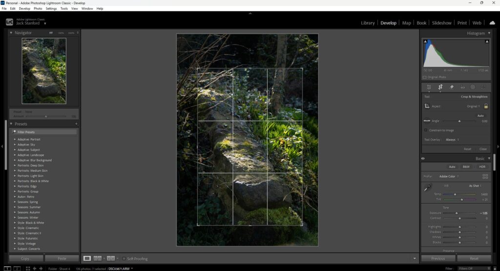
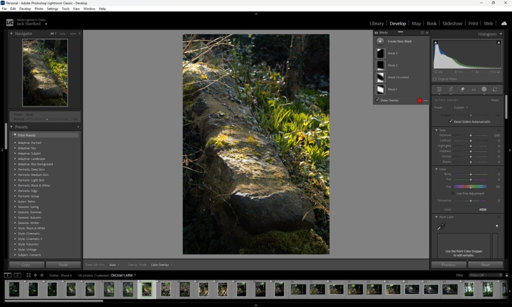
Lightroom Editing Process
The following is a step by step proccess of how I handle my images in Lightroom.
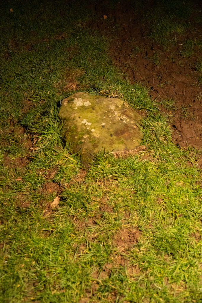
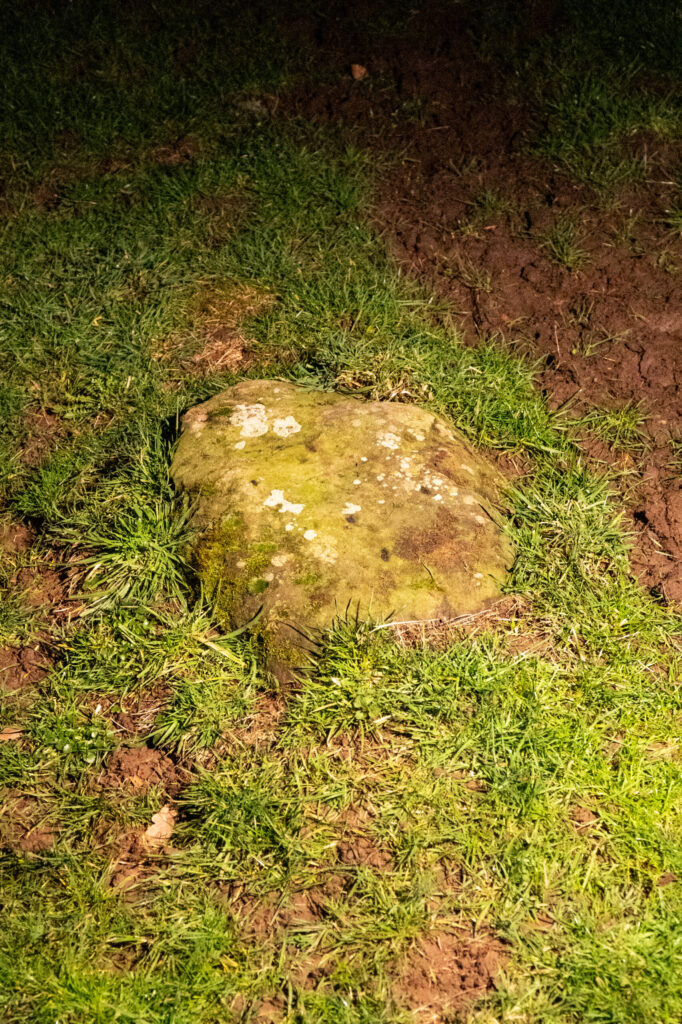
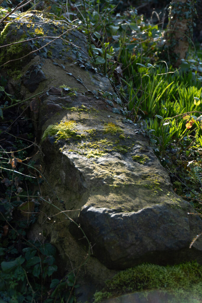
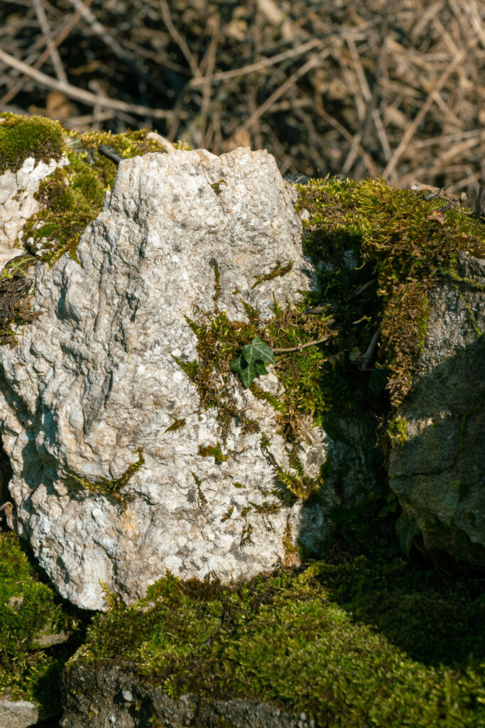
Step 1 – Framing and Exposure
I often take my pictures slightly wider than I actually want them, this allows me to later reframe the image to be how I want it. I also at this stage will pick and exposure level that feels balanced across the whole image. So in the case of this image I dropped the exposure by -1.05EV which allows the shadows to naturally gain depth but also the light on the rock to become balanced and less blown out.
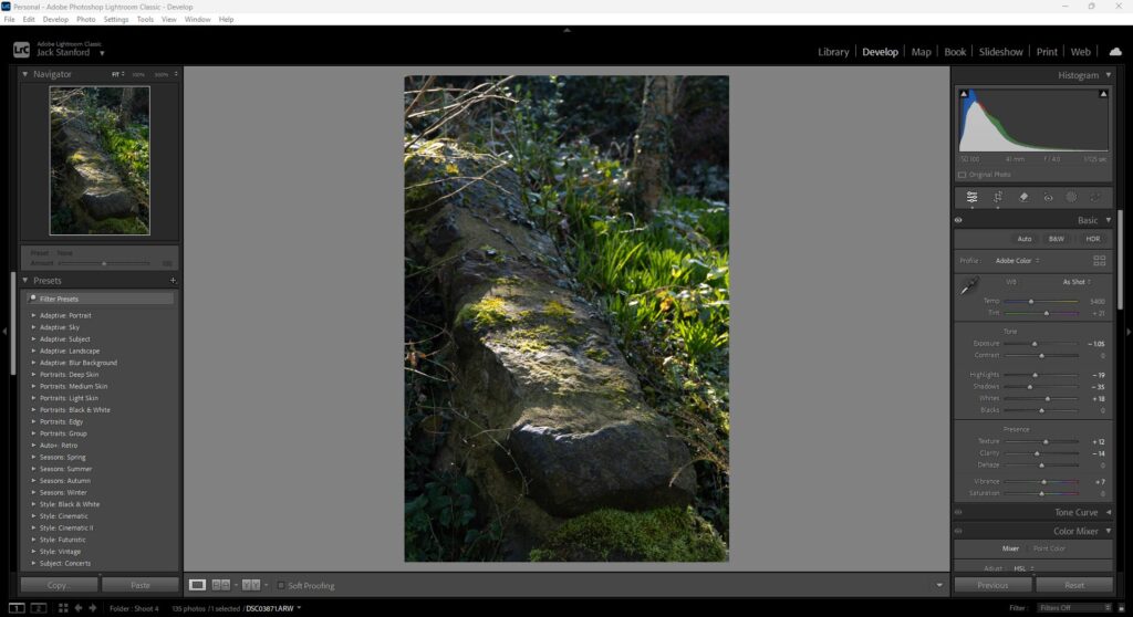
Step 2 – Toning and Details
At this stage I have balanced the image in compositon and general exposure. So now I need to adjust individual aspects of light like the highlights, shadows and in this case whites. All of this helps me tone the image and make it as lively or as flat as I want it. For this image due to the stark contrast of the light coming down onto the rock and the surrounding areas I had to crush the highlights quite a bit to ensure that the light looked natural.
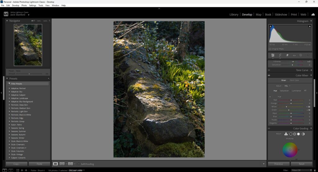
Step 3 – Colour mixing
Now I need to add my personal touch to the image. I will do this by tuning the colours to appeal to me. In the case of this image I felt like the foliage and the moss on the rock needed to have a warmth to it to add to the idea of the sun beaming down on the rock. I pushed my yellows to orange and my greens to yellow which warms up the foliage beautifully.
Step 4 – Colour grading
To continue from the last step I will also push my midtones to be warmer by using the midtones colour wheel and pushing it to the top right towards orange. This adds a warm hue into the, well, midtones.

Step 5 – Masking the main subject to enhance light
Now I need to work with the light in this image to add more effect to the sun beam on the rock. To do this I will use masking to be able to boost the exposure slightly of the sun patch on the rock and in the foliage just behind. I also boosted the clarity very slightly here to add some extra detail.
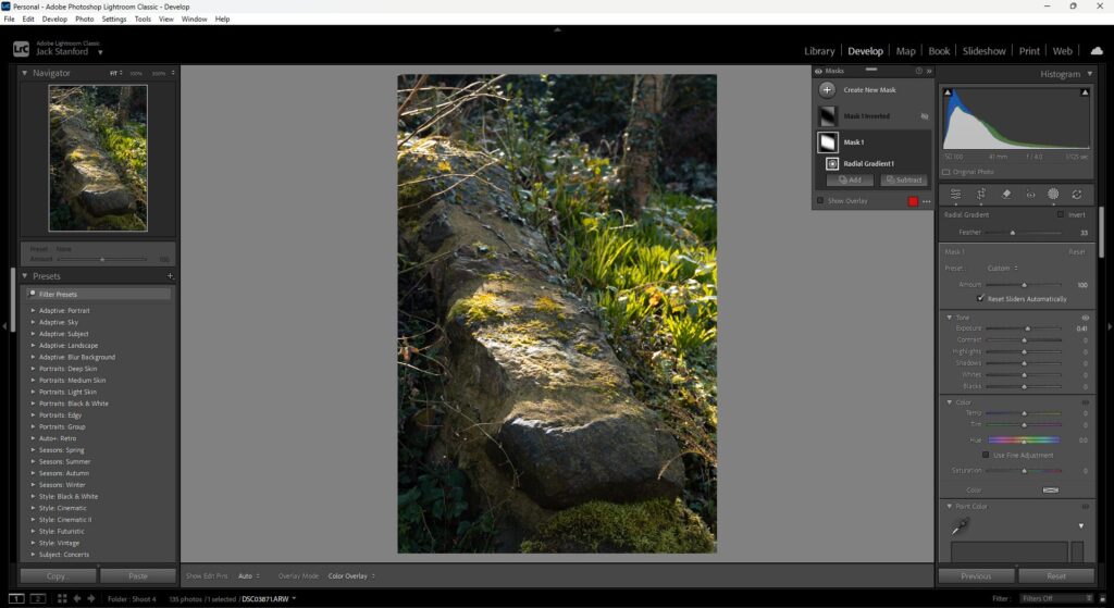
Step 6 – More masking to deepen shadows around subject
Here I added more masks around my subject, one in the top left to add some overexposure to where the sun looks like it is coming from, but also took out some clarity to this does not become too distracing in the overall image. I then also added a linear gradient to the bottom of the image to show a natural drop off in light from the edge of the rock onwards.
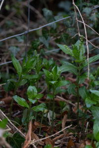
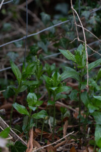
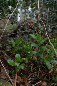
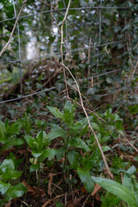
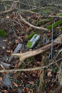
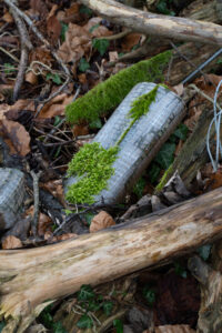
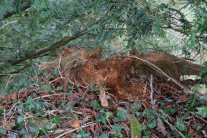
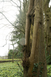
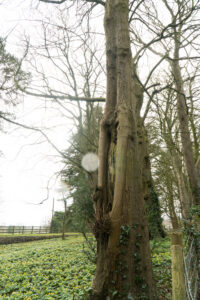
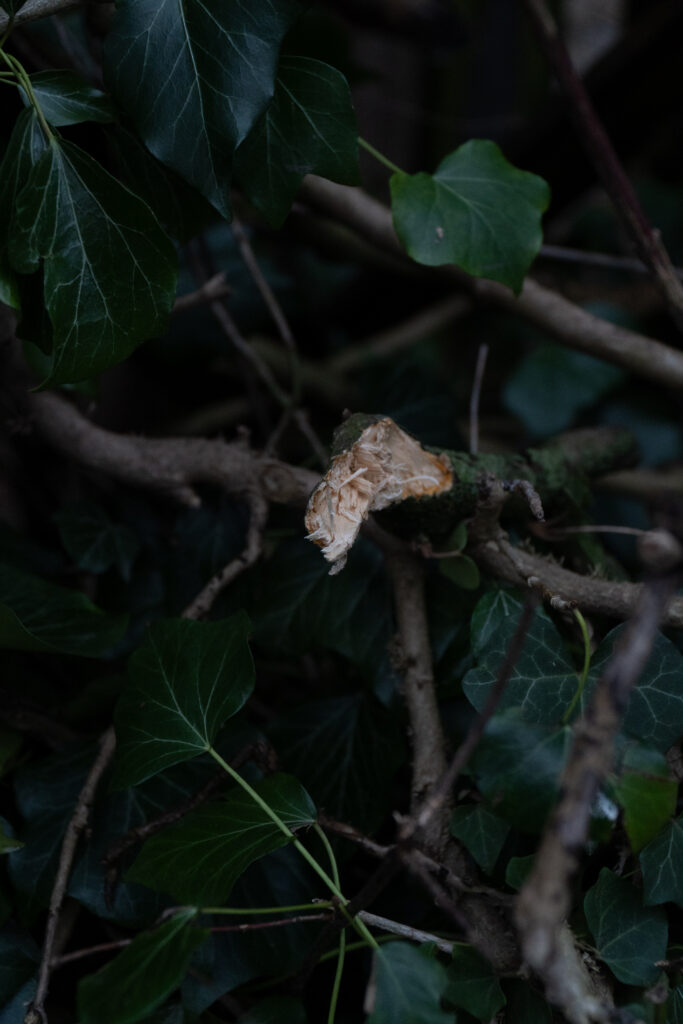
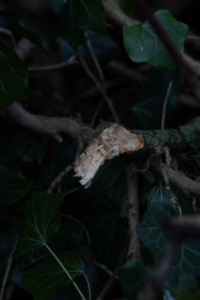
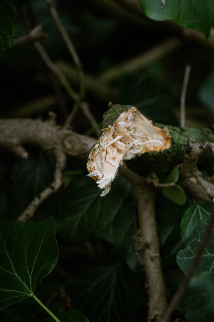
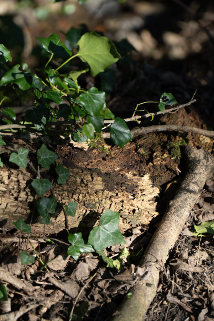
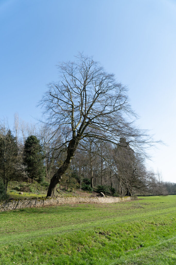
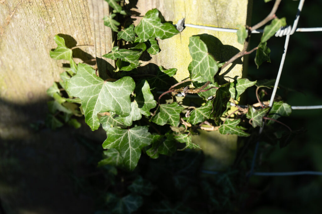
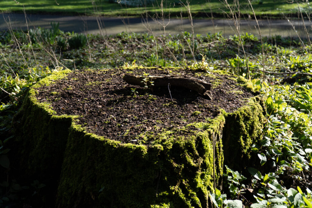
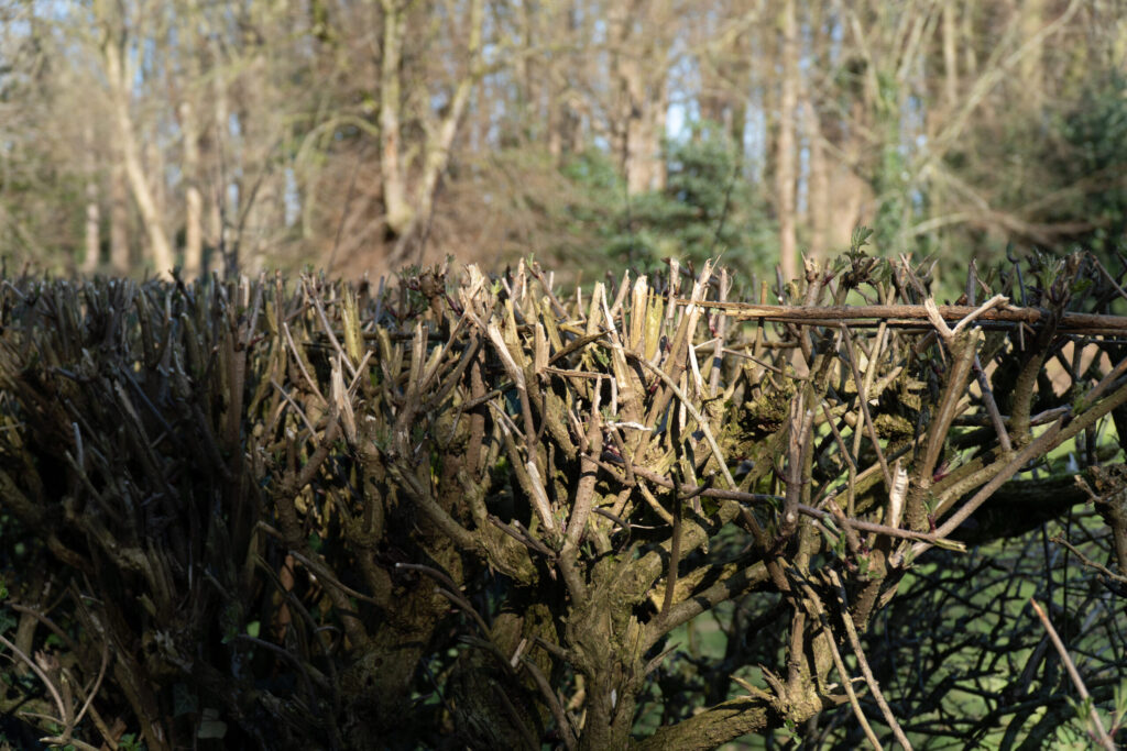
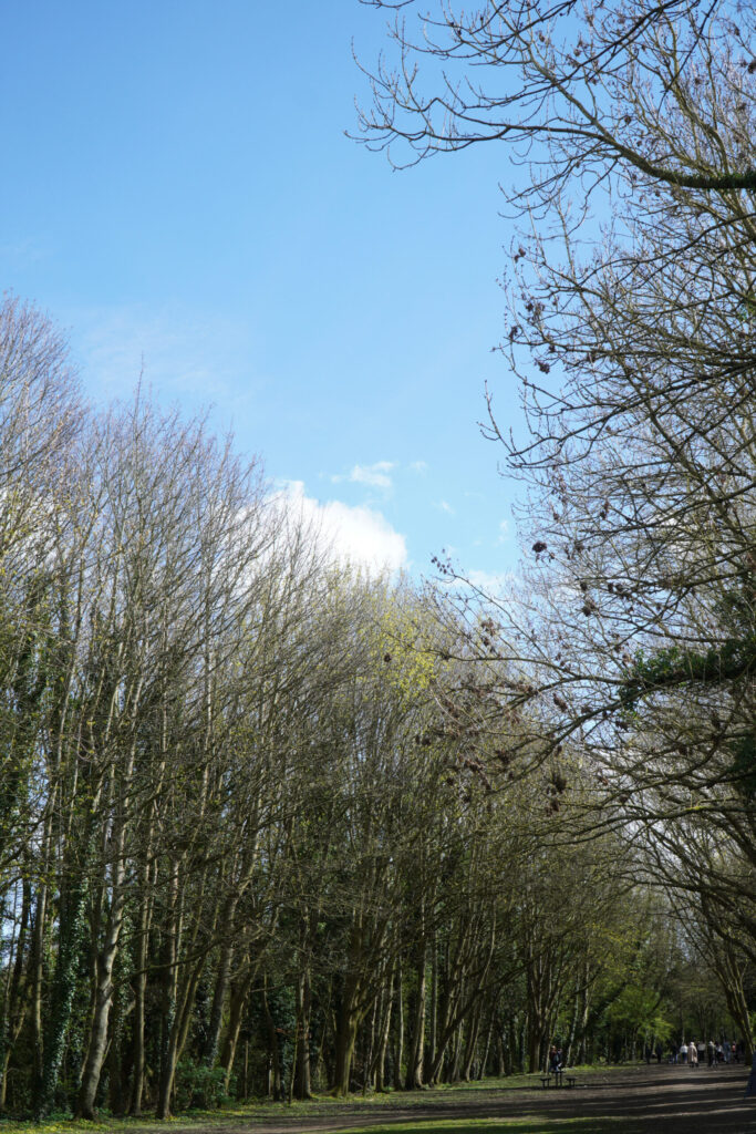
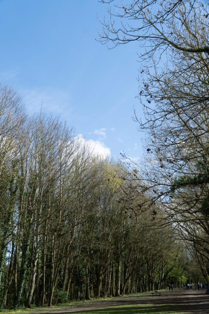
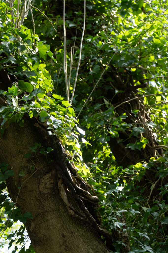
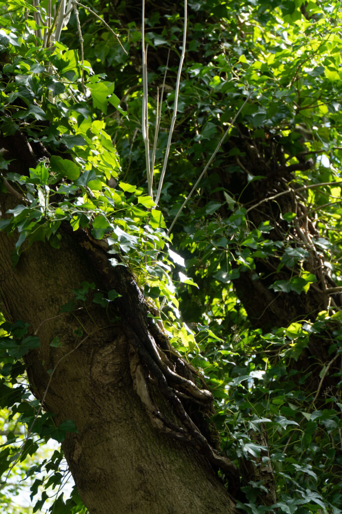
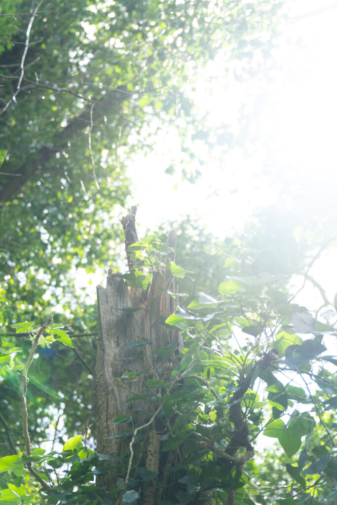
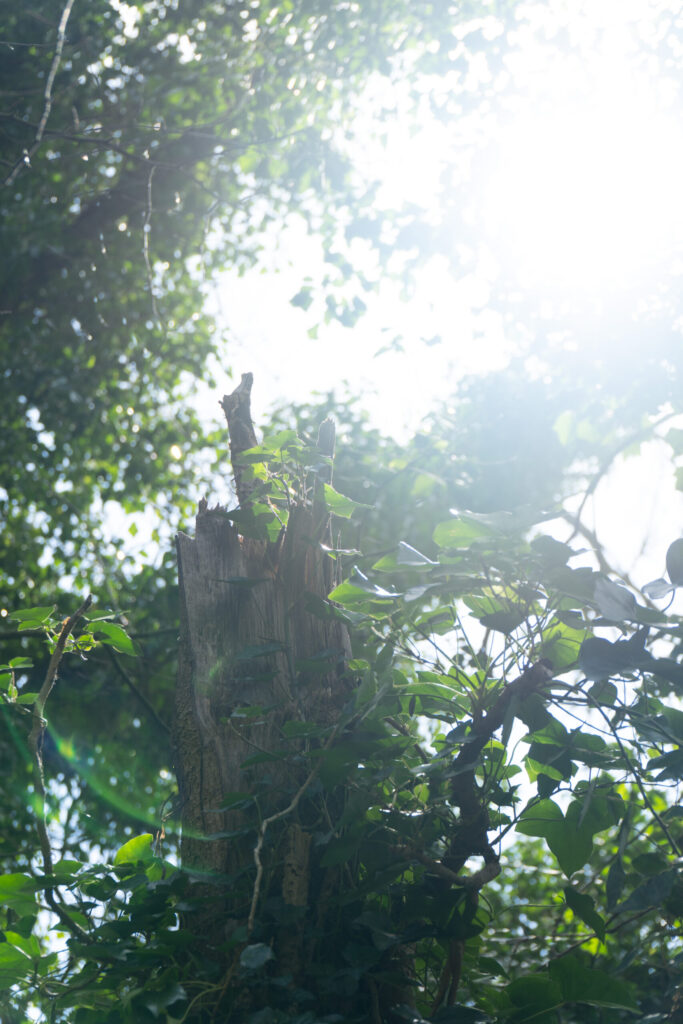
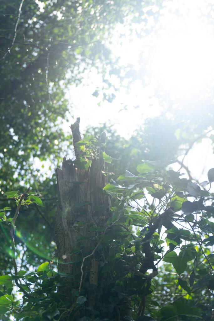
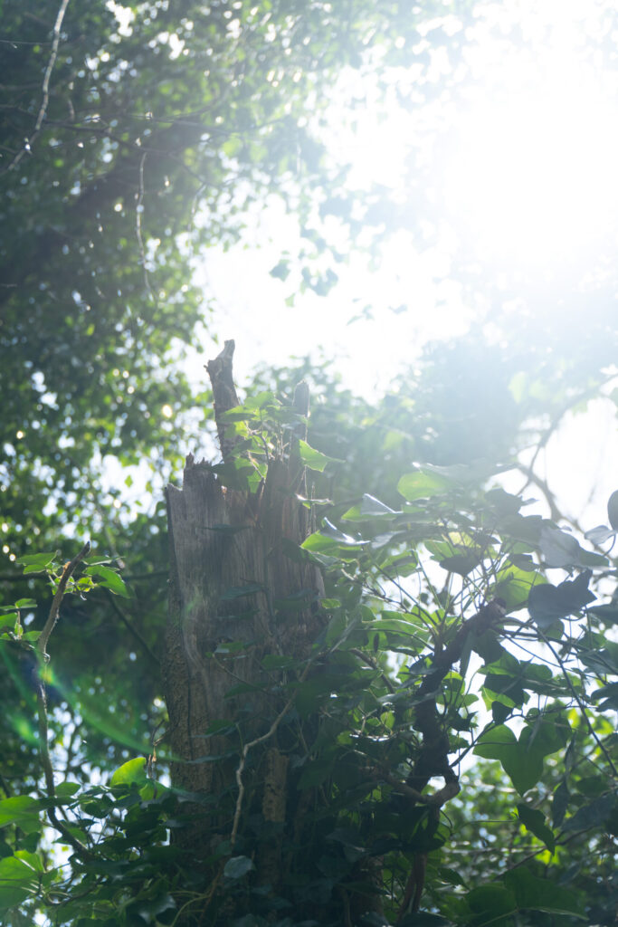
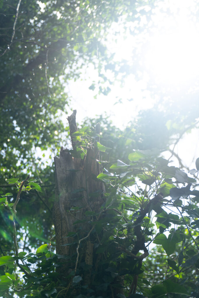
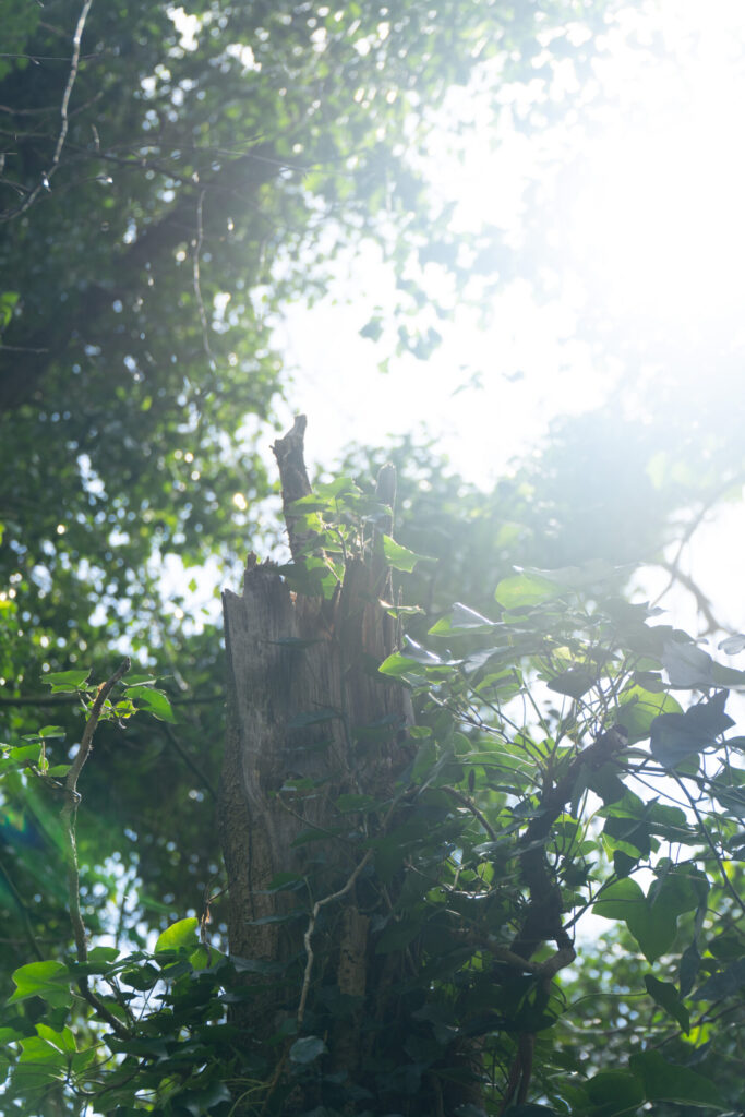
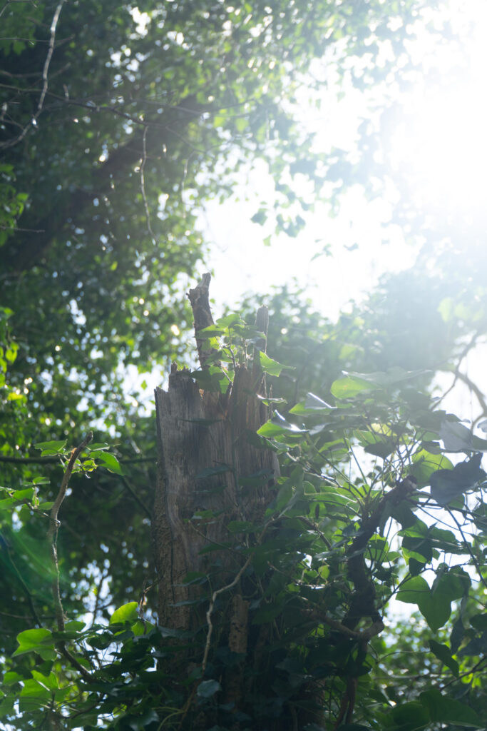
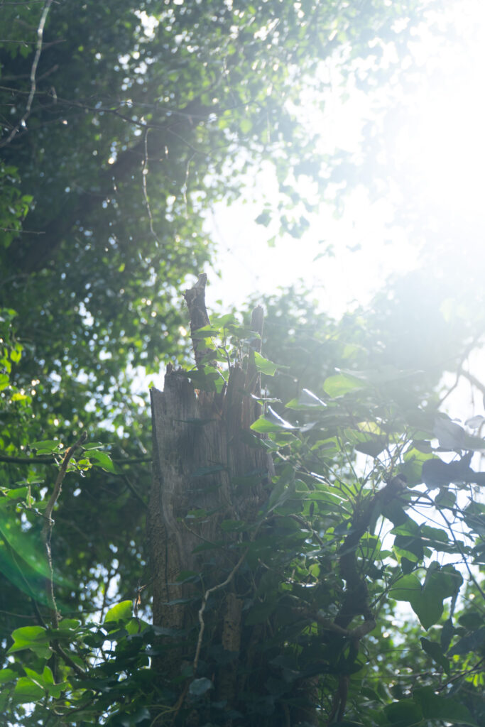
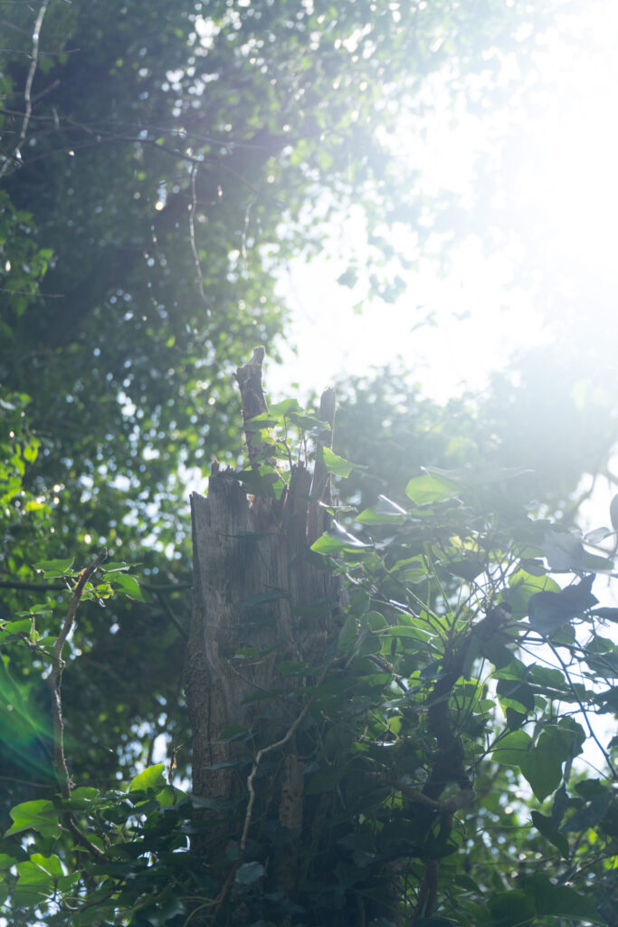
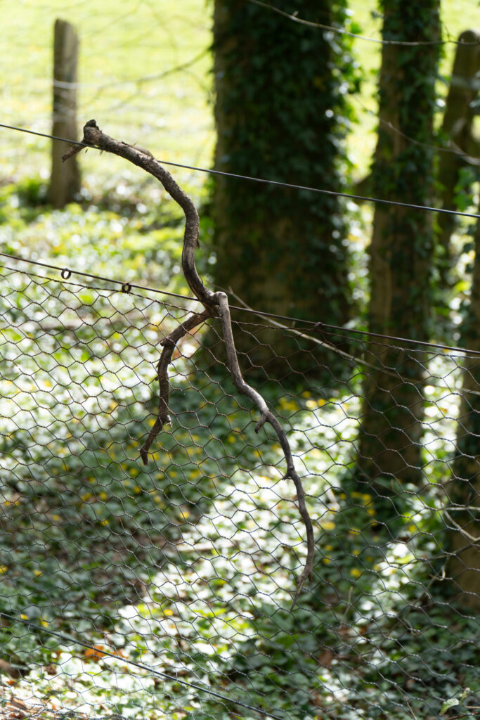
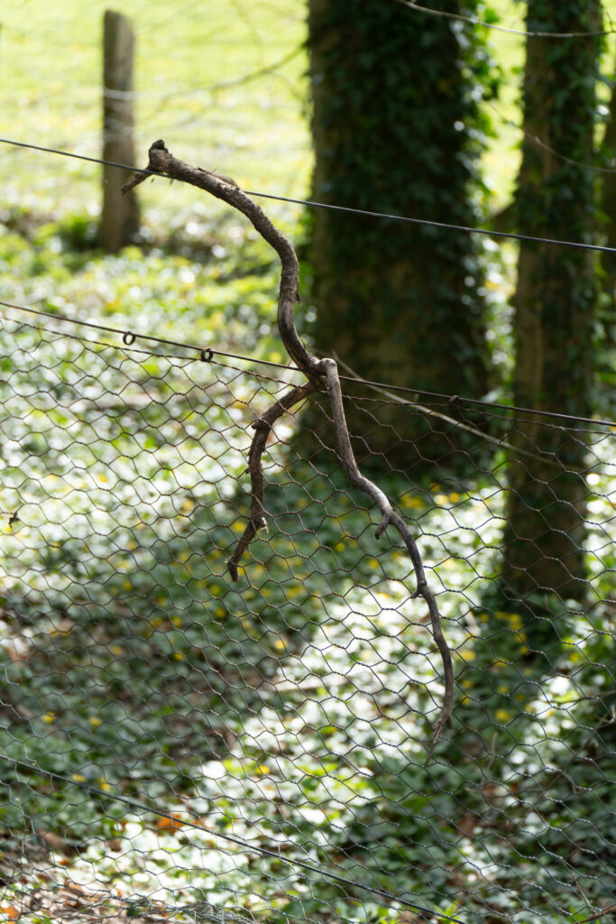
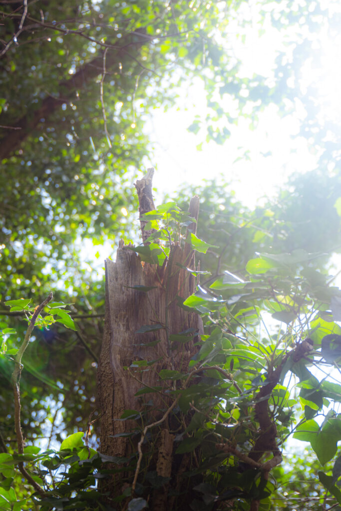
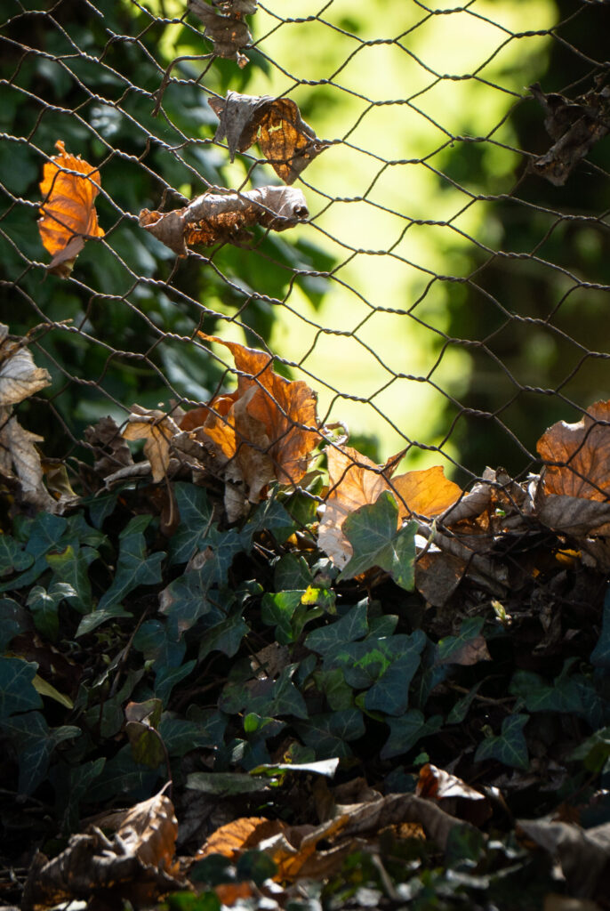
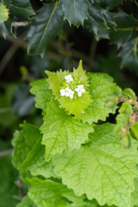
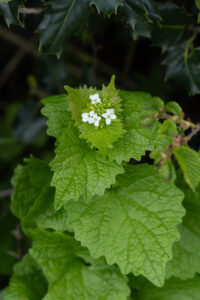
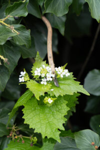
Shoot 4 – Spring walk
For this photo shoot I wanted to picture what it is like to take a mid-afternoon spring walk.
View Full Shoot


Lightroom Enhanced Edited Selection
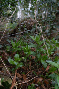
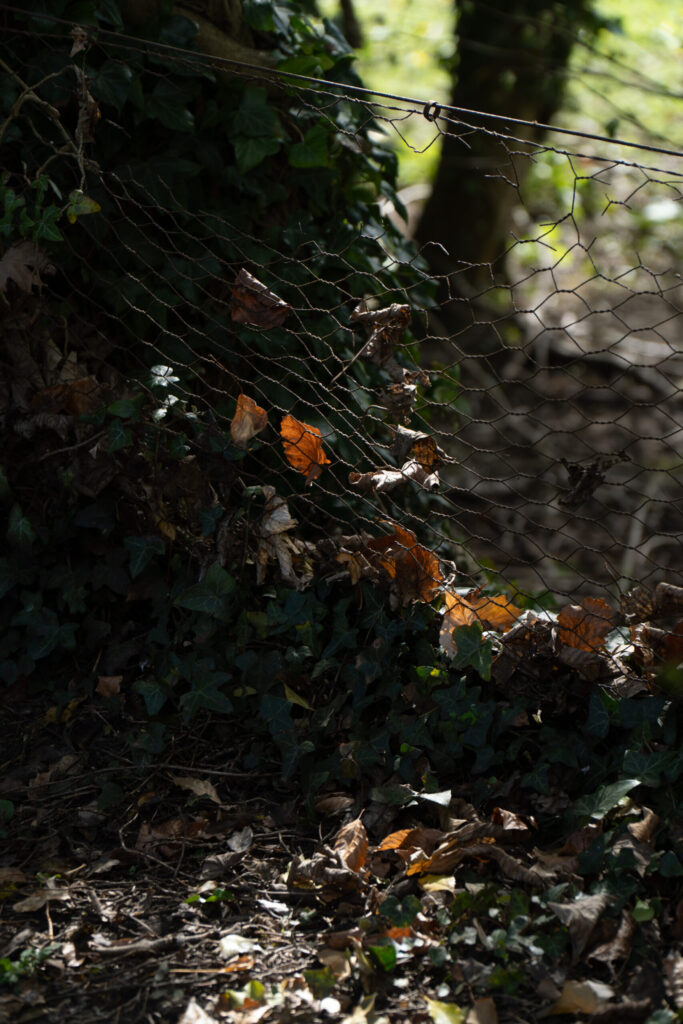
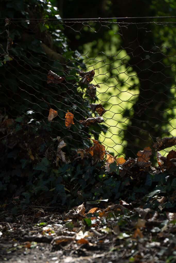
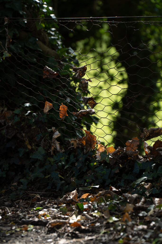
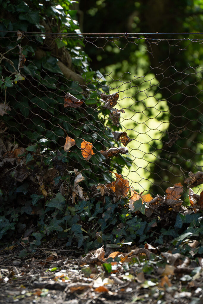
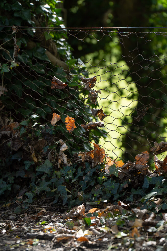
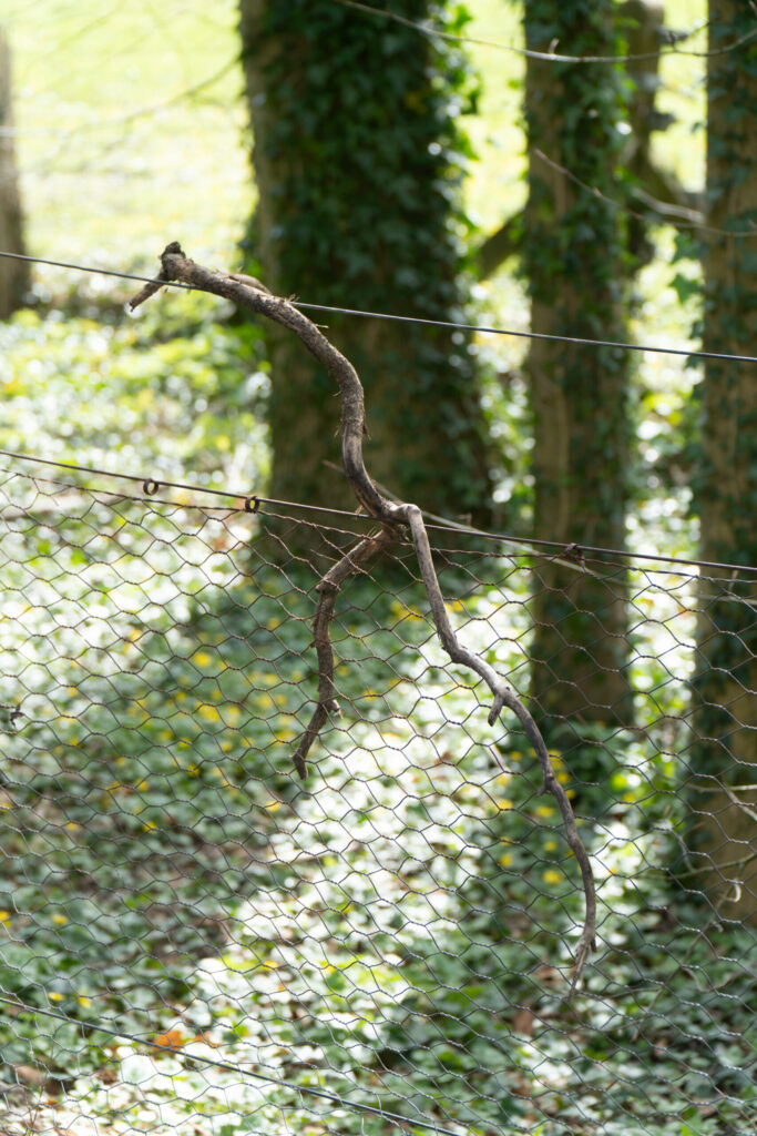
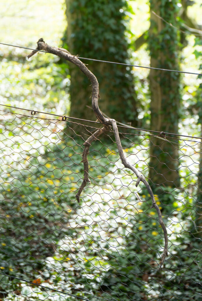
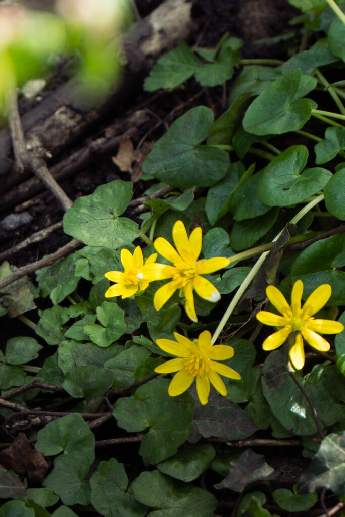
For the images I have selected for my lightroom enhancements I have picked images that show the randomness and small details of nature. Showing a broken away tree trunk, with the light beaming from behind it, cutting through the leaves that remain of its surrounding trees. For this edit I have focused on making it feel really dreamy and almost filmic, with heavy light leaks and tanned shadows. To do this I have pushed the exposure slightly, dropped the contrast, dropped lots of clarity, boosted the texture slightly and then manipulated the colours to feel life like, but dreamy. I have also leaned into the fact that I had exposed for the light rather than the subject, the tree. By doing this I have made it more realistic to how you would see it in person which makes the image feel real. For the second image that I decided to edit for my enhanced selection; I wanted something that showed how manmade structures can interfere with nature. Here I have picked a wire fence that has caught a few fallen leaves from the autumn. The brown leaves blend quite nicely with the metal fence colour wise and I have tried to push that by using the HSL slides to change the hue and saturation of the reds and oranges in this image. I have then also tried to boost the colour of the grass field that is just behind the fence. Doing so creates a harsh colour contrast between the ground, fence and leaves. It also shows that this area is shaded by trees which can be seen lightly to the left and right of the sides of the image while the field behind is in full sun. For my third image I have again gone for a very similar style, showing how man made fences have interfered with natures day to day. A fallen branch has caught on a fence and is floating there in mid air. When I took this picture I thought it was unique as it is something that many people would not notice, but I knew that I had to get the focus tack sharp on the branch so I could boost the texture of it in post. For editing here I have gently blurred the top of the image by reducing the clarity but also boosted the exposure and added some slight warmth to add to the idea of the sun being behind the subject. I have also done a similar thing for the bottom of the image but instead I have reduced the exposure, creating a nice gradient that leads the eyes of the audience into the subject. For the subject itself I have added clarity, some exposure but also changed the overall colours of the image to make them feel quite muted and subtle. I did this by using the HSL sliders and particularly the saturation of the greens and yellows in the image. I have also again leaned into the subject being the exposure focus here. Keeping the sun streaks in the background overexposed, this is how someone would see this in real life, making it feel more realistic. Now for the final photograph that I selected, a small collection of buttercups on the ground. For this image I made sure to keep the colours muted of anything but the flowers, so the HSL slides were used again here to pull out the exposure and saturation of the green leaves and ground surrounding the subject. While the opposite was done for the subject, where the yellow of the flowers was boosted in both colour and saturation. However, I have made one distraction from the subject and that is in the top left corner with a small foreground subject that is leaves falling into the corner of the frame. To try and boost the visibility of these I have boosted their exposure and saturation and warmth using a gradient mask.
Lightroom Black and White Selection
I wanted to try and create a candid selection of edits here, that feel like you are just taking a walk through nature and showing moments captured like memories.
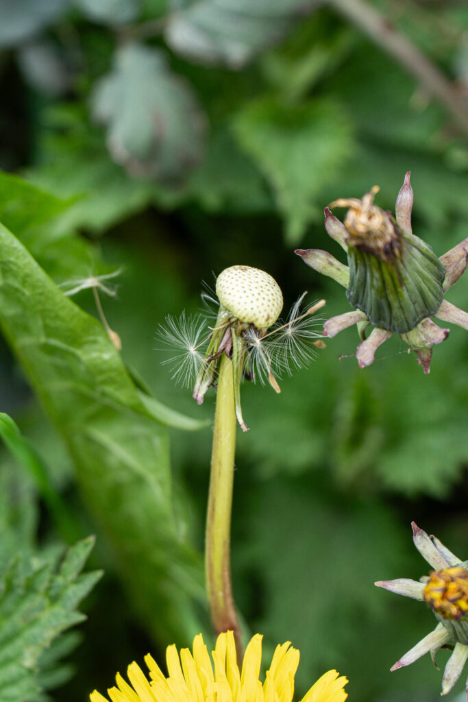
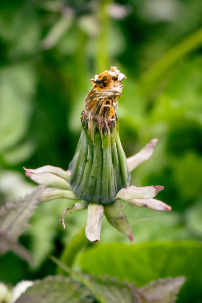
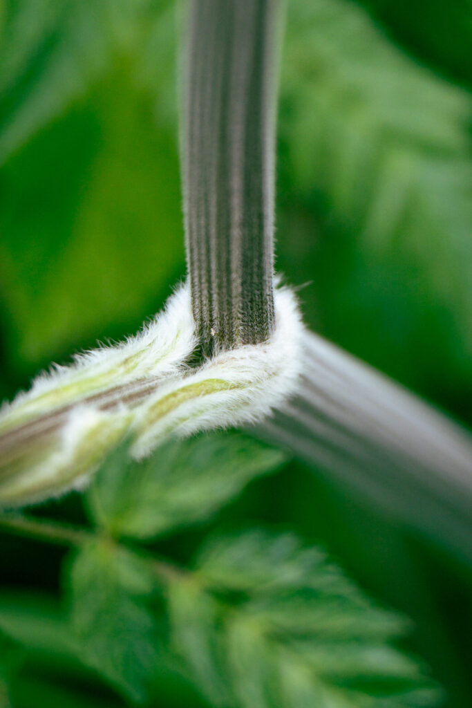
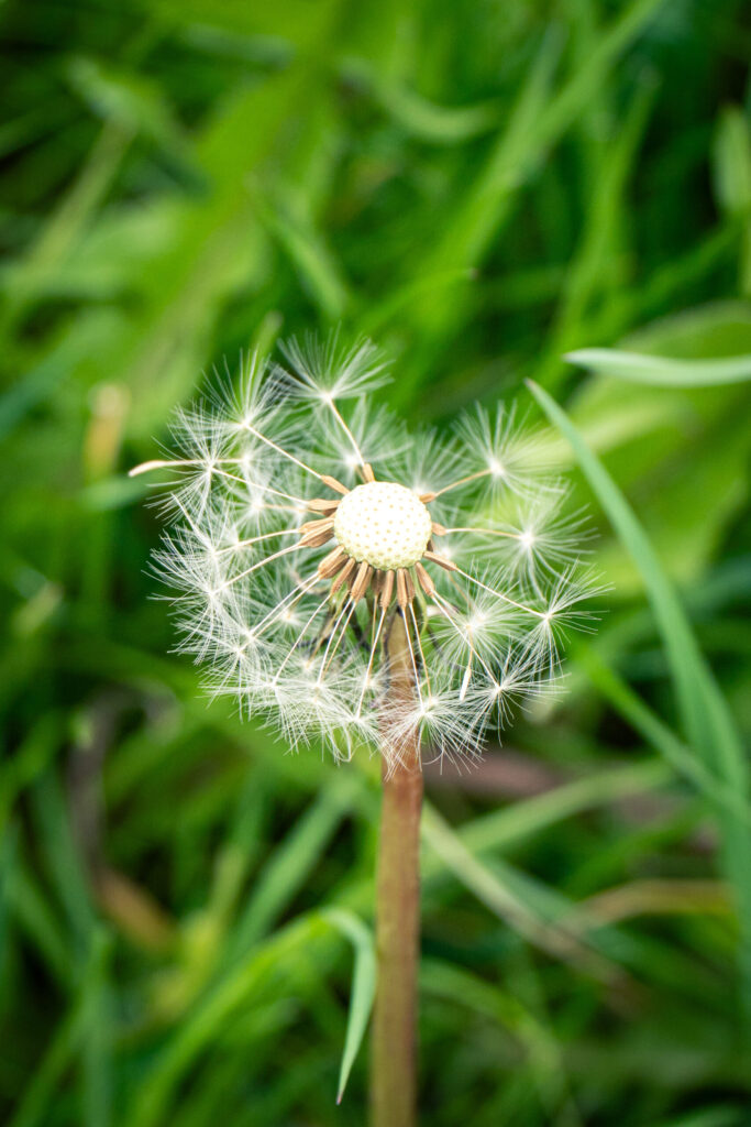
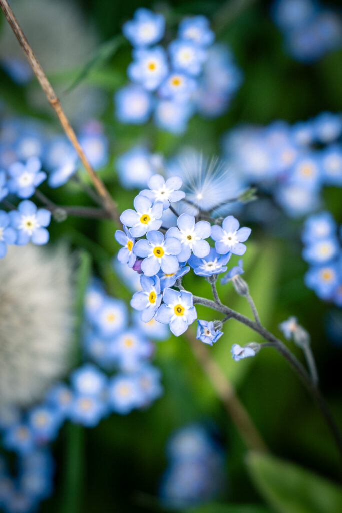
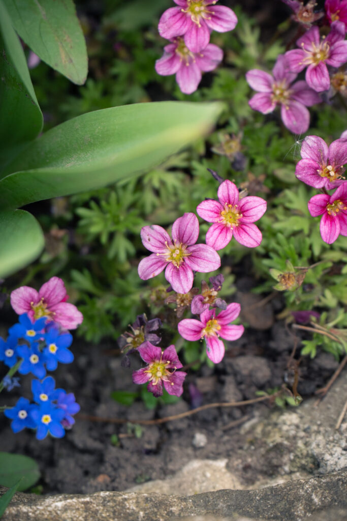
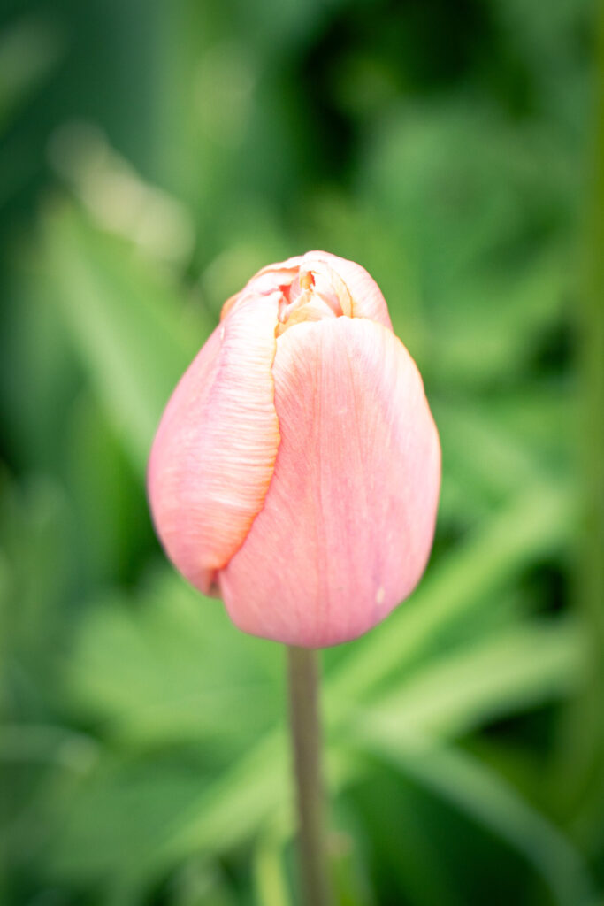
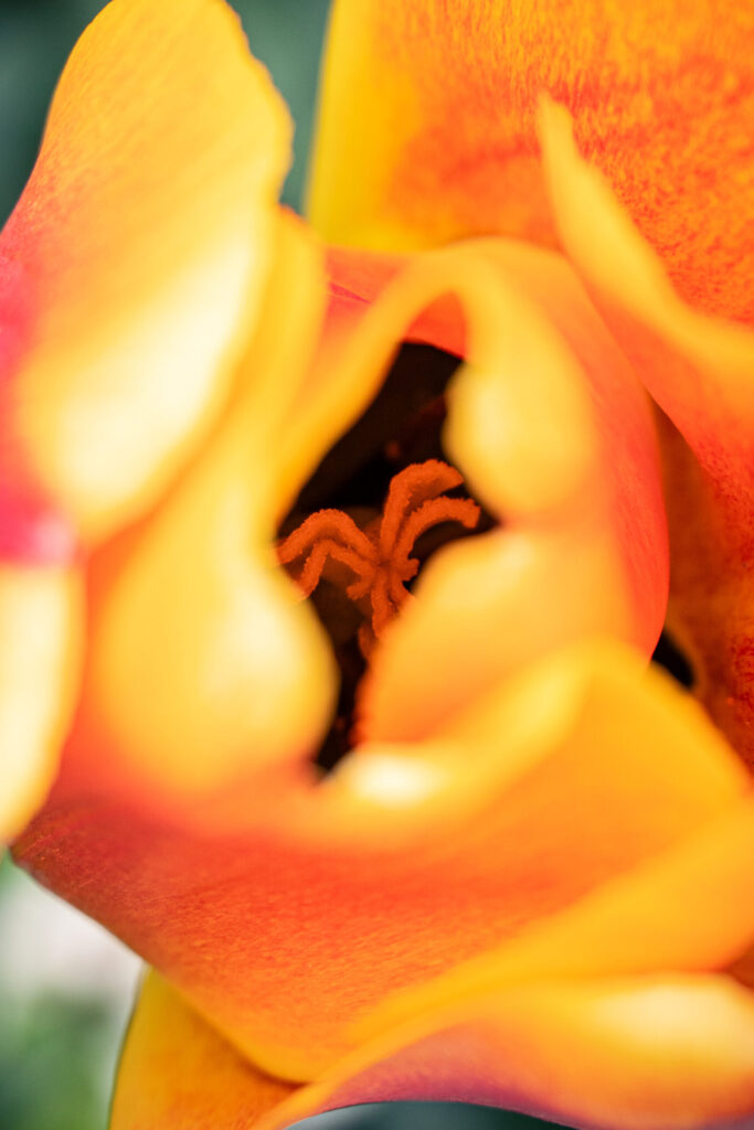
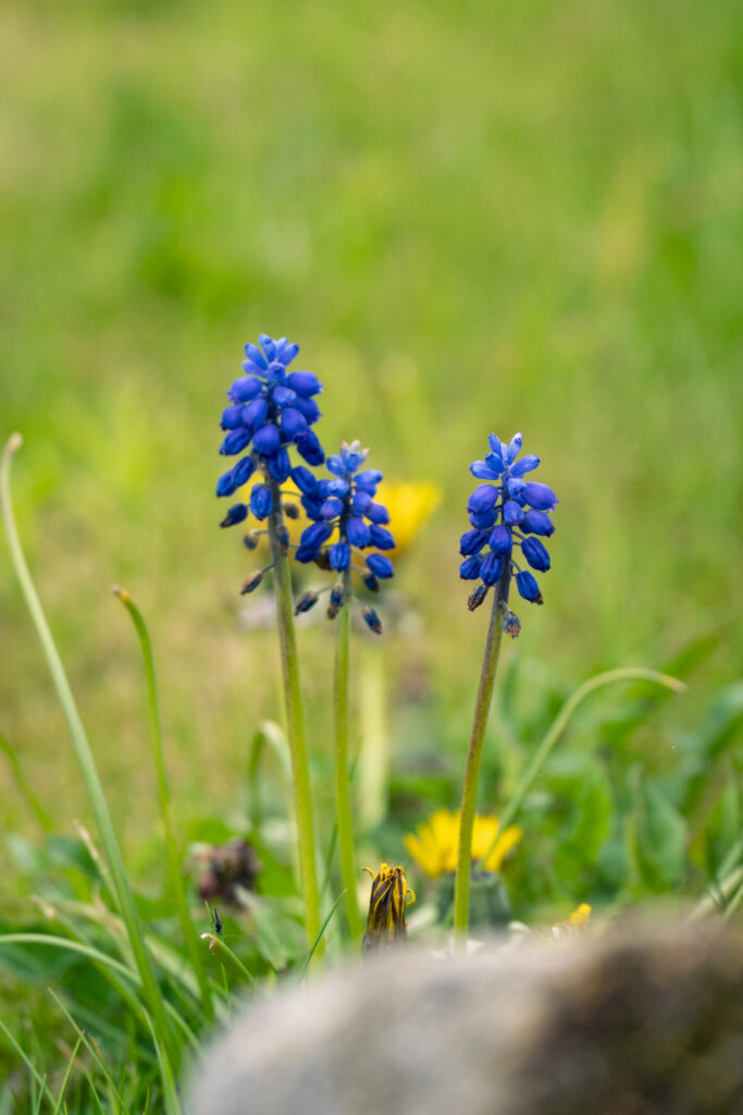
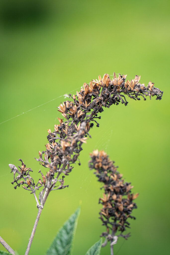
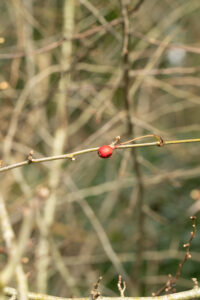
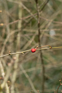
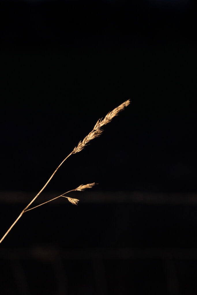
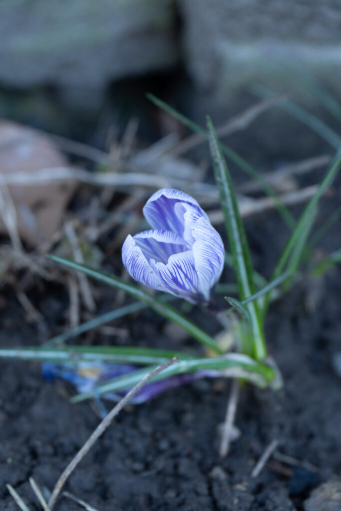
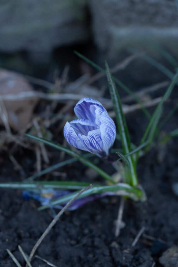
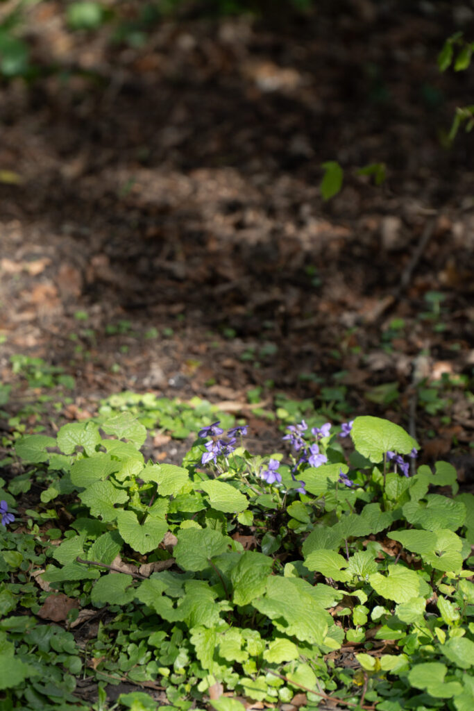
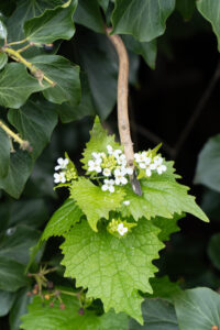
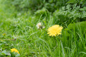
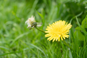
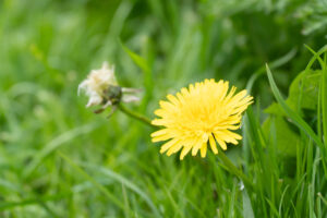
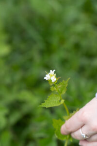
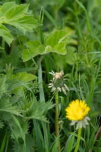
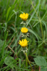
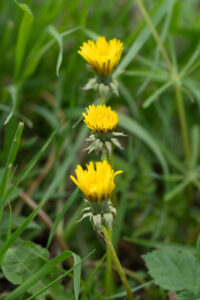
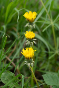
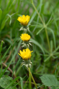
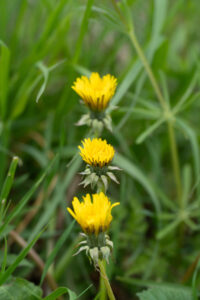
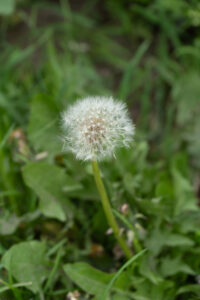
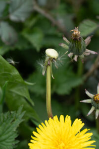
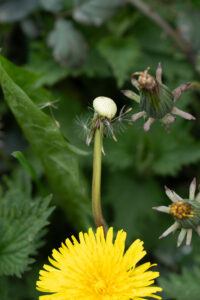
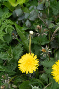
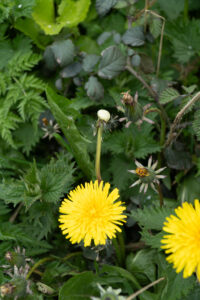
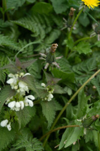
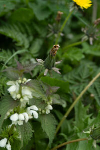
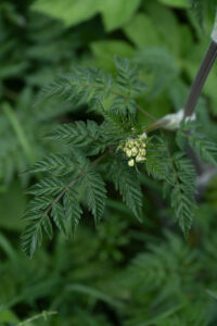
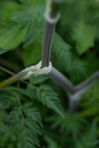
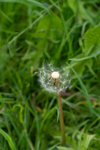
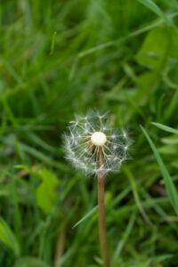
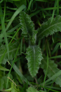
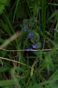
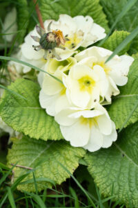
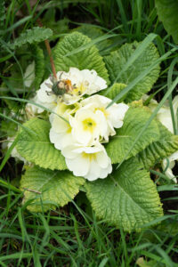
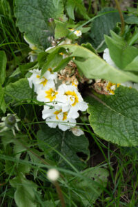
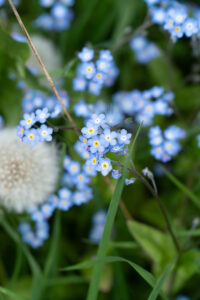
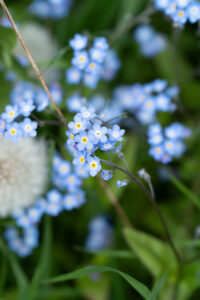
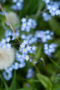
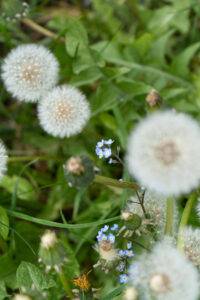
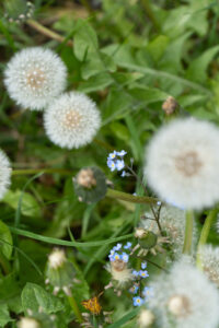
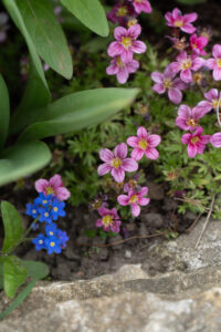
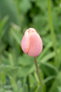
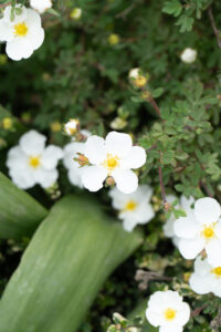
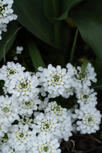
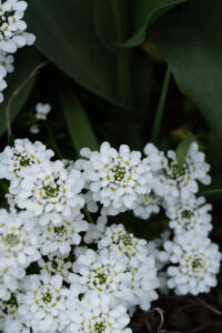
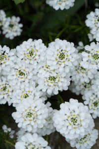
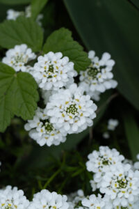
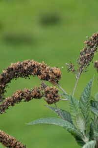
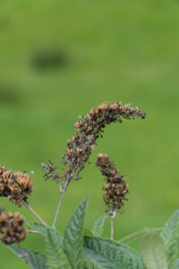
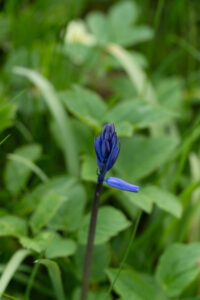
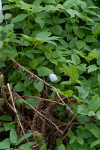
Shoot 5 – Budding Life
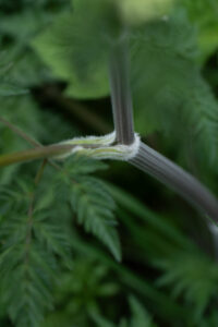
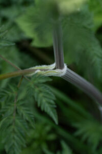
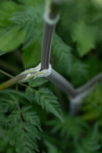
I wanted to make a shoot that showed the life of a plant, being a bud, beginning to bloom, at it’s peak and then it’s slow erosion. During this shoot I was heavily focused on my composition and lighting, I wanted to ensure both elements were balanced. With my composition I was trying to place the subjects in prominent positions that would be eye catching, though as this is nature we are talking about I had to move myself and the camera rather than the subject. As for the exposure I was trying to keep a balance between quality and zero motion blur to ensure a sharp image every time. To achieve this I used a shutter speed of at least 1/400s which limited any unintended blur that could’ve been caused by the wind.
View Full Shoot
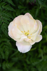
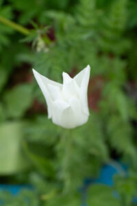
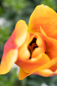
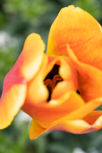
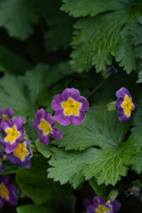
Lightroom Enhanced Edited Selection
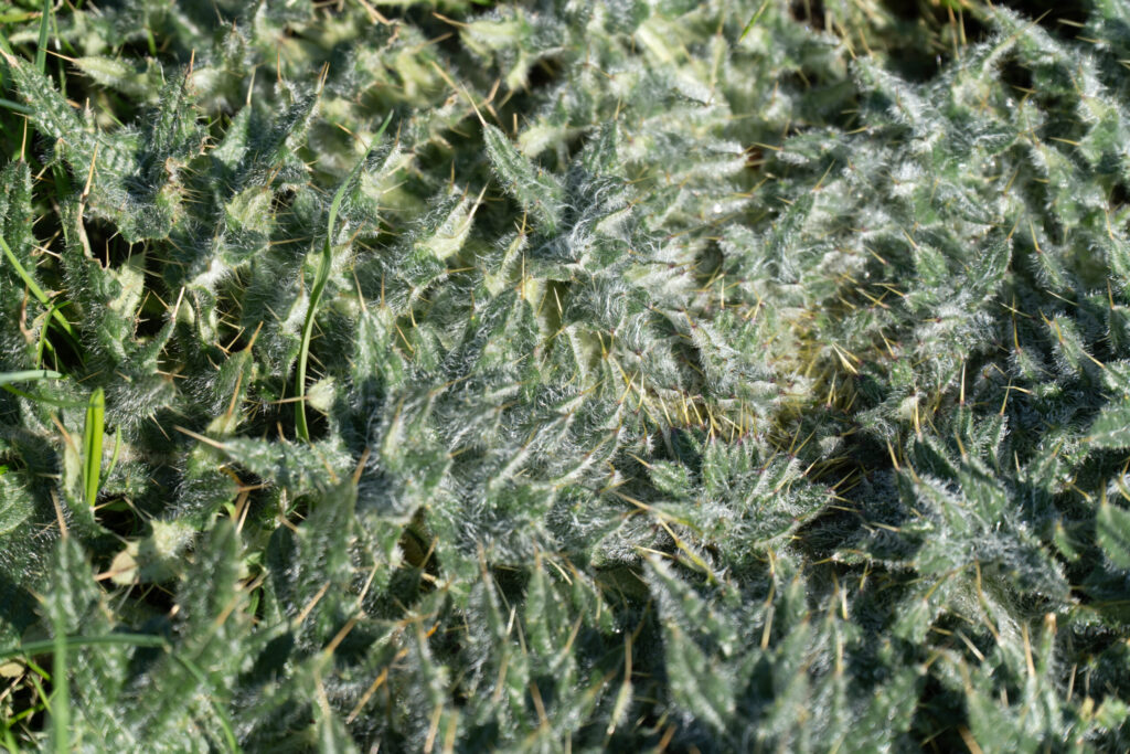
In these edits I was trying to really make the colours pop and hit you in the face. To do this I have utilised masking to help create a harsh vignette on most of the images, this allows the subjects colours to really pop out and hit you in the face. I have also used clarity and texture to boost the sharpness of the images and add extra detail to the subjects. I have also experimented with the HSL sliders, colour mixing and colour grading; all of these combined allowed me to create some unique colour pallets and really boost the vibrance of my subjects without just turning the saturation knob to 11.. The muted colour pallet of the furry plant was inspired by Victoria Siemer’s work with her reflections, where I have tried to capture the dark and moody colour pallet. The last few images of this selection take inspiration from David Noton with his vibrant colours and contrasty blacks. This can be seen especially in the pink flowers in the flower bed where the image is sharp and vibrant but with a dark background and again in the picture of the big pink flower where a harsh vignette has been used to focus on the subject and the colours have been boosted selectively using the HSL sliders by using the luminance and saturation tabs.