Section 1 – The main ideas of my project
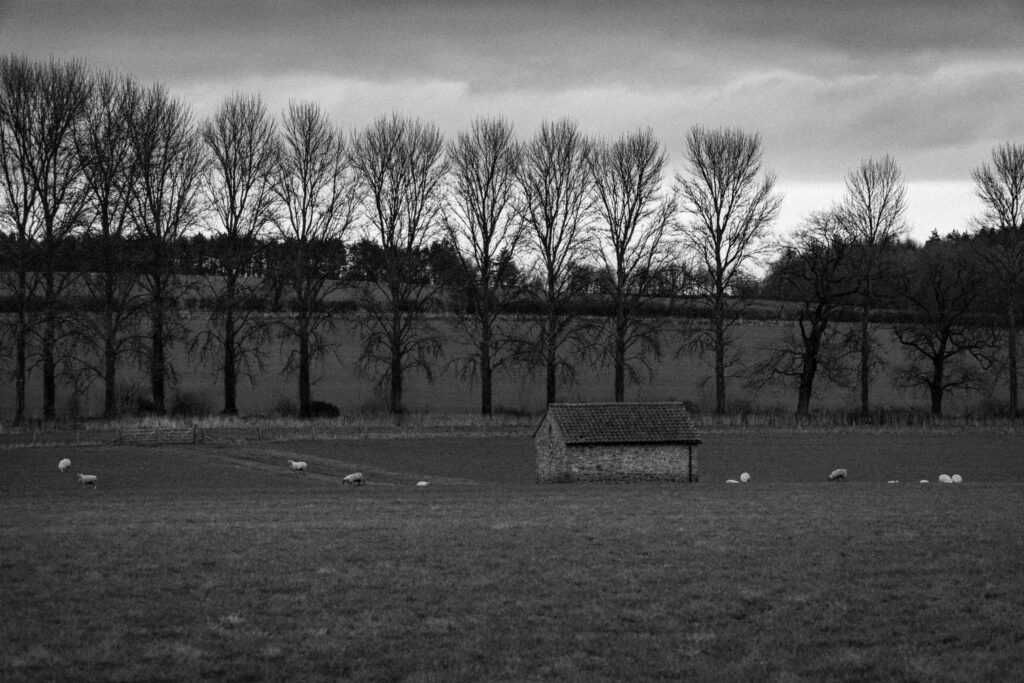
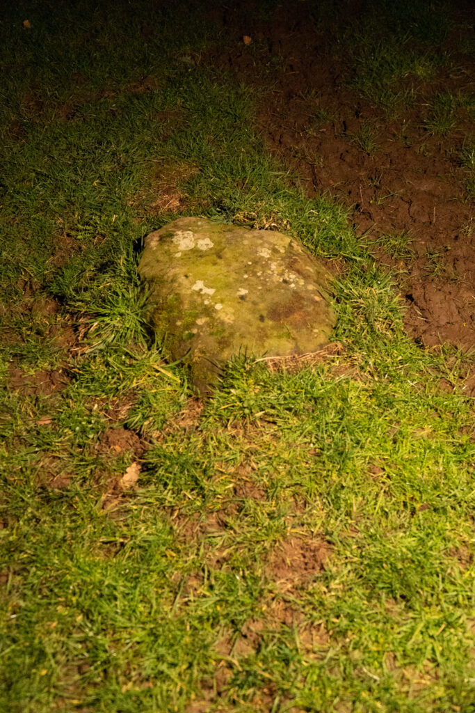
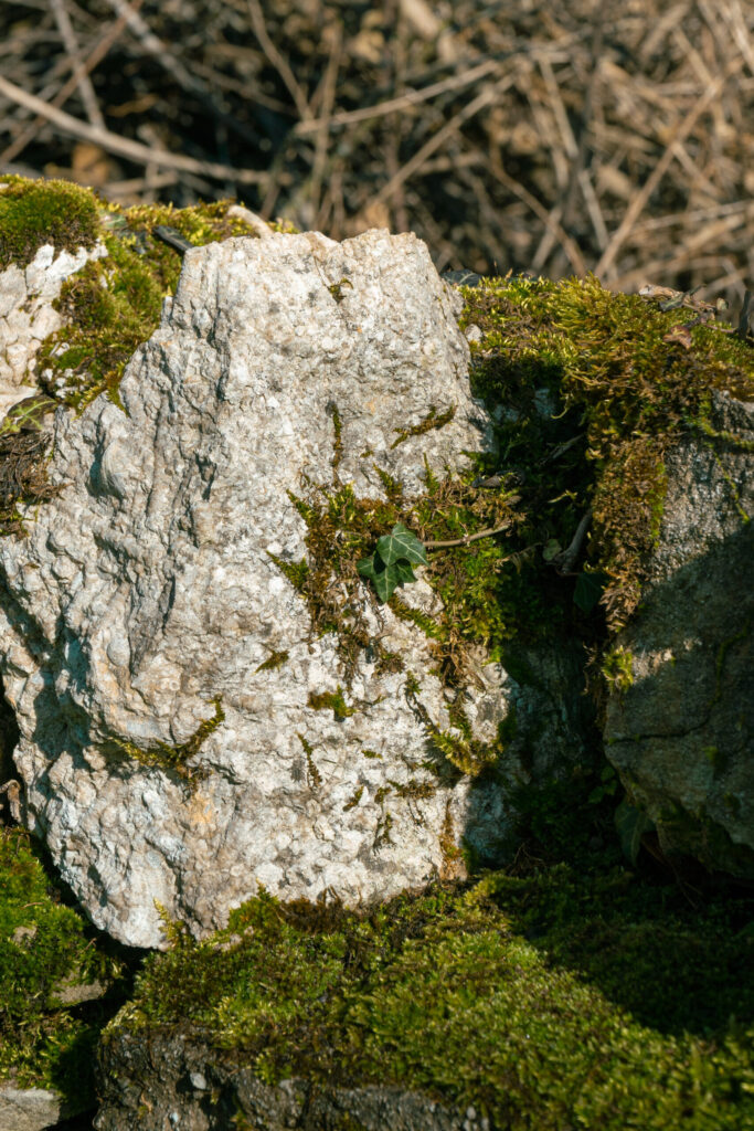
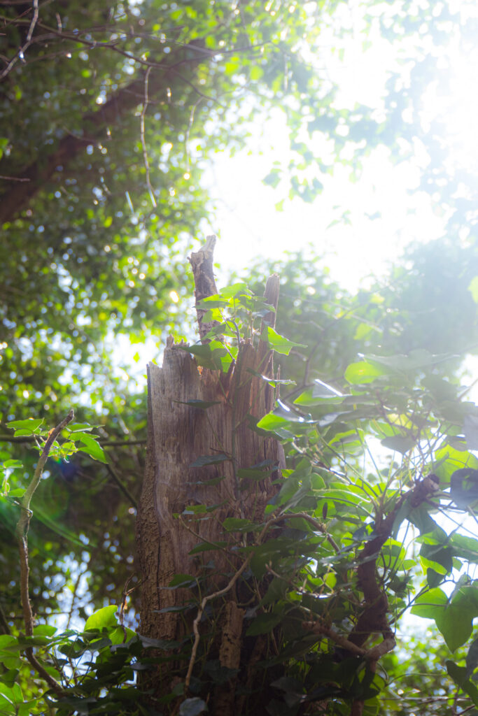
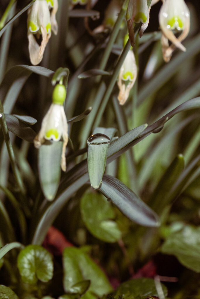
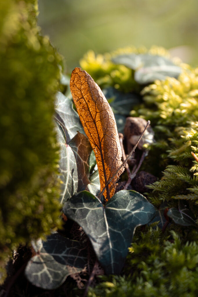
The heart of my Component 2 photography project is something I find genuinely fascinating: the raw, tension-filled divide between the natural world and the structures humans leave behind. My images will explore the friction and the beauty that exists in that space between; gnarled trees pushing against crumbling walls, sweeping landscapes interrupted by a forgotten barn (f. 1), rubble slowly being swallowed back into the earth (f. 2), walls built by human hands now reclaimed by moss and root. (f. 3)
This direction chose me as much as I chose it. Coming out of Component 1 and the workshops, I discovered something about the way I see. I’m drawn to the overlooked, the quietly dramatic, the details that most people walk straight past. The way moss colonises a wall like it’s mounting a slow, patient takeover. The way the ground seems to breathe upward, creeping along stone, pulling structures back into itself. That sense of nature’s quiet persistence became the foundation of everything I want to say with this project. (f. 4)
Lighting is where I really want to push myself. I’ll be working with natural available light far more intentionally, repositioning myself to let the environment do the work (f. 5), but I also want to introduce artificial light into these spaces, using a torch or portable lighting to sculpt specific features within the frame, making the invisible suddenly visible. (f. 6) I want to chase golden hour for those warm tones and long dragging shadows (f. 7), shoot in overcast conditions for something moodier and more diffused (f. 8), and find the vivid contrasts that only harsh midday sun can give. Beyond that, I want to photograph in early morning mist, capture reflections after rainfall, and venture out at night to experiment with light painting across natural surfaces.
Formally, colour is where I plan to be most adventurous. I want to push the palette of each image until it sits right at the edge of reality, somewhere surreal but never fake, where the colours feel heightened rather than invented. Lighting and colour together are the tools I want to master here, using them not just to document a scene but to give it a feeling, an atmosphere, a sense that something ancient and alive is quietly winning.
Section 2 – How I plan to produce my project
Living in Middleton Tyas, a small village tucked into the North Yorkshire countryside near the market town of Richmond, I am fortunate enough to have some of the most compelling subject matter for this project quite literally on my doorstep. The surrounding landscape is rich with exactly the kind of tension I want to capture: ancient drystone walls threading through open moorland, crumbling field barns half-consumed by ivy, beaten tracks disappearing into woodland. Richmond itself and the surrounding dales offer an abundance of locations where the man-made and the natural exist in close, uneasy company, and I plan to make full use of that proximity throughout the project.
For shooting, I will be using my Sony a6400 paired with an 18-105mm f/4 G lens. This combination gives me a lot of flexibility in the field; the zoom range means I can shift between wide environmental shots that place a structure within its landscape, and tighter compressed frames that isolate a specific detail, such as the texture of lichen on stone or the way roots grip a wall. The f/4 aperture, while not the fastest, is consistent across the full zoom range and handles natural light well, particularly during golden hour and overcast conditions where I will be shooting most frequently.
The majority of my editing will take place in Adobe Lightroom, with Adobe Photoshop used selectively for more involved compositing or retouching work where Lightroom reaches its limits.
The first step after any shoot is importing and organising. I import my RAW files directly into Lightroom, using its folder and collection system to keep shoots clearly labelled by location and date. From there I do an initial cull, flagging the strongest frames and rejecting anything that is out of focus, poorly exposed beyond recovery, or simply not serving the project. Working in RAW is essential here as it preserves the full tonal range of each image and gives me far more room to manoeuvre in post than a JPEG ever would.
Once I have my selects, the editing process follows a fairly consistent order, though every image has its own demands.
I start with exposure and tone. Using the basic panel in Lightroom, I adjust the overall exposure first, then work through the highlights, shadows, whites, and blacks sliders individually. This is where I establish the tonal foundation of the image. For this project, I often want a slightly lifted shadow to preserve detail in darker natural textures, while pulling the highlights back to stop skies from blowing out.
Next comes detail, where I work with the sharpening and noise reduction sliders. Because a lot of my shooting will be in low light conditions, including mist, dusk, and night-time scenes, noise can be an issue, and Lightroom’s AI-powered denoise tool is particularly effective at cleaning up high ISO grain while preserving texture in surfaces like bark, stone, and soil.
From there I move into colour, which is where the most expressive work happens. I use the HSL sliders (Hue, Saturation, and Luminance) to individually adjust specific colour ranges within the image. For example, I might desaturate the oranges slightly to stop autumnal tones from becoming garish, or shift the hue of greens toward a cooler, more olive tone to give the vegetation a more ancient, weathered feel. Luminance adjustments let me darken or brighten specific colours without affecting the whole image, which is useful for making skies more dramatic or lifting the detail in shadowed foliage.
Following HSL, I work on colour grading using Lightroom’s colour grading panel, which lets me independently tint the shadows, midtones, and highlights. This is where the surreal, heightened quality I want for this project really begins to take shape. I might push the shadows toward a cool blue-green to suggest damp and age, while warming the highlights slightly to retain a sense of natural light. The interplay between these tonal colour shifts is what gives an image atmosphere rather than just accuracy.
Cropping and composition come next, though I try to get the framing right in camera as much as possible. Where I do crop, I am thinking about the tension at the heart of the project: how much of the frame does nature occupy versus the man-made structure, and where does the boundary between them sit? Cropping can dramatically shift that balance and change the entire reading of an image.
Finally, I use masking to make localised adjustments. Lightroom’s AI masking tools, particularly the subject, sky, and background selectors, allow me to apply targeted edits to specific areas without affecting the rest of the image. I might darken a sky independently of the foreground, or apply a separate colour grade to a stone wall to make it feel colder and more inert compared to the warmer, living tones of the surrounding vegetation. Radial and linear gradient masks are also useful for directing the viewer’s eye, subtly brightening a focal point or deepening the edges of a frame to create a natural vignette.
Where Lightroom’s tools are not enough, I bring the image into Photoshop for more precise work: removing distracting elements, blending exposures from bracketed shots, or working with layers to composite light painting captures taken in the same location.
Section 3 – The context of my project and what influenced my work
The ideas behind this project did not arrive fully formed. They came together gradually through research, through looking at other people’s work, and through asking myself what kind of images I actually want to make and why. My research process included building a mindmap to map out the connections between my ideas, creating a Pinterest moodboard to gather visual references, studying three photographers whose work genuinely speaks to this project, and reading through a relevant issue of the British Journal of Photography.
Victoria Siemer (Witchoria)
Victoria Siemer, who works under the name Witchoria, is a Brooklyn-based graphic artist who creates surreal photographic manipulations, most famously her “Geometric Reflections” series, where sections of a landscape are duplicated, flipped, and framed within a precise geometric shape, a circle, a rectangle, a horizon-skimming sliver, placed back into the original scene. The result is something that should feel impossible but instead feels quietly inevitable, as if the landscape is folding in on itself, revealing a second version of its own reality.
What draws me to her work in the context of this project is how she uses the natural landscape not just as a subject but as raw material to be broken apart and reassembled. In her “Geometric Reflections” images, the atmosphere is consistently heavy; skies full of cloud and diffused light, dark forests, gloomy moorland. These are not pretty pastoral scenes. They feel ancient and unsettled. The geometric intrusion into those landscapes creates a tension that mirrors exactly what I am trying to explore in my own work, the idea that something foreign has entered a natural space and changed the way we read it. In her case that intruder is a digital manipulation. In mine it is a stone wall, a crumbling barn, a formed path.
Her “Hue Don’t Own Me” series also interests me from a colour perspective. These images, shot in darkness and lit only by vehicle headlights, have been pushed through extreme hue shifts and feature glowing, superimposed typography. They are disorienting and deeply atmospheric, and they show how aggressively you can push colour away from reality without losing the emotional weight of the image. That tension between the surreal and the believable is something I want to carry into my own editing, particularly in how I use colour grading to give my images an atmosphere that feels heightened rather than falsified.
Ansel Adams
Ansel Adams needs little introduction, but what matters here is not his fame but how his specific technical approach connects to what I want to do. Adams was one of the founders of the f/64 group, which advocated for sharp focus across the full frame and the use of the complete tonal range of a photograph. He and Fred Archer also developed the Zone System, a methodical approach to understanding how exposure and development choices affect the final tonal range of an image.
What strikes me most about Adams is how he achieved foreground and background separation without relying on shallow depth of field. Working at very high f-stops, everything in his frame is in sharp focus from front to back, and yet the images never feel flat. He achieves that sense of depth and hierarchy through tonal contrast instead, darkening certain areas to push them back, lifting others to bring them forward, directing your eye through brightness rather than blur. This is something I want to consciously apply in my own work, using masking and exposure adjustments in Lightroom to create that same sense of depth without always defaulting to a wide aperture.
His compositional choices also push back against the usual rules in ways I find genuinely inspiring. One of his landscape images breaks the rule of thirds entirely, placing the horizon at the very bottom of the frame and giving nearly the whole image over to sky. Rather than feeling wrong, it makes the sky the subject, making the clouds feel enormous and the land feel small and ancient beneath them. That willingness to let the landscape dictate the composition rather than imposing a formula onto it is something I want to carry into my own shooting.
David Noton
David Noton is a British landscape and travel photographer with nearly four decades of professional experience, and his work feels in many ways like the most direct influence on this project. His images of the North Yorkshire Dales, stone walls threading through lush green fields, tight apertures rendering everything from the nearest stone to the furthest hillside in perfect clarity, vibrant but naturalistic colour, dramatic skies balanced against detailed foregrounds, describe almost exactly the kind of landscape I am working in and the kind of image I want to make.
One of his images in particular stopped me: a shot looking down the length of a drystone wall stretching away into the distance, a lake and woodland beyond, sheep in the mid-ground, the sky heavy with cloud. The technical construction of it is careful and considered; a tight aperture for deep depth of field, what looks like a localised exposure mask applied to the shadow side of the wall to deepen it, and a corresponding mask on the far sky to let the highlights blow slightly toward the sun. These opposing adjustments work together to stop the image from going flat, keeping the drama alive in the light without sacrificing any of the detail in the stone. That is the kind of thoughtful, localised editing I want to bring to my own images in Lightroom.
What Noton does that I find hardest to articulate but most want to learn from is how his images feel immediately placeable. You feel like you could step into them. The colours are enhanced but never artificial, the light is clearly observed rather than manufactured, and the sense of being in a specific, real, extraordinary place is overwhelming. That groundedness, that sense of here, is what I want people to feel when they look at my images of the landscape around Middleton Tyas and Richmond.
British Journal of Photography
Alongside my artist research, I looked through a relevant issue of the British Journal of Photography, a magazine described by its publisher as the world’s oldest and most influential photography title. This gave me a broader sense of how contemporary photography is being discussed and exhibited, and reinforced the idea that documentary and landscape photography, when done with a strong conceptual underpinning, is taken seriously as fine art practice. The issue I selected was chosen specifically because its content felt relevant to my project’s themes, and engaging with it as a physical object, handling it, scanning pages, sitting with the images, felt like a different kind of research from scrolling a screen. It reminded me that photographs are made to be printed and held, not just uploaded.
Section 4 – Reflecting on my project critically
Bibliography
“This is Collosol” Article: https://www.thisiscolossal.com/2015/06/new-reflected-landscapes-and-photo-manipulations-by-victoria-siemer/
Witchoria’s Website: https://www.witchoria.com
Witchoria’s Instagram: https://www.instagram.com/witchoria
Ansel Adams’ Wikipedia: https://en.wikipedia.org/wiki/Ansel_Adams
Ansel Adams’ Website: https://www.anseladams.com/
David Norton’s Website: https://www.davidnoton.com/
F11 Magazine Website: http://www.f11magazine.com/
Pinterest: https://uk.pinterest.com/